Design
- Design
- The Editors
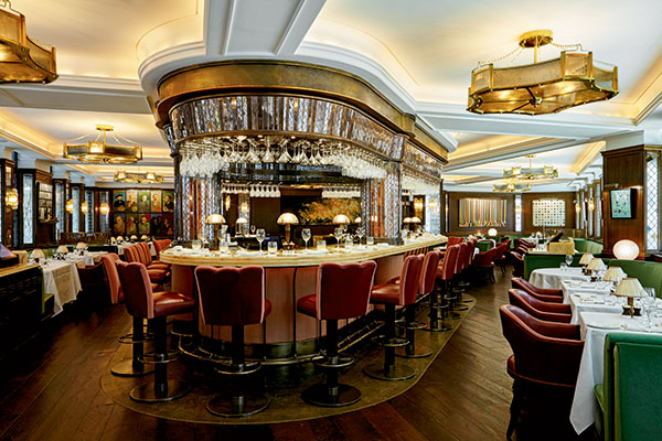
History and sleek, modern style coincide throughout England’s capital, and the city’s restaurants are also adept at juxtaposing the two. There’s no shortage of top chefs in London, either, giving “the Old Smoke” a hot and vibrant dining scene. — Amanda Baltazar, Contributing Editor
- Design
- Caroline Perkins
Restaurant queuing evokes different responses in people depending on their relationship to the line. If you’re an operator standing at the front of a long, snaking line, you’re happy. Business is good. If you’re a customer joining the end of a long, snaking line, however, you’re probably not happy.
- Design
- Margie Monin Dombrowski
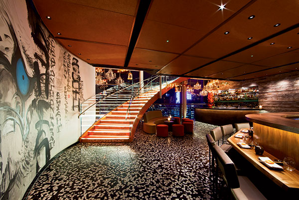
When there’s nowhere to go but up, smart design strategies help restaurants rise to the occasion.
- Design
- Dana Tanyeri
New Design Brings the Brand Home
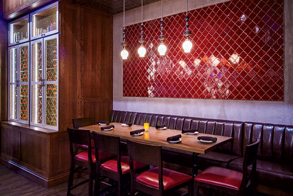
In Cuba, “paladares” represent a unique and much-loved form of hospitality: Essentially, they’re small, comforting restaurants that operate out of people’s homes. When partners Elie Weiss and Andy Himmel launched their first restaurant in Cleveland in 2007, they took the Paladar name as a way to represent the vibrant Latin cuisine and cultural experience on which they wanted to build their brand.
- Design
- The Editors
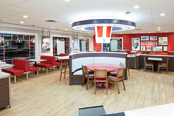
New menu items, a revamped website, new social media and advertising campaigns, redesigned packaging and the introduction of a fresh new restaurant prototype are all part of Kentucky Fried Chicken’s 75th anniversary celebration this year.
- Design
- Toby Weber
This fast-casual comfort food concept draws inspiration from autumn in Northern Michigan to meet the needs of its diverse customer base.
- Design
- Dana Tanyeri
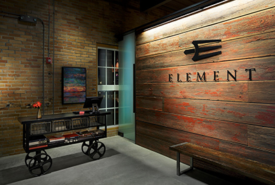
Element's entrance greets guests with a taste of what's to come, including repurposed materials such as reclaimed barn wood and original brick walls juxtaposed with contemporary design elements.

