When there’s nowhere to go but up, smart design strategies help restaurants rise to the occasion.
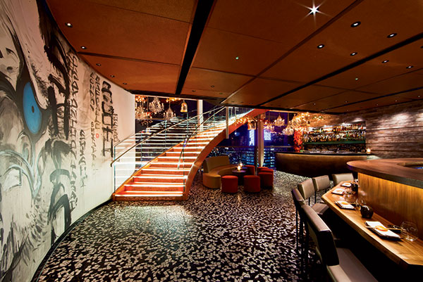 Sculptural orange glass staircases add design pizzazz and connect the top three floors of London’s glittering Heron Tower, occupied by SushiSamba and sister brand Duck &Waffle.When designing and developing a restaurant with multiple levels, operators and designers have so much more to consider — spatially, operationally, mechanically and more. And every decision seems to have a more powerful impact on success when compared to a single-level restaurant. With a single level, getting customers in the door may be the biggest worry, but a multilevel restaurant has to multitask, moving staff, guests, food, dishes and supplies up and down efficiently and safely.
Decisions also have to be made about ambiance. Will each floor be a unique experience, or will they all look and feel the same? Will additional staff be necessary? What kinds of redundancies are necessary, and how much will they impact the budget? These are just some of the questions that demand serious consideration and creative solutions when signing on to develop multilevel locations.
Despite the challenges they present, however, the realities of the real estate market, particularly in urban environments, mean sometimes the only way to go is up. Here’s a look at how four companies rose to the occasion to create attractive, efficient, successful multilevel restaurants.
Roofers Union, Washington, D.C.
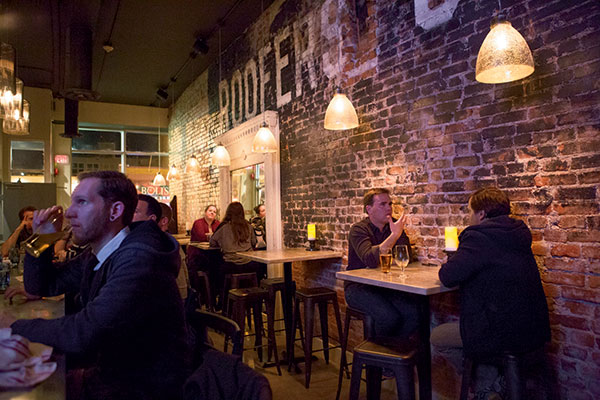
 Roofers Union created different environments on each level. The first-floor bar is rustic and intimate, with high-top tables and a painted brick feature wall. Photos by Elizabeth ParkerWhen searching for a location for their second restaurant, Roofers Union owners Roger and Betsy Marmet weren’t looking for a multilevel space. But when they spotted a rundown bar in the city’s Adams Morgan neighborhood, they saw the potential of its three floors, one of which is a rooftop deck. “Outdoor dining and outdoor bars do really well in D.C. when the weather allows,” Roger says.
After debuting their first restaurant, Ripple, an upscale farm-to-table eatery in 2010 in D.C.’s Cleveland Park neighborhood, the Marmets came up with the concept for Roofers Union, which opened in 2014. For Roofers Union, executive chef Marjorie Meek-Bradley, who heads up both kitchens, created a simpler menu of creative American classics and bar snacks with a sustainable twist, and each of the three floors features a bar with its own specialty. The floors transition from an intimate bar with high-top tables and painted brick feature wall on the first level (craft cocktails and wine) to a loft-like main dining room and bar with floor-to-ceiling windows overlooking the bustling 18th Street scene below on the second (beers on tap and craft spirits) to a covered rooftop deck with heat lamps and 15-seat horseshoe bar (punch bowls and frozen cocktails).
Warm, industrial materials such as repurposed barn wood and old tin roofing used as wainscoting tie all of these spaces together. Mismatched seating adds personality: metal stools and navy chairs, painted wooden chairs, schoolhouse chairs and tufted vinyl banquettes. The casual vibe of the interior, designed by Betsy, who’s also an interior designer, reflects the menu of “elevated bar food.”
Since guests would frequently use the front stairs, Marmet highlighted it. It’s made of poured concrete with metal wainscoting, decorative lighting and artwork to accent the stairwell. Staff primarily use the back staircase, which brings up another point: “Your food runners need to be in great shape because we have one large kitchen on the second floor, and you have to get your food either up or downstairs,” Roger says.
 The main dining room on the second level is bright and airy, with its own bar, floor-to-ceiling windows and an eclectic, industrial design aesthetic. A third level offers yet another environment — a covered rooftop deck — with its own 15-seat horseshoe-shaped bar. Photos by Elizabeth ParkerRedundancies such as plumbing, back-up refrigeration and a glass washer on each floor, not to mention staffing, generate added costs. For a “high-touch” restaurant like Roofers Union, the schedule calls for two general managers during busy weekend nights so they can visit each table. More bartenders are needed as well. “It’s like maintaining three different restaurants in a way,” Betsy says.
“Multiple levels create great opportunities for multiple environments, but they do increase your staffing,” Roger says. “You have to create an environment that makes them want to go to a different level, and that’s by a different theme or mix of cocktails . . . The more levels you have, the more moving parts there are.”
P.F. Chang’s, Bogotá, Colombia
 The main dining room on the second level is open along the outer wall to the atrium space and wall of windows beyond. The open space helps the energy of the restaurant to flow between the levels. Photo courtesy of Aria Group Architects Inc.A standalone building is a coveted space for a new restaurant, but when it sits on a busy street its exterior needs to grab guests’ attention in order to capture business. And in a big city with thousands of cars whizzing by all day and limited parking options, it needs to be easily accessible.
Such is the case for the 3-story, 13,650-square-foot P.F. Chang’s location that opened in June 2013 in Bogotá, Colombia. Because the site is in a sought-after entertainment district at the intersection of two well-traveled roads with lower-level parking available, Mexico-based operating franchisee Alsea took a chance on it for the upscale casual Asian-themed restaurant.
Adding curb appeal, however, called for a makeover. The existing building was revamped with an illuminated three-story stair wrapped in a wood trellis, giving the corner restaurant visibility. Double-height metal screens perforated with the P.F. Chang’s bonsai graphic split up across the screens form another exterior attention-getter.
“If you’re lined up perfectly, the full image of the bonsai is clear, but as you move past the building, the image is more abstract because they’re separated by large expanses of glass,” says Shannon Sterne, project design architect for Aria Group Architects Inc., in Oak Park, Ill.
Also spanning the second and third floors, behind the bonsai image, a double-height curtain wall window-glazing system simultaneously opens the restaurant to the outside while giving passersby a glimpse of what’s going on inside.
 Playing up the height of the space inside, LED brass-finish, metal ring pendants are suspended from the third-floor ceiling at varying heights and angles to create interest in the open area between floors. A wood trellis ceiling feature on the second floor travels across a soffit and climbs up a wall to the ceiling of the third floor. Photo courtesy of Aria Group Architects Inc.Playing up the height of the space inside, LED brass-finish metal ring pendants are suspended from the third-floor ceiling at varying heights and angles to create interest in the open area between floors. A wood trellis ceiling feature on the second floor travels across a soffit and climbs up a wall to the ceiling of the third floor. Downstairs, the first-floor bar area, which opens up to an adjoining patio, has lower ceiling heights, and darker finishes and materials create a more intimate atmosphere.
With the majority of the dining on the second level, most of the kitchen functions take place there, including the cook and pantry line, dishwashing station and walk-in cooler. A secondary service bar on the third level makes it easier to serve drinks there. An efficient use of space, the public stair wraps around the elevator, while a service stair and dumbwaiter allow staff to run food and dishes between levels.
Physically opening up each floor to the others can be a successful design strategy in such multilevel spaces, as it helps to create and maintain an integrated sensory experience on each level. “The challenge is making sure there’s some way you could activate the energy of each level and make people feel like a part of the restaurant,” says Joseph Vajda, Aria Group principal. “By connecting the levels with open space in between and the noise from the kitchen reflecting up on the third level, that also helped activate that space . . . Having some of the noise connecting the levels helps you feel that energy.”
Matchbox 14th Street, Washington, D.C.
 The 14th Street unit occupies a two-story, 1907 building that the company revived into an open, urban-style restaurant whose design details honor its history. Photo courtesy of Matchbox Food GroupOccupying space in old, urban buildings typically presents a welcome challenge given the built-in character that can influence design. Matchbox Food Group, which operates 10 restaurants in the metropolitan D.C. market under the Matchbox, Ted’s Bulletin and DC-3 brands, has embraced the challenge in many of its locations.
The group’s 14th Street Matchbox unit is one of several restaurants that have transformed this once-blighted neighborhood into a vibrant dining scene.
That same idea carries through the old-meets-new design of the 6,730-square-foot 14th Street location, 1 of 5 Matchbox locations. Opened in November 2012, the historic, two-story 1907 building with “good bones” housed a jazz club, billiards parlor and bowling alley in days past. Matchbox revived it as a vintage, urban-style restaurant that honors the building’s history with design details such as exposed masonry and timber beams.
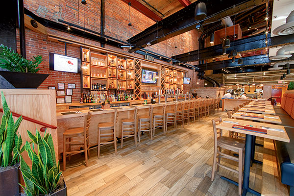
 A full-height entry, open kitchen and open steel staircase leading up to the second floor with two mezzanines give a sense of the volume of the Matchbox space. Photo courtesy of Matchbox Food GroupThe full-height entry, open kitchen and open steel staircase leading up to the second floor with two mezzanines give a sense of the volume of space. Six-person booths called “boxes” cantilever over the first floor, almost floating. Surrounded with reclaimed wood and open on one side with a wall of glass at the opposite side, they help to create intimacy in the open space. “We like to play with the volume and fill it in so it’s not one huge, overwhelming space,” notes Jennifer Jafke, director of architecture at Matchbox Food Group.
Matchbox is known for its crisp, wood-fire artisan pizzas, and on the first floor two side-by-side pizza ovens are clad in masonry and in full view of guests. Craft beer selections help make sure the first-floor bar is popular.
To distribute seating more evenly, the kitchen is split on both levels. Meanwhile, server stations on each level and a prep room and dishroom up on the second level offer convenience.
While keeping the temperature comfortable on all levels was one challenge (an HVAC system specifically for the mezzanine level was the answer), allowing for vertical circulation was one extra cost. So in addition to the primary guest stair, which was turned into a functional design element, a service elevator and staircase were added at the rear of the building for transporting trays of food and dirty dishes.
Working around these challenges to define and redefine space in a multilevel restaurant is worth it, according to Jaffke. “We had some fun with it; it gives our guests a unique dining experience no matter where they’re sitting.”
SushiSamba + Duck & Waffle, London, England
 Surrounded by full-height windows with sky-high views of the London cityscape, SushiSamba’s 21,340-square-foot crystalline environment is made up of 4 bars, 2 restaurants and a lounge. SushiSamba and its lounge are on the 38th and 39th floors, and Duck & Waffle, a new brand the company created just for this location, is on the 40th floor. Photos courtesy of kalory.co.ukFor a restaurant with a unique brand and exciting menu, a captivating interior is a must. When the top three floors of London, England’s glittering Heron Tower became available, it was just the place for opening SushiSamba’s first European restaurant in 2012.
SushiSamba operates restaurants all over the United States, including in New York, Miami and Las Vegas. Wanting to bring the brand to Europe, Samba Management selected London as the jumping-off point. And, as a 24/7 venue, it would be the first of its kind in London.
Surrounded by full-height windows with sky-high views of the cityscape, the 21,340-square-foot crystalline environment includes 4 bars, 2 restaurants and a lounge. SushiSamba and its lounge are on the 38th and 39th floors, and Duck & Waffle, a new brand the company created just for this location, is on the 40th floor. SushiSamba’s menu represents a fusion of Japanese, Peruvian and Brazilian cuisines, while Duck & Waffle features foods from those same cultures but with an English flair, such as fried duck egg served on a waffle.
“There are three venues on three different floors that we chose to connect with an amazing sculptural orange glass stairway so all floors are open to each other, and it really created an exciting, new kind of food and beverage environment for London,” says Nancy J. Ruddy, president of New York–based CetraRuddy and architect on the project.
The architectural stair not only becomes a focal point but an environment unto itself. At each floor, circular “pads” extend out where guests can sit and have a drink. “Even though there are elevators, people love the stairs because you can not only see London but you see what’s happening on each of the floors so it’s like a party,” Ruddy says.
To facilitate the fresh cuisine, every floor includes prep kitchens to celebrate the food and make guests a part of the experience. On the 38th floor, for example, a robata bar — where guests can watch sushi and grilled Brazilian dishes being made — takes center stage.
An indoor/outdoor bar starts inside the 39th floor and meanders outside, wrapping around a large artificial orange tree that’s reminiscent of a warmer climate. Along with other details, such as terrazzo tile floors inspired by the sidewalks in Rio de Janeiro and reflective surfaces such as the floor-to-ceiling glass walls, the space is designed to make you feel like you’re outdoors even though you’re in an enclosed tower.
On designing the tri-level space, Ruddy says, “Let there be visibility and connectivity between all three floors. By making every floor a distinct and important space, it maximizes the fact that you have a three-story space . . . You can make it an event and an experience.”
Roofers Union created different environments on each level. The first-floor bar (below) is rustic and intimate, with high-top tables and a painted brick feature wall. The main dining room on the second level (above) is bright and airy, with its own bar, floor-to-ceiling windows and an eclectic, industrial design aesthetic. A third level offers yet another environment — a covered rooftop deck — with its own 15-seat horseshoe-shaped bar.

