Restaurant queuing evokes different responses in people depending on their relationship to the line. If you’re an operator standing at the front of a long, snaking line, you’re happy. Business is good. If you’re a customer joining the end of a long, snaking line, however, you’re probably not happy.
You’re probably hungry and possibly in a hurry. Keeping guests happy by making that wait as short and painless as possible requires good queue design and management strategies. We turned to three prolific design consultants — Bob Welty, Andy Simpson and Tom Kowalski — for some tips on how to get it right.
The End of the Line
Consumers make a decision when they walk in the door and see a line. Is it worth it? Preventing a line from stacking up in the front of the store represents one of the biggest challenges, according to Bob Welty, executive creative director of WD Partners. “One of the things we’ve seen is, if people come by and see a big line, they will pass,” he says. “This is a cardinal sin. You have to keep them away from the front door. It’s an art to lay out the area so that you pull them deeper into the space.”
Speaking of the front door, opening it should not be one of the barriers to entry. Tugging at a heavy door does not start the queuing experience in a positive manner, particularly for elderly guests, moms with kids in tow or guests with special needs.
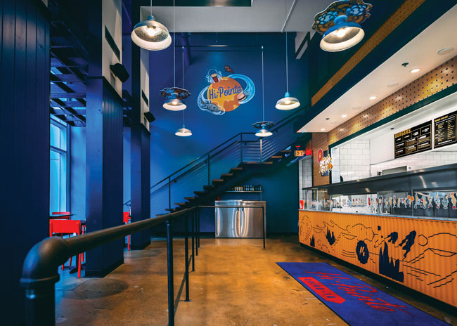
Once customers enter the operation, they should understand immediately what to do and where to go to enter the end of the queue. They should not feel confused or foolish. Welty says he likes to create an 8-foot diameter space in the entryway for guests. “We call it our orientation zone,” he explains, where guests can experience visual cues guiding them to line up to place their order.
Andy Simpson, chief creative officer at Restaurant Design and Development and a consultant with Results Thru Strategy, cautions that an operator should not need signage to let guests know where to queue up. “If you need a sign, it means there is something you’ve missed as far as visual cues, like lighting or flooring,” he says. For instance, narrow beam spots can provide a “follow the dots” scenario on the floor. He likes the lighted arrow trained on the floor that he saw at one concept.
Wait time has to do with speed of service and the expectations surrounding that speed. Tom Kowalski, senior director of restaurant experience at Interbrand Design Forum, points out the difference between QSR and fast-casual lines. “In QSR, the line is typically bunched up in front of the order counter. You’re in a crowd. With fast casual, it’s a part of the experience, and it’s not necessarily a negative thing.”
Even if it’s crowded in a QSR, a well-run production line will guarantee that the line or lines will move quickly. Having well-trained cashiers who invite the next person in line to move forward reduces confusion. In fact, well-trained staff members are essential to all elements of queue management.
In fast casual, staff prepare each order near or at the counter, which leads to a different wait expectation. Guests will trade time for quality. Kowalski gives the example of Chipotle, where “it’s a fun, hip place. You are people watching. The line moves quickly. It’s part of the experience.”
Keep Customers in Line
Restaurants can use a number of methods to guide customers through the queuing process without making them feel that they are being boxed in or corralled. The traditional way is to have a solid divider separating those in line from those who are dining. Simpson says it’s not necessary to have a solid wall. You can use planters or merchandising shelves just as effectively.
Shelving or interesting containers can facilitate merchandising, whether for sale or promotional purposes. The queuing area represents a marketing opportunity. Ingredients can provide interest and subtly send brand messages of freshly prepared menu items. Kowalski notes the use of bags of potatoes by Five Guys Burgers & Fries. “It gives guests something to interact with and pass the time,” he explains. Restaurants can promote limited-time offers or specials in the queuing area as well, as long as the materials don’t clutter up the space.
A padded, “hip-height” queue rail for people to lean against as they move through the line provides a modicum of comfort, Kowalski adds, while creating separation from diners. Simpson says a large table with stationary stools arranged so that diners have their backs to the line also works well.
With dividers or flooring, Welty notes it is imperative to use extremely durable materials. “This area gets infinitely more wear and tear,” he says. “This goes for the side walls as well as the floor and dividers.”
Line Busters Cut Wait Times
Line busting — when staff with mobile devices take orders from people waiting in the queue and transmit them to the prep line — is an efficient way to reduce wait times. Orders are ready when these guests arrive at the counter, so they can quickly pay and be on their way. Digital ordering, through kiosks or notepads, can also speed the process. Kowalski notes that McDonald’s successfully employs this tactic in Europe. It is essential, he cautions, that the technology is user-friendly.
Low-tech strategies can work as well. At Austin, Texas-based fast-casual Hopdoddy Burger Bar, for instance, guests receive a laminated menu as soon as they enter the door. Each party is also given a table number. “You already know that you have a table for the right amount of people in your party,” Kowalski says. You place your order and then sit, and they bring it to your table.
Providing menus during queuing addresses the problem of diner indecision. It helps if they can decide what they want to eat before they get to the order counter, otherwise they slow the process down. Kowalski points out that a hand menu should be “written with some personality and have a cool factor. It should be easy to read, the items can have funky names — so you’re entertained, but by the time you get to the front of the line, you know what you want.” Digital menu boards along the way will also aid decision making.
Smart queue management also requires considering functional areas that are often sources of blockage once customers have placed their orders. These typically include beverage dispensers and the condiment area.
Place the beverage dispenser well away from the line and away from the area where people may wait to pick up their orders. At some concepts, handling drink refills at the counter can exacerbate the situation, says Kowalski. Sending staff out into the dining area to provide refills represents one way to resolve this situation. Another is to create a designated area of the counter for the refill line, one that’s clearly separated from the order line.
As for condiments, one strategy that works to decrease congestion is to decentralize — forgo one large condiment island in favor of several smaller ones placed throughout the operation.
As Kowalski says, the critical factor in optimizing queue control is to keep people comfortable and entertained — not boxed in, confused or frustrated. Designing with human behavior in mind and providing visual cues and tools for people to get through the line with a minimum of waiting will keep them coming back no matter how long the line is when they arrive.


