New Design Brings the Brand Home
In Cuba, “paladares” represent a unique and much-loved form of hospitality: Essentially, they’re small, comforting restaurants that operate out of people’s homes. When partners Elie Weiss and Andy Himmel launched their first restaurant in Cleveland in 2007, they took the Paladar name as a way to represent the vibrant Latin cuisine and cultural experience on which they wanted to build their brand.
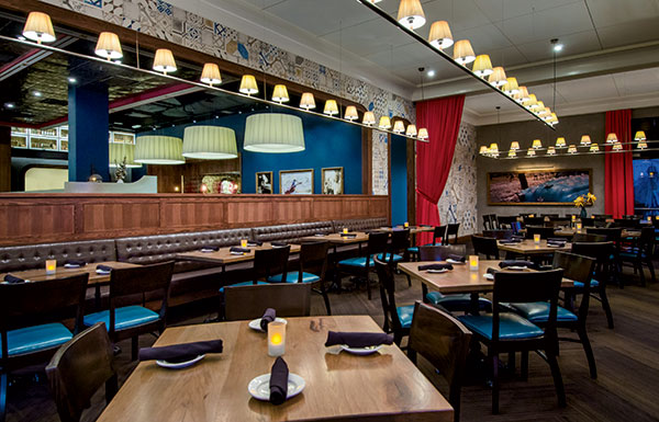 The formal dining room comes to life with bold fuchsia drapes, deep teal seating and table accents, and Spanish tiles against a neutral gray stucco backdrop.Over the next few years, they opened additional Paladar Latin Kitchen & Rum Bar units — one in Annapolis, Md., one in Hallandale, Fla., and three in the D.C. market. It wasn’t until they opened a unit in Gaithersburg, Md., last September that they felt they had really gotten the concept and the essence of the brand right.
Reaching that milestone has everything to do with the design of the Gaithersburg unit, which uses a bolder, more sophisticated prototype that Himmel says the polished-casual concept will continue to leverage as the brand grows.
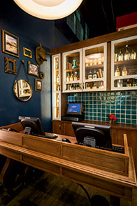 As they enter, guests are welcomed at a custom-designed host desk inspired by 14th- and 15th-century Spanish furniture.“We had evolved aggressively, and I finally feel like we’re at the point where we’re not evolving; we’re fine-tuning,” Himmel says. “For the original design of the space, we used a very talented residential designer who did a great job without any direction. Moving forward, we tried to replicate that — but the scale was out of place, and we never found our footing. The units performed well, and continue to, but the design wasn’t where we wanted it to be. I think halfway between that first unit and Gaithersburg we started sharpening our focus on how to bring the design and the brand together. And the thought really came with the idea of a more residential-style hospitality, like inviting someone into your home — which, of course, is what true paladares offer. We’d never pulled the whole thing together, but it was suddenly a clear directive for both the brand and the design. That’s when the name Paladar and the residential aspect all started coming together.”
Kristie Oldham at Cleveland-based Richardson Design led the prototype redesign and branding effort in Gaithersburg, starting with an empty shell. Located in a new lifestyle center, it was Paladar’s first freestanding unit and, at 6,700 square feet, is comparable in size to other locations. Certain elements of the Paladar brand from existing units — particularly brand colors and a vibrant bar where rum is the hero — are consistent. But room by room, the balance of the space offers an elevated, more strategically designed experience that brings the brand’s essence to life in fresh, new ways.
Making Cultural Connections
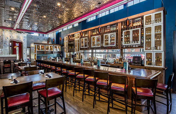 The bar area is large and open to the casual dining room on one side and a patio on the other. Painted wooden beams and pressed-tin ceiling panels help to create a more intimate atmosphere, and a variety of seating styles accommodates different customer occasions.Two key themes drove the effort: creating a space that would reflect the vibrancy of Latin cuisine and culture without being thematic, and creating a space that delivers an intimate, residential-style experience within a 6,700-square-foot footprint.
“We wanted to convey the spirt of the Latin culture and the bold flavors that you get in the food and incorporate those into the overall feel of the restaurant,” Oldham says. “We also wanted to make sure it had distinct identity, one that wouldn’t be mistaken for a Mexican restaurant. We referenced Cuba in the architecture and design elements and incorporated a lot of Spanish residential-style furniture throughout.”
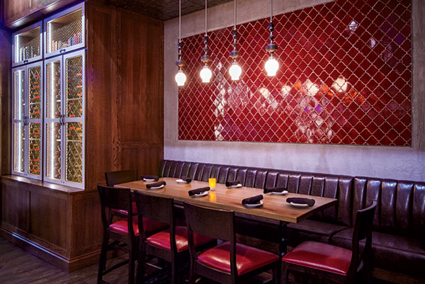 A special “paladar” nook within the bar is just right for a party of six to eight guests. It’s open but has a more intimate feel thanks to a slightly lower ceiling, a tile wall feature and pendant lights that set it off from the rest of the room.Those elements become evident as soon as guests enter the restaurant’s lobby. A custom-designed piece inspired by 14th- and 15th-century Spanish furniture serves as the host desk. A small collection of frames on the adjacent wall contributes to the residential atmosphere. “Throughout the restaurant, we were looking to incorporate those types of traditional details that you see in Latin culture, mixed with modern components,” Oldham says. “So the host station has some detailing in that regard. It sets the stage for a very friendly, welcoming experience.”
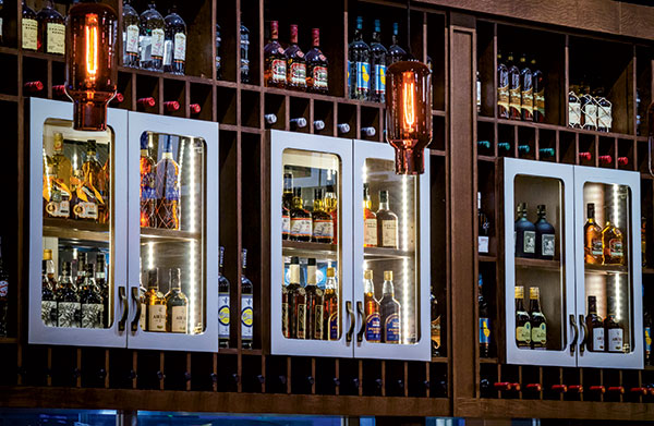 Lighted residential-style cupboards with painted white wood frames put Paladar’s extensive rum collection on display in the back bar.Inside, the restaurant extends the paladar theme through creative delineation of space into separate but visually connected rooms, each of which offers a slightly different experience. The restaurant includes a formal dining room, a large bar area that opens to an outdoor patio, a more casual dining room off the bar and a second outdoor patio for dining.
“Part of what works so well here is that we’ve created several spaces that are distinct but that all feel like they go together,” Himmel says. “It doesn’t feel like a 6,700-square-foot space. Depending on where you’re sitting, it’s actually very intimate.”
Playing with Color, Scale
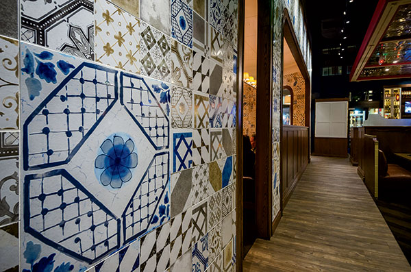 The designers played with color and scale to give the Spanish-style tile feature wall a modern feel.Guests in Paladar’s main dining room enjoy a casual but more formal experience. The room’s neutral, gray stucco backdrop comes alive with large fuchsia draperies, deep teal seating and table accents, crown molding and custom walnut millwork. The carpet’s herringbone pattern “reflects traditional wood flooring designs that you would see in Latin — and especially Cuban — homes,” says Oldham.
Lighting plays a key role in this room as well, just as it does throughout the restaurant. “We used a linen ribbon-type, pleated shade — again, something you’d typically see in a residence — and brought those details and textures into a restaurant setting,” she says. “That same style is used in different sizes — smaller in the more formal dining room and overscaled in the more casual areas. The idea was to take traditional elements and modernize them by playing with scale. We had 13-foot ceilings to work with, so the lighting style ended up being critical to helping create intimate-feeling rooms, even though they’re actually quite large.”
Another feature of the main room that works well from both an operations and a design standpoint is the area designated for private dining. Located at the back of the room, it can be partitioned off with the large drapes or, when not needed for private groups, left open for general dining.
The patterned Spanish-style tiles lining both sides of the arched wall that separates the dining areas from the bar becomes the room’s most distinctive feature. It runs the entire length of the room, — roughly 23 feet long — extending from the restaurant’s entry area into the private dining area as well.
“We wanted to bring in that traditional detail of Spanish tiles and how eclectic that can be in traditional Spanish culture. It adds to the layering of all these different patterns on top of each other. We wanted traditional touches, but to modernize it we found a tile that has those types of patterns with a variety of neutrals and pops of color,” Oldham says. “We also played with scale. Some of the tiles are 8 by 8 [inches] or 6 by 6, and the largest is 24 by 24. They create this nice quilted pattern that is showcased on both sides of the space.”
Channeling Retro Havana
Attention to melding traditional, Spanish-inspired design details with modern-yet-retro influences is evident in Paladar’s casual dining room as well. In addition to the large-format light fixtures and tile wall feature on one side, custom furnishings and millwork were keys to achieve a look and feel that suggest mid-century Cuba.
The various seating styles available include custom leather booths adjacent to a featured guacamole bar. The design of both the booths and the guac bar, at which customers can see employees preparing the restaurant’s signature fresh guacamole, reflect a 1950s and ’60s retro Havana feel.
“The tile on the base of the guacamole bar is one of the more modern components we brought in,” Oldham notes. “It’s a nod back to the type of design you’d see in the cars of that period and that are still frozen in time in Cuba. It creates a nice texture and a focal point. Above the guacamole bar we installed shelves displaying a collection of rums and books.”
Rich, brown leather booths with contrasting piping also reference retro car detailing and provide a more residential aesthetic than standard booths would, Himmel adds.
A bold, dark teal feature wall in the casual dining room serves as a backdrop for large, gold-framed artwork that celebrates Latin culture and adds vibrancy to the room. The neutral adjacent walls feature a combination of gray stucco and rich walnut veneer.
Of the artwork, Himmel says the company has curated 15 to 20 different images that can be rotated in to additional units as Paladar continues to expand. “Some might come into play in some units, and some might not. It depends on the shape and vibe of the space,” he says, noting that, while the new prototype provides the core aesthetic for the brand, each unit will have its own individual look. “We want people to walk in and know they’re in a Paladar restaurant, but not because it’s an exact replicate, rather because of the energy, the feel and the level of detail in the overall design.”
Being a Latin kitchen and rum bar, the latter space naturally generates much of the concept’s energy. In Gaithersburg, the large bar area is the first main room the guests walk into after passing the entry vestibule and host station. Open to the casual dining room on one side, its opposite side features a large glass garage door that opens up in mild weather to a patio area outside.
A soffit hanging over the area features painted wooden beams and pressed-tin panels that help to create a more intimate atmosphere in the high-ceilinged room and a variety of seating styles suits different customer occasions. The long, walnut-topped bar seats up to 16, while the adjacent area offers a combination of bar-height tables, large communal tables and tufted leather banquettes.
“Within the bar there’s another little space or nook that we call the bar paladar,” Oldham notes. “It’s just right for a smaller party of six to eight. It’s completely open but has a more intimate feel thanks to a slightly lower ceiling, a red tile wall feature that sets it off and different pendant lights above it.”
And then there’s the rum. Paladar touts more than 50 varieties and uses its large back bar — as well as smaller shelving nooks throughout the restaurant — to show off its collection. Constructed around and above low windows overlooking the street, the back bar showcases rum bottles in backlit residential-style cupboards with white painted wood frames.
In addition to the overall look and feel of the new Paladar prototype, Himmel says the Gaithersburg location also hits the mark operationally in terms of layout. “On the functional side, we have finally developed true thresholds for what we consider acceptable for items such as unanchored tables and how to make sure every table in the restaurant is a good table. In the first restaurant we built, probably 50 percent of the tables weren’t good tables, and people were always asking to move,” he says. “Here, it’s very rare that anyone requests a different table because all of the spaces are designed for the right purposes — from the private dining room to the bar. Kristie brought a level of sophistication to the process, and the end result is something we feel we can grow with.”
Project Team
- OWNERS: Andy Himmel, Elie Weiss, managing partners
- DESIGN: Richardson Design (Scott Richardson, owner; Kristie Oldham, design and trend director; Kayla Mehalic, designer; Kira Makshova, designer)
- ARCHITECT: RSA Architects (Richard Siegfried, founder; Tony Majc, partner)
- KITCHEN SUPPLIER: Wasserstrom
- FURNITURE: Hardwood Solutions Commercial Wood Products
- SIGNAGE: Federal Health
Snapshot
- SEGMENT: Full-service, polished casual
- PROJECT TYPE: New construction
- REAL ESTATE: Freestanding, lifestyle center
- UNIT SIZE: 6,700 square feet
- KEY COMPONENTS: Formal dining room, casual dining room, bar, two outdoor patios
- DESIGN HIGHLIGHTS: Bold colors, Latin artwork, residential-style lighting, Spanish tile walls, guacamole bar, rum displays, Spanish furniture–inspired custom furnishings and millwork
- BUILD OUT: Two months
Photos courtesy of John Spaulding Photography

