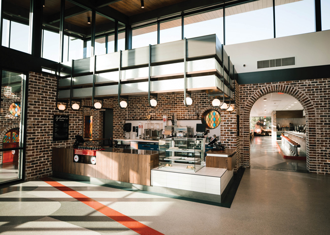
 Named for a long-time Dwarf House pie maker, Zelma’s Pie Shop in the lobby sells fresh-baked pie and beverages. Images courtesy of Chick-fil-AWhen Chick-fil-A’s design team set out to create a new brand home for the iconic chicken sandwich chain, it did so with the objective of developing a multifaceted, interactive experience. It would, first and foremost, be a working restaurant, but it would also be a place for families and the community to gather. And it would be an inspiring destination designed to tell the company’s story and honor its heritage. Built on the site of Chick-Fil-A founder S. Truett Cathy’s first restaurant, the 572-square-foot Dwarf Grill, later renamed The Dwarf House, the new facility does all of that and more.
Opened in mid-February 2022 in the Atlanta suburb of Hapeville, Ga., the new Dwarf House is one of a handful of operations under the STC Brands umbrella. A separate entity from Chick-fil-A proper, STC’s portfolio currently includes six additional Dwarf House locations but, ultimately, this new brand home will be the only one to bear that name: All others will be rebuilt under the Truett’s Chick-fil-A banner. As the place where Cathy got his start in 1946, the Dwarf House legacy endures here. And celebrating that legacy was central to creating a place that customers, Truett family members and the entire family of Chick-fil-A operators, would take pride in, says David Pruiksma, director of operations at STC Brands.
Bringing it all to fruition, however, was a lengthy process. Nearly a decade ago, prior to Truett Cathy’s death in 2014, he and Pruiksma began discussing ideas for reimagining the Hapeville property. Over the years, it had undergone a number of changes. In 1957, the original building was renovated and expanded. In 1967, the year Cathy launched Chick-fil-A, a second building was built 3 feet behind the original, which operated continuously during the transition. That 1967 facility, in turn, received a few add-ons over the years, including a Chick-fil-A with a drive-thru on one side. The location had become maxed out and inefficient. “We started looking at different options for what we could do here but we were limited,” Pruiksma notes. “We needed more land, and it took several years to be able to acquire that.”
By 2019, three additional pieces of property across an adjacent short side road were purchased, as was the side road itself, from the city, giving the development team the space to think about what the brand home could be. Ground on the project finally broke in May 2021.
Today, the combined 3-acre site includes a mid-century-inspired 10,000-square foot-building with full-service Dwarf House diner on one side and a Chick-fil-A with drive-thru and mobile-order pickup entrance on the other. The Chick-fil-A side also includes a new community room, dubbed the 1946 Room, which can be reserved for group meetings or events. A 4,600-square-foot central kitchen serves both sides and was designed with room to accommodate tour groups, allowing for a peek behind the scenes and a slice of pie.
Separating the restaurant areas is an entry lobby with Zelma’s Pie Shop, named for a long-time Dwarf House pie maker, and a small retail area. The site’s exterior includes a play area with waffle-fry climbing structures, all-weather concrete seating, a lawn with a stage for community events, and the 1946 Pavilion, which was built to scale from the original building’s blueprints. A canopied double drive-thru accommodates nearly 50 cars and there’s parking, including some charging stations, for 6 buses and more than 120 cars.
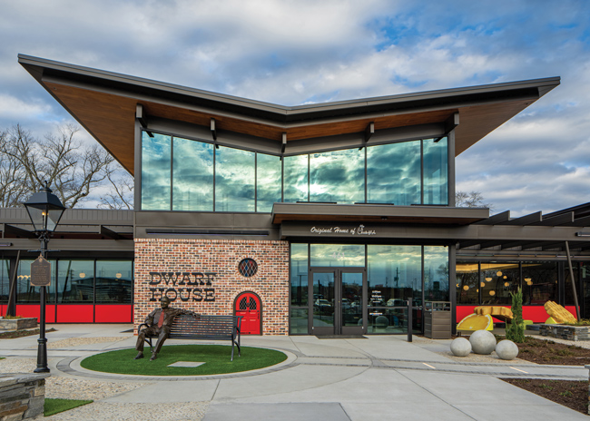 Storytelling begins at the entrance to the modern, mid-century-inspired building, where a statue of founder S. Truett Cathy still sits on the bench, as it has for decades, with the original red dwarf door in the background.
Community First
Bidding out with the old, however, wasn’t taken lightly. Extraordinary measures were taken to ensure that business wouldn’t stop completely during demolition and rebuilding. “Once we had the land and were ready to proceed, we presented our ideas to the Cathy family,” says Jenn Allstun, senior principal design lead at Chick-fil-A, who was tapped to lead the project’s design. “Among their top concerns were how long it would take and how we’d continue serving the community during construction. The longest the operation had ever been closed was 19 days during a previous renovation. The diner had been a 24/7 operation, and there were a lot of locals who ate there multiple times a day. It really was like home to them.”
To address those concerns and create a solution that would later alleviate pressure on the main facility’s kitchen, the team looked off-site. “This ended up being two projects in one because we decided to repurpose a nearby building that had been Chick-fil-A’s corporate office until 1981,” Allstun says. “We converted the front of that building into offices for the Hapeville leadership team and the back into a commissary kitchen. Takeout and delivery orders were filled there during construction and the commissary continues to support the Hapeville operation and handle catering orders.”
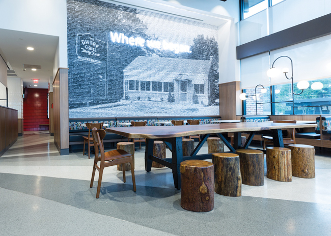 In the new community room, a mosaic mural depicting an old photo of the original Dwarf Grill was created from individual photos of more than 2,500 restaurants across the country opened during the company’s first 75 years.The fact that so many locals considered The Dwarf House a second home was underscored via multiple focus groups, customer intercepts and interviews done during concept development. “We heard over and over that this place feels like home,” Pruiksma says. “When we pressed a little harder on what that meant, we heard things like, ‘Everyone knows everyone. It’s comfortable. It’s familiar.’ They liked the layout, the center aisle that Truett used to walk up and down greeting people, their favorite counter stool and booth. They liked the stained glass, lamps, original brick, and quirky elements like the dwarf mural. And they loved the statue of Truett on the bench out front, with the red dwarf door in the background. These were things that were sacred to them. That research confirmed the approach that we were working on, which was to recreate and reuse much of what was already here and to keep the layout of diner on the left and Chick-fil-A on the right the same.”
As the old structure came down, the team reclaimed and refurbished those sacred items and spent hundreds of hours researching archival materials for additional design inspiration. There was no shortage. Rather, the challenge became how best to honor and incorporate elements of the past without going too far. Truett Cathy, in fact, had insisted on that.
“When I started discussing the project with him years ago, he said time and again, ‘Museums don’t make money. Don’t make this a museum.’ As we finally got into development, I kept hearing those words in my ear,” Pruiksma says. “So we grappled with how do we tell the story well, as you would in a museum, but do it in the context of a highly functioning restaurant?”
As for any highly functioning restaurant, tackling that objective started in the kitchen. With prep support now provided by the commissary, Allstun could dedicate additional space to better accommodate tours. “We spent a lot of time talking to and watching the kitchen staff work,” she says. “I also joined kitchen tours and knew that we should position certain stations, like pie and biscuit making, up front for best visibility. We did that, and we also added an 8-foot-wide aisle at the forefront of the kitchen, so groups can comfortably see what’s going on without getting in the way. We included signage to point out what happens in the different areas, and some storytelling, such as photos of pie makers through the years.”
The design team also worked to ensure that the company’s stated commitment to building a team-member-friendly kitchen wasn’t just cliche. Kevin Moss, executive general manager of the Hapeville operation, along with leaders from other Chick-fil-A restaurants, provided input on key features that were incorporated. Those include plenty of natural light and positioning large freezers close to where employees actually need them, near the fryers. “Kevin stressed the fact that we should design for the employees, not the delivery drivers,” Pruiksma says. “We had created an entire foam core replica of the kitchen — actually of the entire restaurant — and when we asked how we might do that, he picked up the freezer, which is in the back of every one of our kitchens, and put it right near the cook line up front. Jenn made that work, so now employees aren’t running back to a freezer 20 to 30 times a day to get product.”
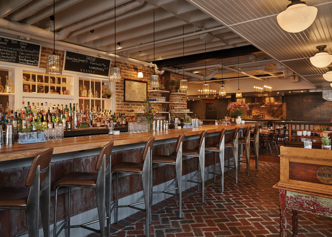
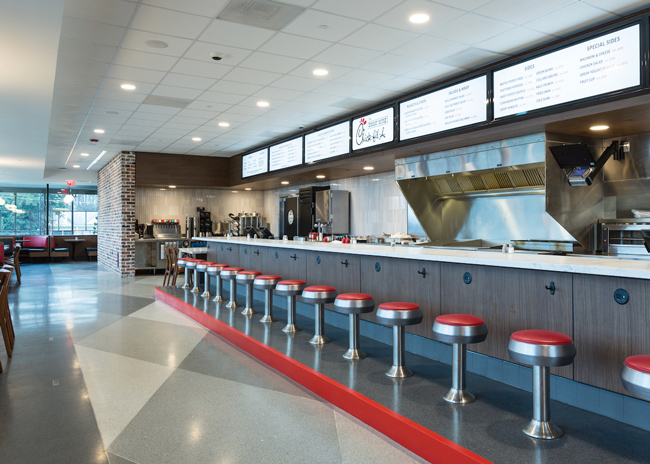 The diner side of the building re-creates The Dwarf House experience in layout and furnishings, including the same 14 counter stools from the 1967 restaurant. Here, both the traditional diner and Chick-fil-A menus are available.
The full-scale mock-up was critical to getting the overall design right and ensuring operational efficiency, Allstun agrees. “We built the entire building to scale out of foam core, including all of the furniture and equipment,” she says. “We brought the operations team in to actually run tickets in the kitchen and get their input on what should be tweaked before we finalized the kitchen layout. Then we worked on rest of the restaurant. If the kitchen didn’t work well, we knew nothing else would either.”
Creative, Interactive Storytelling
With the kitchen as its engine, the rest of the restaurant is where the bulk of the storytelling magic happens. And it does so in myriad ways that go well beyond posting pictures and plaques on walls.
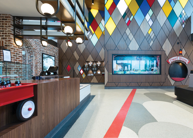 A spacious lobby that separates the diner and Chick-fil-A sides of the building features Zelma’s pie shop, a retail area and the iconic dwarf mural, a gift to Truett Cathy in honor of his original restaurant.Cobble pavers in the parking lot mimic the sound of gravel at the original restaurant, which alerted Cathy to arriving customers. Just before the entrance, the aforementioned Truett bench and original red dwarf door in the background provide a familiar welcome and a photo opportunity. Inside, original brick, lamps and stained glass set the stage and the old dwarf mural is a lobby centerpiece. Previously positioned in The Dwarf House dining room, the mural was given to Cathy by an artist years ago, according to Allstun, and features dwarfs that move continuously within the scene.
The diner side of the building faithfully recreates The Dwarf House experience and menu. “It was important to keep a lot of the heritage and nostalgia, especially on the diner side,” notes Allstun, who collaborated with Atlanta-based design consultancy Sense Makery on storytelling strategies. “It’s bigger and brighter, but when people walk in they see the same layout and even the same 14 counter stools from the ’67 building. We just refurbished them and added two additional ADA-compliant counter seats. The booth layout is the same, as well, but we added some four-top tables that can be pushed together for larger groups.”
Storytelling continues in the new community room on the Chick-fil-A side, where the designers created a mosaic mural depicting an old photo of the original Dwarf Grill beneath a neon sign that reads, “Where it all began.” The mural was created from individual photos of more than 2,500 restaurants across the country opened during the company’s first 75 years. A little red dwarf door in that room is part of an interactive scavenger hunt element enjoyed by kids and adults, alike. Behind the door? A whimsical bronze dwarf statue, one of several placed in the building, inspired by a cartoon character that Allstun discovered in old company newsletters during her research.
Mobile orders are picked up in a dedicated area where a large vintage photo shows the 1967 building’s carry-out area and signage. Cathy added carryout at The Dwarf House to be able to more quickly cater to passengers of the Seaboard Air Line Railroad, which had a stop right across the street, according to Pruiksma. Even the flooring in that area, dubbed the Seaboard room, tells a story. The patterned terrazzo depicts railway lines, with a red dot for the Hapeville stop.
Discovering the 1946 building’s blueprints lent design inspiration and authenticity to what became the 1946 Pavilion outside. There, guests sit in a re-creation of the original Dwarf Grill, which had 10 counter stools and four booths. “That element is a big storyteller for us,” Allstun notes. “A lot of people assumed the 1967 building was the original, but in the Pavilion they discover the real original. It’s set on the exact same spot and was built to scale using the original blueprints. The steel structure framing it represents the old building’s framing structure and windows. When you enter, it’s like you’re walking through the threshold of that ’46 building. It’s a really cool way to pay homage. We have a lot of operators from around the country come to our offices in Atlanta, and they bring their teams here to show them the humble beginnings, where it all started. It’s inspiring for them and a point of pride for the community. It brings everything back to the point that this really is the brand’s home.”
Snapshot
- Location: Hapeville, Ga.
- Concept: Chick-fil-A/Dwarf House diner brand home
- Project type: New build
- Opened: February 17, 2022
- Hours: 6 a.m. – 10 p.m.
- Size: 10,000 square feet, 181 seats inside
- Build out: 9 months
-
Design highlights: Mid-century modern architecture; refurbished original materials and furnishings; storytelling graphics; split layout; mosaic mural made from more than 2,500 photos of individual restaurants; waffle-fry play structures; separate mobile-order pick-up area; terrazzo flooring; outdoor pavilion with carved brick mural
Project Team
- STC Brands: John White IV, President; David Pruiksma, Director of Operations
- Chick-fil-A: Jenn Allstun, Senior Principal Design Lead; Joseph Latimer, Director, Strategic Reinvestment; Christina Alexander, Senior Real Estate Representative
- Environmental Design/Storytelling/Graphics: Ruth Fowler, Sense Makery
- Architecture and Design Consultants: Selser Schaefer Architects
- Project Manager: Tony Hayes, JLL
- General Contractor: Chris Daniel, W.H. Bass, Inc.
- Site Supervisor: Rick Lumpkin, W.H. Bass, Inc.

