Based in San Diego, Better Buzz Coffee is an emerging chain that eschews the warm wood tones and aesthetic that the largest players in the coffee space embrace. Two recent locations, one in Escondido, Calif., and one in San Diego’s Miramar area, showcase the brand’s light and bright vibe that’s designed to fully embrace social media aesthetics.
According to Melissa Young, Principal of MY Studio ID, which handled the interior design for both spaces, Better Buzz does not make identical locations. Instead elements and themes run throughout its locations in different ways.
“Although both locations are vibrant in different ways, the design throughout reinforces the brand’s personality with bold black and white patterns, hexagon elements, brass accents, elevated finishes and attention to detail,” she says.
In the Escondido restaurant, the design was complicated by the space’s prior tenant, Young says. “The location had been previously occupied by a well-known coffee brand, which used a dark green color and heavy wood accents in their designs. We faced the challenge of changing the guest perception of the previous brand’s cafe by engaging them with a completely new environment.”
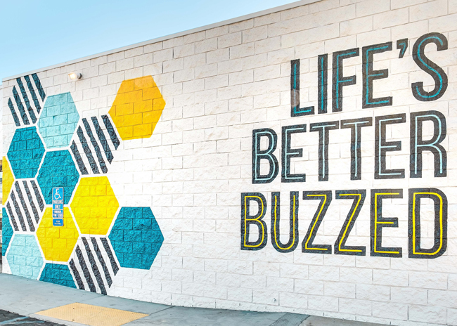
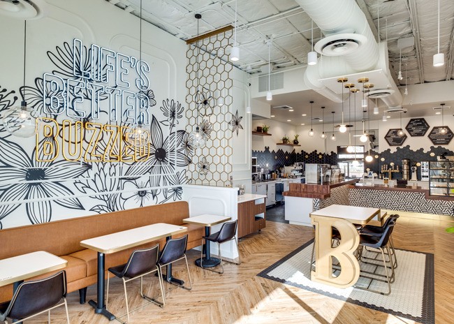
This new space is bright and cheery, with buttery leather upholstery and light wood-style tile flooring paired with the restaurant’s prominent use of black and white. The location’s feature wall also includes the chain’s tagline “Life’s Better Buzzed,” presented in an Instagram-friendly neon-style light against a flower mural.
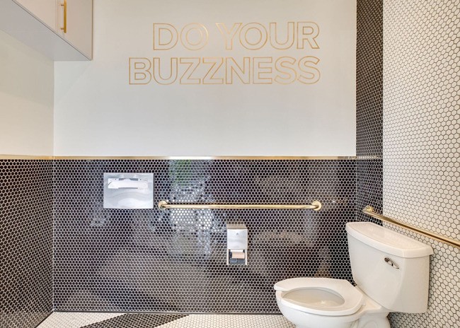
The Better Buzz brand aesthetic even extends to the bathroom, notes Young. Here guests will find the brand’s hex tiles — evoking a honeycomb — and its signature brass color on the cap for the wall tiling and handrails. The bathroom even boasts its own social media moment, a “cheeky” play on words, on the wall, Young adds.
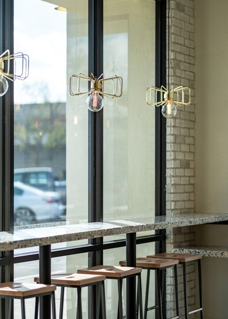
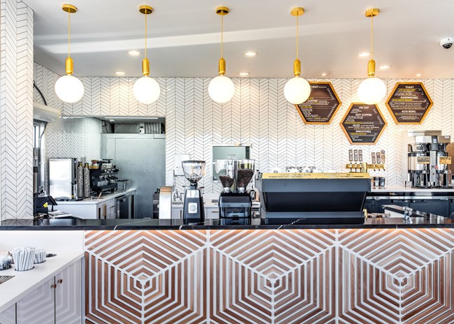
Better Buzz’s bee theme is a unifying element across all stores. In Escondido it can be seen in the hex patterns, used not only in the bathroom but in dividers between spaces and even in LED lighting. Pendants hung above a custom terrazzo bar feature brass-colored wing-like extensions, giving the fixture a bee-in-flight feel.
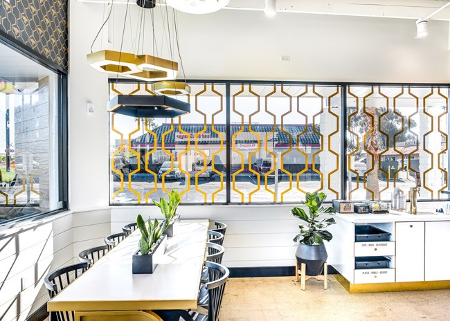
The hive theme in Miramar comes across in additional ways.
“By providing a bold yet relaxed atmosphere for guests, this space immediately invites customers to experience the buzzing ambiance with beehive inspired motifs placed strategically throughout the space in places such as gold window decals that parallel the drive through,” say Young.
At the ordering counter, meanwhile, the hive comes through on the counter face with a custom white oak installation along with hexagonal menu boards on the back wall.
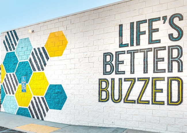
At the Miramar location, MY Studio ID also paid special attention to the restaurant’s exterior, which features another Instagrammable element, a large mural with the “Life’s Better Buzzed” tagline and hex pattern.
The mural is meant for more than social media, though. It also attracts the attention of drivers, Young says.
Miramar has “a popular drive-thru due to its location next to offices. The dynamic exterior branded hexagon mural helps to draw in busy commuters looking for their daily coffee fix.”


