Mandated dining room closures in the wake of the COVID-19 pandemic left many restaurant operators grappling with how to best utilize their space for an unexpected shift to off-premises dining. It also gave some an unusual opportunity: the chance to rethink how to layout the restaurant to meet the demands of the moment and the future.
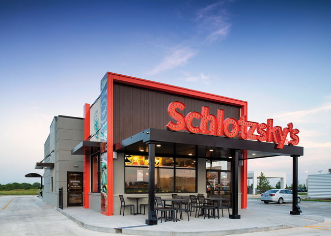 This outdoor seating area adjacent to the front door is positioned well for optimal efficiency. Just a few steps outside, it is visible to staff working inside through large windows. Image courtesy of Focus BrandsOf course, safety and health concerns for clientele and staff also became a top priority. “Safety will continue to be on people’s minds in the near future,” says Mike Frey, vice president of construction, Freddy’s Frozen Custard and Steakburgers, a QSR chain.
Of course, the popularity of off-premises dining shows no signs of abating. The uptick in to-go business has caused many restaurants to rethink space allocation in the front of the house. Also, the drive to cut footprints to improve profitability that was underway prepandemic only gained momentum in the last two years, so using every square foot effectively has never been more critical to business success.
Business Model Influences on Space Planning
Several brand attributes must be considered when devising a space plan, including service model, ambience, site specifications, and takeout and delivery fulfillment procedures.
With these factors in mind, space planning starts with a big-picture look at how customers and staff will move about the establishment. A diagram depicting interior features and functions helps planners visualize pedestrian flow, which differs for different service concepts. For example, a prototype for Moe’s Southwest Grill, where customers place orders in a participatory fashion along a makeline, must provide ample space for customers and staff to move along the makeline. Also, designers must allot significant open space on the customer side or include barriers between the order queue and the seating area.
In a full-service establishment, customers place orders from their table and remain seated while waiting for their food. Although in-store diners may queue up at the reception station while they wait for their table assignment, they do not typically congregate in other areas. The result is a more dispersed flow of people than within a typical limited-service restaurant.
In the full-service world, however, bars can be focal areas for gathering, making them points of concern for layout, says Cori Kuechenmeister, design director for design firm Shea. A screen or half wall can effectively separate the bar from seating areas, preventing bar patrons from spilling into the dining area. Designers tend to favor locating bars in direct eyeshot of the front door so that patrons are easily drawn to it. A generous corridor from the entryway to the bar fosters a welcoming path for bar patrons. Booths and banquettes make effective border options for this pathway, preventing people from moving tables or chairs that could partially block the route to the bar.
Indeed, space planning at every establishment should closely examine all intersections of pedestrian flow. “We look to reduce conflicts and potential pinch points,” Frey emphasizes.
The impact of COVID-19 concerns has increased the potential for flow issues. With more customers opting for takeout, they may crowd the reception area as delivery drivers and in-house diners waiting for a table. To avoid that outcome, designers are creating separate takeout, delivery, and in-house pick-up areas. Some are going as far as specifying doors and stations exclusively for delivery drivers.
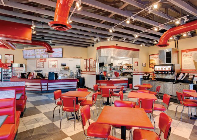 This Freddy’s location provides a generous space in front of the counter so customers don’t have to crowd close together. Image courtesy of Freddy’s Frozen Custard & Steakburgers
Delineating Space with Style
Aesthetically appealing visual cues to distinguish various functional areas are design imperatives, especially in a QSR format. Do this well and you reduce opportunities for crowding. Installing big, bold signs is effective, but this strategy can make a space look like an institutional cafeteria, and that is not the vibe most restaurateurs want.
“Make sure you are always thinking about the customer experience,” says Kuechenmeister, who warns against an over-reliance on signs. “People have been over-signed through the pandemic,” she observes. Signs and floor stickers promoting social distancing and encouraging mask use became ubiquitous in public indoor spaces. Signs may just raise the visual clutter, reducing their impact.
Robeks, a juice bar and smoothie chain, has a logical service line model that has held up since its founding in the mid-1990s. “Some of our stores still have signs saying, ‘Order here’ and ‘Pick up here,’ but we have found that it is so obvious to customers that they are really not needed,” says Mitch Baker, vice president of marketing for Robeks.
Instead, the brightly colored menu board hovering behind the order station is a beacon that lets customers know where to go first. Robeks, like many establishments with makelines, has a left-to-right flow, emulating how those in most of the developed world read. It’s a natural, intuitive arrangement.
Some brands use other alignments with a right to left flow, but in these spaces the position of the POS station makes the order placement nexus obvious. To direct the flow of the order queue, some QSRs install railings that provide for a winding, back-and-forth customer line like airport screening queues. This prevents a free-for-all atmosphere like you might see at a crowded bar, but it also conveys a regimented feeling.
Other QSRs have multiple order points at the counter, encouraging customers to form multiple lines — an arrangement that spreads people out and discourages them from getting in each other’s way. Given the current labor shortage, however, this arrangement challenges managers to ensure that every POS/order line is staffed at peak times.
Subtle Cues
Freddy’s straddles the QSR and fast-casual space. Its service model — no table service but extensive indoor seating — means cues to direct flow at the service counter must be provided. “The difficulty is keeping those fairly subtle,” Frey says.
Freddy’s distinguishes space at some stores with black dividers perpendicular to the back wall. The dividers separate the pickup area from the POS counter and the condiment station. These simple dividers aid a logical, linear flow and are pleasing to the eye. Other methods to distinguish spaces include installing different flooring materials and patterning, millwork elements, and affixing large, colorful graphics to walls, Frey says.
Self-service beverage stations can create bothersome pinch points. Most Freddy’s locations ease congestion by installing two soft drink machines separated by an area holding cups, lids, and straws. “With a drink machine on each end of the beverage station, customers flow from the center and then out to their tables,” Frey says. “This eliminates stacking in line.”
Providing customers with a way to track their order’s progress can also aid traffic flow and promote social distancing. During the height of the pandemic, Robek’s installed a 27-inch to 32-inch monitor behind the counter, to the side of the pickup area. The screen displays two columns. The first is a record of the order showing the order number and the first letter of the customer’s last name. That information appears in the second column when the order has been completed. Staff also call out the customer’s name when the order is ready for pick up.
These approaches provide guidance to customers as they track the progress of their order while allowing them to stand 10 feet or more from the counter. Thus, the likelihood of people congregating close together at the counter is reduced.
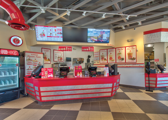 The menu board above the counter is a beacon for order placement at this Freddy’s location. To the right, a simple “Pick Up” decal at the same height as the menu board tells customers where to get their frozen treats. Image courtesy of Freddy’s Frozen Custard & Steakburgers
Flexible Seating
The shifting local rules and social norms over the past two years forced operators to rearrange dining rooms repeatedly. Anticipating uncertainty in the winter of 2021, many operators have replaced four-top tables with two-top versions that are easier to move and reconfigure. Freddy’s also ditched high-top tables that were unwieldy for staff to move.
In addition to social distancing, another driver for smaller, easier-to-move table adoption is about economics. “There is continuing pressure to be smaller and cheaper,” says Kevin Kilgore, vice president of design and construction for Focus Brands.
To place more seats in a smaller footprint, some Focus Brands’ properties have removed booth and banquette seating in favor of two-tops. This makes it easier to rearrange tables for differently sized parties. For this reason, the prepandemic trend of adding large community tables may be consigned to the past.
Not all establishments are on board with this strategy, though. Some recognize that many customers prefer booth seating and want to retain it for a better customer experience.
Efficient Outdoor Layout
To plan an outdoor layout, start by considering an aerial view of the site. Planners must assess how much space is available for drive-thru and whether a double-drive-thru is feasible or necessary. Is there space for curbside pickup? How much space is available for outdoor seating, and where could it be located?
These questions are critical these days for Kilgore of Focus Brands, the company behind Moe’s Southwest Grill, McAlister’s Deli, and others has many freestanding buildings or end-cap units that accommodate drive-thrus but not all locations have room for one. When that’s the case, Focus Brands negotiates with the property owner to dedicate parking spaces for curbside pickup. “Generally, it is a relatively easy process, and we try to have this need documented in our leases, so no questions arise later,” Kilgore says. “We usually keep the request to two or three spaces.” That’s a reasonable ask and is typically enough capacity to accommodate demand. Only rarely does a property owner determine that the number of available parking spaces is too limited for the request, or that the configuration of the lot is not suitable, Kilgore says.
Dedicated pickup parking should be visible to staff from inside, if possible, to visually confirm arrival of to-go customers. Minimal design and construction are required to convert regular parking spots to dedicated pickup, but wayfinding for customers is critical. “At a minimum, we put up parking stall signage similar to handicap signs,” Kilgore says. “Some of our brands install additional signage in the form of pavement striping and larger, highly visible stall signs.” The effort is well worth it for establishments that cannot construct a drive-thru lane.
While restrictions related to the pandemic have largely eased, shift to off-premises dining and the addition of takeout, delivery and outdoor dining to every conceivable restaurant type is unlikely to return to prepandemic levels. Designing with multiple purposes and flexibility is key.

