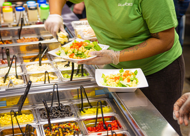
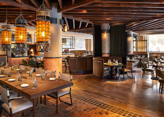
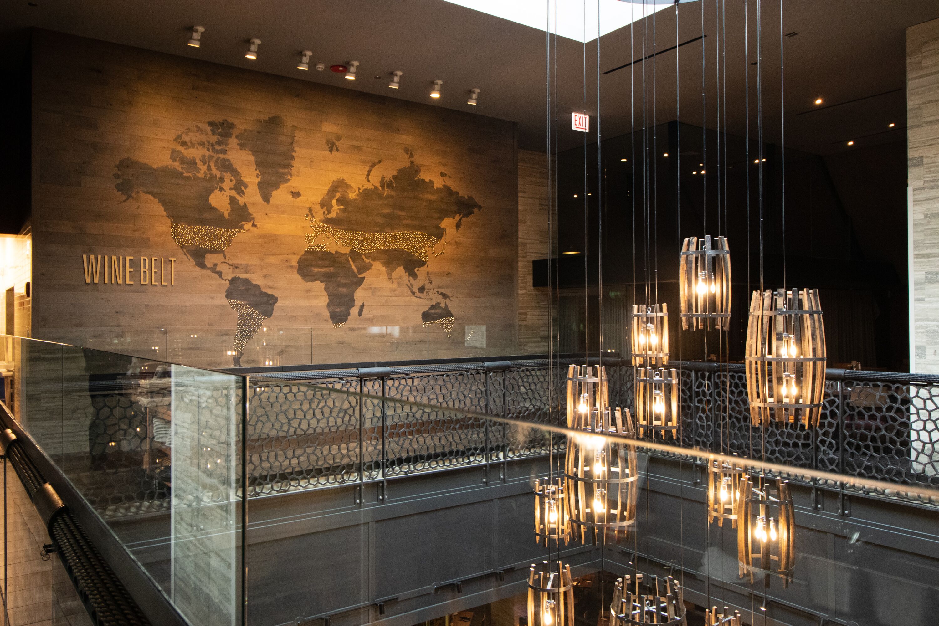
Popularized by chains such as Subway and Chipotle, makelines draw in customers with bountiful displays of menu ingredients. Diners co-create their meals along the makeline by choosing items step-by-step as servers put together sandwiches, tacos, grain bowls and other customizable dishes. The makeline premise fosters interaction between guests and staff, offers high customization, and uses fresh, visually attractive fruits, vegetables and other fare to convey a healthy food vibe.
You’ll find makelines at fast-casual establishments serving many types of cuisine. Restaurants serving Mexican dishes, panini, ice cream concoctions, Asian fare, and various fusions of different styles have adopted them.
“Watching your meal being made for you is where the trend is going,” says Eric Lavinder, vice president of development, Saladworks. The fast-growing purveyor of salads, soups, and grain bowls offers 65 different ingredient selections in its generously sized makelines. That’s surely the high end of the choice spectrum. Whether your brand offers that many ingredients or opts for a more modest number, good makeline design is critical to making the eatery visually attractive to guests and to providing efficient service.
Makelines address some important market trends. “The market is demanding craftsmanship and quality,” says Marty McCauley, design director for architecture firm Nelson Worldwide. Makelines provide stages for displaying many offerings of fresh, colorful ingredients and skilled assembly of the meal.
“People like having many choices,” says David Rader, senior project manager, Dyer Brown Architects. Customers can visually assess the quality of each ingredient and contemplate the flavors being added to the meal as they follow their server down the makeline. Both mom and pop shops and major national brands have adopted the makeline concept, Rader notes.
When planning a makeline design, McCauley takes a brand-driven approach that emphasizes the essence of what the restaurant offers. “It’s about how to bring the point of differentiation to the forefront,” he says. The makeline should highlight the establishment’s signature items by displaying them prominently near the front of the line.
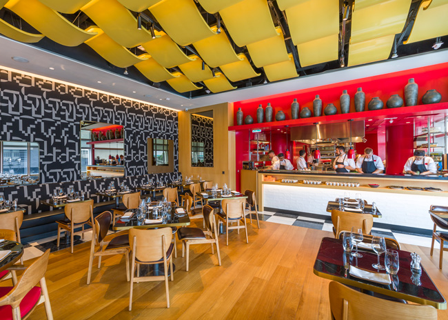 CetraRuddy designed Duck and Waffle's makeline with an upscale aesthetic. Image by Michael Perini courtesy of CetraRuddy Architecture
Sizing it up
Correct sizing and placement of makelines is essential. Optimal length is related to anticipated customer volume at peak times, and the number of servers needed to accommodate that volume. Makelines at Saladworks outlets stretch 18 feet to 20 feet long, they hold three 5-foot-long salad-making stations. The restaurant also offers soups and panini sandwiches. As many as seven servers attend to customers simultaneously on the makeline.
In a cold weather city like Boston, designers often place the makeline toward the back of the space, Rader points out. This allows for a longer indoor queue that customers ducking in from extreme weather appreciate. You’ll want the front door to open to a sweeping view of the makeline — which serves as a marketing installation in addition to a meal preparation area.
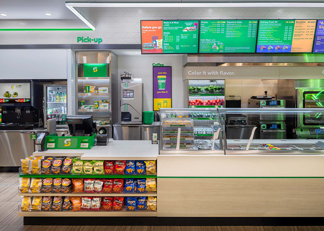 Subway uses a makeline wrap-around space (at center) to display chips products. Image courtesy of Nelson Worldwide
Keeping Cool and Warm
Keeping food at safe temperatures — and separating hot and cold food items — is imperative. Such equipment is typically installed below the counter, underneath food storage wells. There are many options for warming and cooling equipment available from a wide variety of vendors.
Heating elements are electric-powered devices similar to hot plates or steam tables. Cooling units, essentially small refrigerators that accommodate recessed food wells, can provide extra cooling storage beneath the counter. Some have glass walls on the customer side so that refrigerated items can be seen by patrons. To make the most efficient use of warming and cooling equipment, group like items.
Large chains tend to have contracts for warming and cooling equipment with specific vendors, McCauley says. Designers typically work with these off-the-shelf items when devising the makelines, but for some projects they customize configurations.
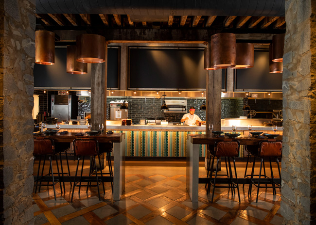 At Sugarcane Raw Bar in Brooklyn, the makeline merges with an open kitchen. Image by Evan Sung courtesy of CetraRuddy Architecture
Customizable Equipment
“Sometimes we get engineering to modify the heating or cooling equipment so that we can get better operational flow or aesthetics,” says Aaron Ruef, director and project manager with Nelson Worldwide. That might mean altering the size of the equipment, which is a challenging task, he says. The performance of the equipment — its ability to maintain temperatures within food safety standards — must be ensured when making such alterations.
Counter space on the makeline is typically a narrow strip at the rear, proximate to where servers stand. Servers perch each meal on this space as they pick items from food wells to assemble the meal. These elements are typically stainless steel or some solid stone or faux stone material. Stainless steel is very durable and cleanable, but it has an institutional kitchen look.
Stone materials like quartz connote a more upscale appearance. This material is a good choice for the POS counter area, Lavinder says. It’s an easier material to cut and drill through when you need to upgrade registers or add touchless POS devices. “You can’t customize and modify stainless,” he points out. Most high-traffic establishments place at least two POS devices on the counter so that at least two orders can be rung up at once.
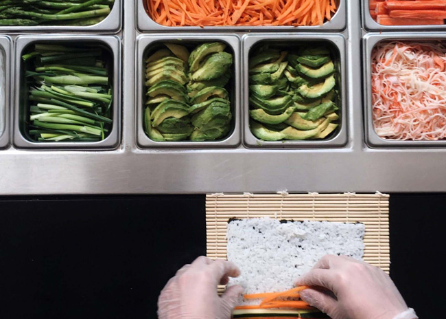 Designers used natural wood to dress up the front of this makeline at Asian fusion restaurant Fusian. Images courtesy of Fusion
Plastic or Glass?
All makelines have either plastic or glass food shields or sneeze guards. Plastic can be shaped in the factory fairly easily into curved forms. Over time though, plastic grows cloudy, and scratches become visible. Glass is not easily shaped, but it doesn’t become cloudy and is more scratch-resistant.
The structure of these products has changed in recent years. “Sneeze guards are becoming more minimal,” says Kana Ahn, associate, senior interior designer, with architecture firm Cetra Ruddy. “In the past they came with frames that tended to collect dust and bits of food.” Now, most come without frames, and minimize exposed screws that could collect dirt and bits of food.
Amid the COVID-19 pandemic, many establishments have added clear plastic dividers above the food shield and around the POS area to reduce the open air space between staff and customers. This is intended to reduce the opportunity for virus transmission, protecting both customers and staff. Given the resilience of the coronavirus, it may be a year or more before these protections are retired.
Rotational Service Benefits
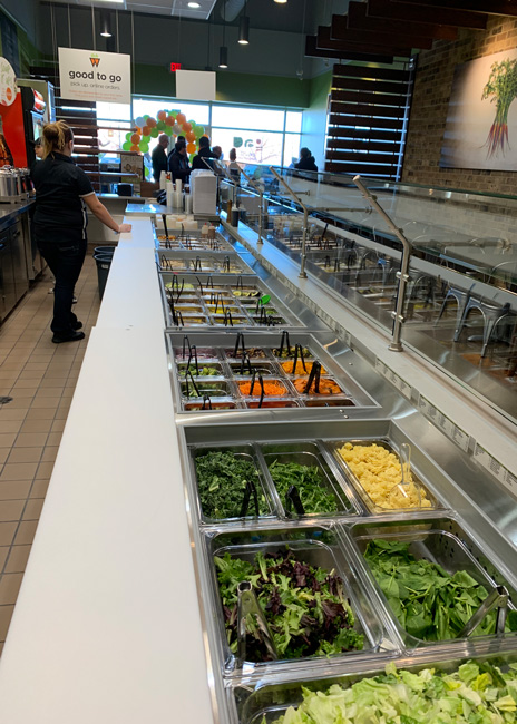 Image courtesy of SaladworksAt Saladworks, a single server fulfills the order of each individual in step-by-step fashion. When the order is completed and presented to the cashier, the server walks back to the front of the line. This rotational server concept, rather than an assembly-line method where a different worker fulfills parts of each order, establishes a rapport between one server and the customer, Lavinder notes. It tends to be more efficient, too, in light of the many choices presented.
“If you don’t know what you want, you can stand there and figure it out while another server can take the next customer who knows what they want and keep the line flowing,” Lavinder says. Also, because the customer doesn’t have to repeat their preferences to different servers, you eliminate some opportunities for miscommunication. “The rotational concept allows us to push through double the amount of tickets,” Lavinder adds.
Saladworks’ backline, located along a wall behind the front makeline, is an overflow area for fulfilling orders at peak periods. This area does not have as many food wells as the front makeline, but servers have ready access to the ingredients they need. Some may be stored beneath the backline instead of on the counter. This area is also used to cut and dice ingredients, which are stored below the counter for either makeline to use.
Food wells come in standard sizes with three or more options. The largest wells hold the most popular items. Positioning like items adjacent to each other is more efficient, Lavinder says. Putting different types of cheese together, for example, makes it easier for customers to decide which one to add to their meal. This arrangement tends to reduce the overall amount of cheese consumed because customers are more likely to stick to one choice when options are clustered in one area rather than asking for multiple cheese types when they are spread out along the makeline, Lavinder says.
The rotational service method requires servers to walk freely behind other servers as they move back and forth on the makeline. There must be enough space between the makeline and the back counter area to enable this flow. A 5-foot to 6-foot corridor is ideal. “Sometimes you see a lot more clearance between the front counter and the back counter or prep area,” Ahn observes. “The result is people are looking at a dirty floor rather than the back wall.”
Framing the Makeline
Consider the look of the makeline area holistically. The back counter and wall compose the backdrop acting as a frame for the feature. This area can reinforce the brand with distinctive materials, colors and graphics. Some establishments hang video screens from the ceiling or attach them to the wall. These can be used as menu boards, though brands are moving away from this traditional application. “Menu boards are a little dated,” Ahn says. Many customers use mobile devices to peruse menus and make their choice while in queue or even before they enter the store. Instead of menus, digital screens could highlight branding with storytelling, highlight promotions, or provide information about the community.
The back wall is typically an aesthetic showcase that might include brand graphics, signage, artwork and attractive coverings. The back counter may showcase attractive produce and screens or posters that tout promotions such as seasonal fare or gift cards. “More than 6 feet is getting too wide,” Ahn says.
The front of the makeline below the glass is another area to highlight brand-specific adornments, though these will only be fully visible at off-peak moments from a distance. Given that reality, most restaurants only add brand-related coloring and designs — no lettering or messaging that would often go unnoticed.
When all elements in and around a makeline design are properly coordinated, the customer experience is satisfying. The array of ingredient choices is appetite-inducing, the meal is efficiently made to order, and the POS transaction is swift and accurate. The COVID-19 pandemic has boosted the desire for to-go meals, but even after the virus subsides, the makeline concept is likely to be adopted by more and more brands. If you follow best practices, there are many concepts that are well served by this approach.

