ZeniMax Media is a videogame maker that has produced some of the biggest franchises in gaming. The company recently redesigned its corporate cafeteria, dubbed MaxCafé, at its headquarters in Rockville, Md. Designed by Frederick & Cederna Architects, the space is intended to serve as a hub for teams and talent to meet and recharge.
The operation features a grill and a pizza station where employees can get a full meal as well as a smoothie/cappuccino bar where people can grab a quick drink and hash out issues or discuss challenges.
As a corporate cafeteria, this MaxCafé was built on a budget that didn’t allow for expensive materials like hardwood floors or granite countertops. Instead, the space consists mainly of drywall, laminate, vinyl and solid surface materials.
 Images courtesy of ZeniMax Media
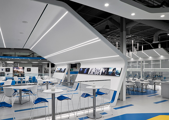
These affordable materials don't mean MaxCafé is a generic space. Looking at the operation, it’s videogame-inspired aesthetic is clear. The space is filled white along with splashes of bright blue and green, along with the use of non-standard angles and ceiling elements.
“This is meant to be a place that allows the imagination to run free. There are very fluid and plastic shapes that were meant to be kind of a blank canvas, to let people envision new ideas, new directions and speak of the future,” says Douglas Frederick, principal of Frederick & Cederna.
Many of these elements also help break up the space, both visually and acoustically, Frederick added. By creating spaces with a variety of seating options, individuals and small groups can have more private spaces to discuss work and brainstorm when needed.
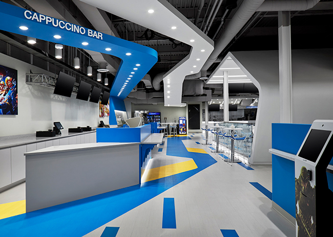
One of the standout sections of the cafe is a space that in many cases would get little thought: a corridor. The space, says Ann Cederna, principal of Frederick & Cederna, is home to an intentional “convergence of forms.” These include the 18-foot dropped ceiling, ductwork and other mechanical elements as well as graphics on the floor. Together, they create an area that adds energy and movement to MaxCafé.
“The different elements create a super dynamic space. That was something we carefully orchestrated,” Cederna says.
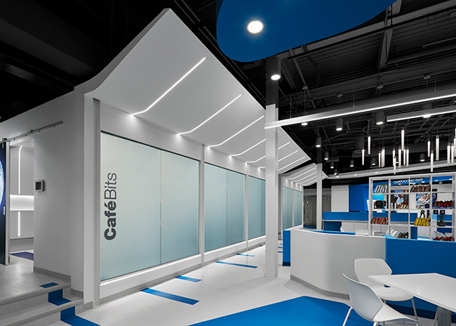
In addition to serving as a corporate cafeteria, MaxCafé is intended to be a gathering space for celebrations, company meetings, happy hours and other activities. The space is equipped with multiple screens throughout, which can be used for presentations, all controlled through a central station. It’s also designed with a highly functional lighting package. In the morning, the lights can be turned bright to wake people up, while they can be dimmed for parties and special events taking place after hours.

“It allows for variety in a space that actually has no exterior window, but you would never know it [because] it feels very light and bright,” says Frederick.
As part of a videogame company, MaxCafé’s design also celebrates the company’s successful games and characters. Each ordering kiosks features one of these characters, as do wall graphics and prints throughout the space.
 In addition to public seating, MaxCafé has two conference rooms, one designed for six people and one for up to 16. The rooms, says Frederick, can be reserved instantly on an iPad located just outside the entry, or in advance on the iPad or online.
The space has a fully wired video screen and, like the main dining area, nooks where items like figurines from the company’s games can be placed. LED strip lights and round LED fixtures allow users to adjust lighting levels for presentations.
The highlight of the conference rooms, though, are the windows, which can turn from transparent to opaque with the flip of a switch.
“You hit the switch and the LED opaques the glass and gives a sense of privacy if there is a private meeting to be held there,” says Frederick.


