Popular New York pizza restaurant Roberta’s recently opened a location on the opposite coast, in Culver City, Calif. Located in a development built around a repurposed automobile dealership, the design of this Roberta’s embraces an unusual footprint and highlights the shape of the classic slice, says Jesse Voigt, co-owner of Studio Jesse James, the project's designer.

Since Roberta’s doesn’t have waiters, guests enter the restaurant and are immediately directed by a host to the ordering counter. Behind the POS station is the fully open kitchen where wood-burning pizza ovens are the stars. These units are imported from Italy and clad in red metal, Voigt says.
“You see the pizza ovens clearly. It was really important that people see the pizza ovens and how the pizza is made.”

After ordering, guests continue past the counter where they encounter a pinch point before transitioning to the dining/bar area, Voigt says.
“There are no archways or doorways. The way we laid out the space from the beginning is based off a pizza slice. We wanted everything to be off an angle or a triangle. The pinch point is one of the results of that.”
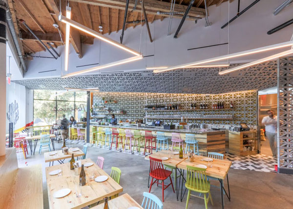
The dining area itself plays up the pizza slice shape in a number of ways, including the triangle-patterned breezeblocks on the ceiling and wall. These were custom made, with hand-poured concrete for the walls and an aluminum resin used for the ceiling.
Other triangle elements can be seen in the pipe and exposed section of the ceiling overhead. These, though, are more happy accident than intentional design, says Voigt.
“There are three other tenants in this rehabilitated structure, and we were the fourth one in. We have this sort of cut-off space. All those pipes are existing in the space. When the building was originally rehabilitated pipes went everywhere for everything.”

The bar area itself has plenty of triangular elements as well, including the tiled floor and large chunks of granite in the terrazzo slab bar top.
The space, though, is just as defined by its light, fresh vibe, meant to reflect the general aesthetic of California design. The bar face, for instance, is a light knotted pine, while the bar stools come in bright shades of blue, green, pink, red and yellow.
“The chairs are made in Europe. We got them unfinished and ended up spray painting them different colors to really pop out what is going on in the space.”

More of that bright feel can be see in the restaurant’s artwork, which was commissioned from several artists just for this location, Voigt says.
While they’re all in the spirit of the restaurant -- fresh, original and a touch edgy -- the artists were given little direction about what to create. “It was kind of a free-for-all. [The owner said] ‘Here are my parameters, do with it what you will.’ He wasn’t dictating what they should do.”

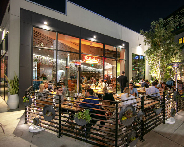
In addition to the dining room and bar area, Roberta’s also has a large patio, so large that it accounts for the majority of the restaurant’s seats. The same knotted pine on the interior is used for the exterior tables, while the chairs are stock pieces and “really the only that was bought and not touched,” says Voigt.
There were a number of constraints to the patio design, she added, with planters defining the shape and the city giving directions on other elements, like the horizontal fence. “We wanted to liven up the horizontal parts of the fence so we bought these round planters and had the landscaper shove them full of plants.”


