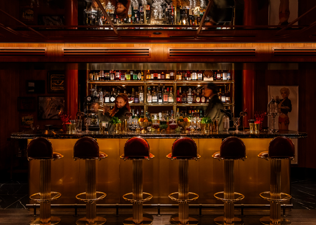
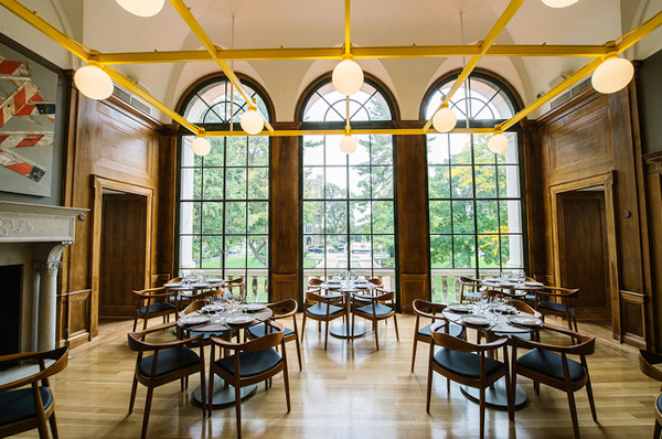
Two years ago, a German town experimented with embedding traffic signals into the ground to alert smartphone users of a tram’s arrival. And in England, a borough in London experimented with padding streetlamps to protect distracted texters from injuring themselves. Smartphones and social media are now part of the fabric of our everyday lives. As consumers share photos of everywhere they go, everything they eat and everything they like, restaurants are being showcased on social media, both for their food and their spaces.
“Photo capture is hugely important and growing,” says Tre Musco, owner of Tesser Big Picture Branding in San Francisco. “We look at how social media is changing the overall experience. There’s this phenomenon of people wanting to be self-published, and spaces need to deal with it.”
.jpg) At Atlanta’s Holler & Dash, colors and patterns make for playful backdrops in photos. Image courtesy of Mark Steele
At Atlanta’s Holler & Dash, colors and patterns make for playful backdrops in photos. Image courtesy of Mark Steele
Social media is changing restaurant design, says Musco, as operators try to make their spaces as friendly to it as possible. Guests often look for elements that stand out, which becomes a social media moment.
Mr. Holmes Bakehouse in San Francisco has a social media wall — a wall of white tiles with “I Got Baked In San Francisco” spelled out in neon letters. A bench sits beneath it, encouraging guests to sit and take a photo. “It makes it more fun to go there and makes it an iconic thing,” Musco says.
Steep Creamery and Tea, which has two locations in San Francisco, has a micro photobooth with perfect lighting so diners can take the perfect picture of their ice cream. “That takes [social media] to another level and makes it very intentional,” Musco says.
Some Ben & Jerry’s ice cream shops have a VW bus inside, which encourages guests to climb aboard and snap away. “This is intentional, too,” Musco says. “And it’s not distracting people from their meal — they take time out before or after to do this.” This, he explains, is controlled and compartmentalized social media — customers have their photography moment, then have a restaurant experience. Creating spaces that don’t disrupt the flow of operations is a key consideration in designing these elements.
Also important, Musco says, is to let these obvious social media moments stand by themselves. “Don’t put up a sign welcoming customers to take a photo. Let people think they’ve figured it out,” he says.
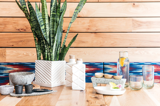 At Agave in Oakland, Calif., fine details pop in photos. Image courtesy of Aubrie Pick.
The Instagrammable Moment
When restaurant operators approach Arcsine in Oakland, Calif., they often ask for an Instagrammable moment, says Lead Creative Strategist Irene Yu.
Because Yu is seeing more consumers experiencing restaurants through the lens of their phones, she likes to compartmentalize social media moments as much as possible so they don’t interrupt the sense of hospitality. “You want technology to enhance the experience, but you don’t want technology to overpower it,” she says.
Yu is a big fan of including social media moments close to entrances. The benefits of this are twofold: one, it can get the social media moment out of guests’ systems, and two, it makes a big impact immediately.
In Marietta, Ga., there’s an impactful sight that people flock to from miles around. It’s a 56-foot-tall chicken sculpture that’s a roadside beacon outside a KFC. “It’s literally made to be photographed and gawked upon,” says Marty McCauley, design director, FRCH Design Worldwide, Cincinnati. The chicken has been there for decades but jumps out as almost needing to be on social media, he says.
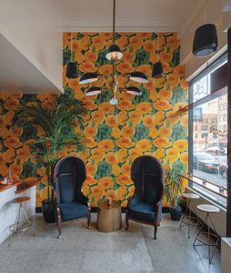 The mural in the main dining room at Agave is a popular backdrop for pictures. Image courtesy of Eric Rorer
FRCH Design, when they worked on the location in 2016 and 2017, wanted to make the chicken even more of a focal point, so they added an exterior dining area and a side porch so people could take photos with the bird in the background.
And once you’re inside the restaurant, there’s a new brick welcome wall featuring an outline of the state of Georgia with a life-size Colonel statue standing by, ready for his photo op. Here, the fun chicken artwork also echoes the playful aesthetic of the exterior.
But social media isn’t all about one big, splashy spot. Social media moments can also be dotted throughout a restaurant. At Agave in Oakland, Calif., the social media moments are woven in to create a cohesive yet authentic Oaxacan experience for guests.
The design features Oaxacan textiles, tiles and ceramics, as well as patterns that would be featured on those. “Social media is built throughout,” Yu says. What tends to be most photographed are a mural and the backbar.
“The mural in the main dining room draws so much attention because it complements architectural features in the space,” Yu says. An example is that the pattern in the mural is directly inspired by the geometry (showing the triangular cuts made by a coa on agave) in the back bar. “Additionally, the mural is on a curved focal wall, which naturally makes it the center of attention.” Neither of these, she says, were created with just social media in mind but as part of the design as a whole.
There’s even a Oaxacan feel to the bathrooms. Using weavings and textiles, Yu created a tile pattern for the bathroom wall. “A lot of people pose there and like the pattern because it’s so bright,” she says.
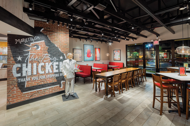 At KFC in Marietta, Ga., there’s a photo op inside with a life-size Colonel Sanders statue. Image courtesy of Mark Steele.
The Embedded Experience
Another project Yu worked on is The Miranda bar in Oakland, Calif., which has a wall featuring giant yellow poppies that gets flagged a lot on social media. “We fell in love with the idea of doing a poppy wall,” Yu explains. “As the poppy is California’s state flower, we thought it was a nice nod to California pride without being too obvious. We didn’t find any poppy wallpaper we liked, so it was custom. We did expect the wall to get a lot of attention — it’s bright and is an easily recognizable feature that people are drawn to.”
In Yu’s opinion, there are two types of social media moments in a restaurant: the obvious (like the photobooth and the chicken) and the more subtle (like Agave’s Oaxacan-inspired patterns). “I think you need to have both,” she says. “You want the recognizable one to make it easy for guests and the other to make them feel they’ve dug it out and discovered a detail.”
FRCH also sees both types. An about-turn from its obvious social media moment at KFC is Holler & Dash, a fast-casual Southern biscuit concept the design firm worked on. “Here, we are more passive with social media,” says McCauley. “We try to embed details through the space from the macro level to micro, and guests can find these for themselves.”
The Holler & Dash Atlanta location is next to an old railroad, so railroad ties are embedded throughout, and the entire location has an industrial aesthetic. Tables are varied from concrete to wooden and some even sport a custom graphic made from wheat paste “to serve as dynamic staging opportunities to inspire guests to photograph and share their meal,” McCauley says.
Social media has not necessarily changed how FRCH designs restaurants, but it led them to think a little differently. “We might look at the tabletop finish, and knowing we have social media and that people will be taking photos of their food, it makes us think of how it will lend itself,” McCauley explains.
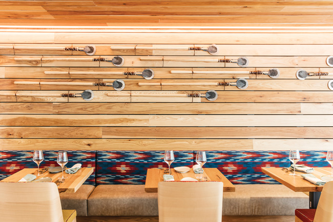 At Agave in Oakland, Calif., the social media moments are woven in to create a cohesive yet authentic Oaxacan experience for guests. Image courtesy of Aubrie Pick
More clients than ever are coming to Aria Group in Oak Park, Ill., and asking for social media moments, says Nicole Poole, associate and project architectural designer. Recently, she’s worked on Salads UP, which has two locations: in Ann Arbor, Mich., and at the University of Wisconsin in Madison.
The Ann Arbor location has a huge mural outside that people love to take photos in front of, according to Poole. “We weaved in that concept to create a patterning of wall covering graphics inside the Madison location,” she says. “The pattern was based on nature, and we extruded the idea of plant cells to create different triangle components within the space — and it’s become a place where people take photos.” The bold, energetic colors and patterns make for a great photo backdrop, she adds.
There are two feature walls inside at the university: The first is a bookshelf wall, which has a lot of vertical divisions and different patternings; the second is by the ordering area and the entrance and features the triangular patterns.
In the Ann Arbor location, there’s an artificial grass turf wall by the bathrooms. The turf spells out “S’UP,” and this wall is a regular fixture on social media, Poole says. “We played up green tones to tie into the salad concept.”
But what’s important is that all these elements, while attracting a lot of social media attention, “all stand on their own but tie in to the overall concept too, which is the idea of fresh,” Poole says. “We wanted a branded pattern throughout.”
.jpg) At the Atlanta unit of Holler & Dash, textures and colors are layered and make interesting backdrops for pictures throughout the space. Image courtesy of Mark Steele
At the Atlanta unit of Holler & Dash, textures and colors are layered and make interesting backdrops for pictures throughout the space. Image courtesy of Mark Steele
Distracted Diners
Social media isn’t just influencing the design of restaurants, it’s also affecting how customers act in them.
“People are highly distracted with their devices, which leads to flow issues,” says Musco. For example, in fast-casual restaurants, distracted consumers slow down lines because they’re not paying attention to questions the employee is asking them or they’re diverted at the checkout by texts or alerts.
Because of this, and similar to the German idea of embedding traffic signals in the sidewalk, Musco says that because consumers now spend so much time staring down, he’s incorporating more wayfinding into floors, like striping and graphics to lead customers to the checkout and seating areas. “Any clues we can give to help people navigate is useful because people get very frustrated if they are stuck behind someone,” he explains.
The ubiquity of smartphones also means more customers are comfortable dining alone. “It doesn’t have the negative stigma it had maybe a generation ago because you are fully entertained with your device,” Musco says. “We see more individual seating, such as countertops that face windows, so we see it impacting seating arrangements.”
From the floors to the bathrooms, and the walls to the tables, considering social media is unavoidable. Poole thinks it’s all a good thing. “Social media is adding to restaurants in a positive way,” she says. “It gets consumers excited about seeing them. They might not know about them until they hit the social media wave. It’s good for us as architects and designers to see how people are interacting with those spaces. I think that’s a great move forward.”
Lights, Camera, Action
We all know good lighting is essential to the perfect photograph, and restaurateurs are having to play to this by keeping lights brighter and having more white walls and negative wall space. “It’s important when amateur restaurant photographers are taking hundreds of thousands of photos a day,” says Hannah Collins, owner and principal designer at Hannah Collins Designs in San Francisco. “You have to wonder how that looks online, and you have no control over it. So restaurateurs have to make it an experience where the amateur photographer can be successful.”
At Salads UP in Ann Arbor, Mich., the lighting is track lighting with an additional row of lighting at the pop walls. “We highlight accent walls anyway, but here it’s especially important,” says Nicole Poole, associate and project architectural designer with Aria Group in Oak Park, Ill. “It’s really about the bright background pop, so we make sure we have bold colors in the patterning. It catches your eye. This warm light helps — it brings out the warmth and the natural color, and especially red colors in food.”
What Tre Musco of Tesser Big Picture Branding in San Francisco is seeing is “staged areas” with special theatrical lighting for guests to get fantastic images of themselves or the food.
But designers don’t have to worry too much about perfecting the light for smartphones. “Phones are much better now with adjusting for light,” says Irene Yu, lead creative strategist for Arcsine. “I think there’s a bigger demand for statement lighting, so we’ve been designing impactful decorative lighting.”he Atlanta unit of Holler & Dash, textures and colors are layered and make interesting backdrops for pictures throughout the space.


