When restaurant design works — really works — there’s so much more to it than meets the eye. Sure, eye candy’s nice, and a great-looking space is an increasingly competitive advantage in this age of Pinterest and Instagram. But peel back the layers, and you’ll find that designs that work exceptionally well do so because the design team immersed itself in brand genetics, multifaceted storytelling and operational flow, pulling in many diverse disciplines to ensure all work in concert from initial idea to operation.
Designers, after all, don’t just make beautiful spaces. They interpret, filter, innovate, curate and collaborate to create experiences for guests and clients whose expectations just keep rising. Each year, rd+d’s Designers Dish! checks in with some of the best and brightest in the business to find out how they do it, where they see the industry heading, and what challenges, frustrates and inspires them. This year’s participants range from veteran designers at top multinational firms to up-and-comers making their mark.
Big thanks to our Designers Dish participants (bios and more Q&A available on the next page):
- Candice Alinovich of The McBride Company, Manchester Center, Vt.
- Douglas DeBoer of Rebel Design+Group, Marina Del Rey, Calif.
- Ken Lam of Navigate Design, Toronto
- Anna Polonsky and Amy Morris of The MP Shift, New York
- Jackson Thilenius of PULSE by Gettys, Chicago
Bonus web content is marked with a double asterisk: **
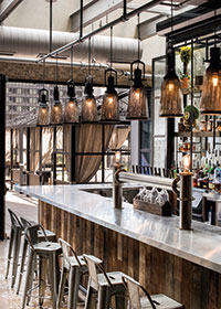 Photo courtesy of The Gettys Group
What trends or consumer forces are having a big impact on your restaurant projects right now?
DeBoer: These days, consumers are obsessed with understanding how food is made, plated and presented. In 2016, there were more than 184 million Twitter posts tagged #food. This trend has foodies seeking more open kitchens, cook’s tables, sushi/diner-style counters, etc. Restaurants are now being designed with Instagram in mind, and the public’s need to be a part of the action is having a definite influence on restaurant design.
Alinovich: I do think that social media is playing a pretty big role right now. People discover new places through social media and live vicariously via online access. So while it’s not necessarily what we design for, having an “Instagrammable” space is important. We also see ongoing shifts toward fast casual, where the food is dictating the design of the space. High-end chefs are working to make their food more accessible. The food quality and ingredients are elevated, and so are the materials and the overall aesthetic, but without being stuffy.
Pope-Westerman: There’s definitely much greater focus on the actual quality of the food. People are much smarter about food, more interested in it and more mindful about what they put into their bodies. From a design standpoint, our teams need to understand that concept and tell the stories of the food, whether it’s through literature, graphics, reinforcing it in the space or actually being able to see more of what’s happening in the kitchen. Previously, the whole idea of open kitchens was more about excitement and razzle-dazzle. Now, it’s much more about transparency, authenticity and communicating messages about the quality of the food and how it’s handled.
To that end, we’re also seeing and doing more projects that incorporate displays of key ingredients right up front for guests to peruse and even select from to create their meals. It might be fish on ice or steaks aging, but it’s brought from behind closed doors in the back of the house to beautiful displays in the front that help connect people to the food being served.
**Do popular design trends sometimes get in the way of a good idea?
**Thilenius: I try to stay clear of trends if possible. By their very definition, trends are temporary. I find that often the best design strategy is to go in the opposite direction from current trends. What better way to differentiate the design? There is certainly always a time and place to incorporate popular design trends, but people today expect a truly unique experience. With so much access and sharing through social media, the expectations to create something original and defining are even more challenging.
**Lam: Just because a particular material or design strategy is trendy doesn’t mean it works for everyone, so trends don’t drive how we design. They may influence some selections of finishes and colors so that we’re not dated and we’re a little more timeless, but they’re not the driving force in our restaurant designs. The main driving force is what the client wants the concept and the food to be and what they think the consumer will react to as a whole experience. It requires an integrated, multidisciplinary approach that goes well beyond interior design. Our mandate is that the interior design has to be a stage on which the food and beverage stand out, and it has to have staying power. It’s not about regurgitating hot design trends.
**Polonsky & Morris: We try to push the boundaries while respecting the client’s vision and the public’s comfort. Clients typically want what is trendy, but it’s our role to convince them to do something that is, yes, current, but also distinct and not just a copy of their competitors. Simply following trends without questioning them or making them your own is a big misstep that’s made too often. A case in point: For too many years, we’ve see so many designers and restaurateurs using barn wood and Edison bulbs in New York City, whether the place is a coffee shop in Brooklyn or a Thai restaurant in Tribeca. It makes no sense!
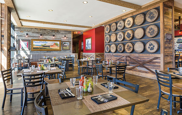 At Barnwood at the Great Wolf Lodge in Colorado Springs, Alinovich and the team at McBride created an elevated farm-to-table aesthetic while ensuring a family-friendly vibe.
Photo courtesy of The McBride Company
What role does research play in your work?
Thilenius: Understanding the local culture and market preferences of the areas surrounding a space we are designing is key. Aside from researching the history of a space, nothing beats pounding the pavement and spending time exploring the adjacencies that will ultimately support the new restaurant. We are designing spaces for specific clienteles, so it’s imperative that we get to know who these people are and understand their desires and expectations. Only then can we position the restaurant in a way that surpasses the status quo.
Polonsky & Morris: Research is crucial. Our approach to design is holistic, and we’d never create a space simply based on personal preferences. A strong design is the result of hours of brand positioning research, a constantly updated knowledge of the market’s past, evolution and trends, endless dialogue with the client’s team and visual documentation.
**Pope-Westerman: For me, research is doing a lot of traveling, a lot of benchmarking and seeing what’s going on around the world as well as in our own backyard. We’re fortunate in that we have a network of locations around the globe, so we’re able to share regular updates and insights on what’s going on, what our teams are seeing in terms of culture, food and design from Tokyo to London to Dubai to Houston.
**Alinovich: With every project we work on, there’s a period that’s dedicated to research. Even if it’s a concept that we’ve worked on in the past, it’s still a new location, so there’s a level of research that goes into it in order to be able to bring pieces of local relevance to that location and make it unique. And outside of specific projects, I think designers are always doing research, whether poring through magazines, scrolling through Pinterest or seeking out new places and trendy neighborhoods to see what other designers are doing. It’s all research, and it’s integral to what we do.
Lam: Agreed. In interior design, research is a day-to-day exercise. We’re always looking for the latest and greatest in hotels, restaurants and retail spaces around the world. But we also do a lot of project-specific research. For example, if a client comes to us and wants to open a Peruvian restaurant, we do area and geographic research to see who’s out there, what has opened with that cuisine and aesthetic, who goes there, what’s the price range, etc. Everything is calculated and data-driven. We also do materials research in terms of what we can source, what’s going to be long lasting, trendy but not dated quickly, etc. All of this happens well before we even start designing. Given that we handle projects from concept to completion, the bulk of research we do relates to the branding of the cuisine and the concept because that defines the attitude of the restaurant, and everything else flows from that.
How about the role of technology in your own work or in the projects you’re designing?
**Alinovich: We’ve been playing around with some of the new virtual reality software. It’s still in its infancy, but it will be interesting to see how we can utilize that to convey concepts to clients. One aspect of technology that’s really exciting for us already is the ability to customize materials. For instance, we’ve recently been researching motion-activated screens. It’s like a piece of artwork, but it changes based on the people who are moving in front of it. So, technology is definitely pushing design to a whole new level of customization.
**DeBoer: On the client end, some fast-food chains are responding to rising labor costs by offering self-serve kiosks in some stores. While it’s still too soon to see what real-world consequences these kiosks will have, the interest in automation continues to grow. While today it may be a kiosk in a burger joint, tomorrow we might have tablets instead of waitstaff in fine-dining restaurants (iPads are already standing in for some menus and POS systems) and robotics in the kitchen.
Thilenius: We’re constantly exploring new ways to use technology to tell our stories. We’ve been incorporating virtual reality into our client pitches, planning and development. By virtually placing our clients into the proposed design, we’re able to map things out, identify and solve problems in advance in ways we never could before. It’s an extraordinary tool for communicating design intent early in the process, and it’s reshaping the way we document our progress.
Lam: At the restaurant level, there’s definitely more and more embedded technology, from AV and sound equipment to POS and automated lighting systems. It allows for much greater control of the energy and ambience within a space. In most concepts, it won’t be in-your-face high-tech but very integrated and experiential. As for the studio, the average age of my staff is probably 30, so they’re very tech-savvy in their own world. Within the next couple of months, we’re rolling out a new program where we’ll be doing more experiential work — 3D, IR, VR. We’re not completely infused with it yet, but it’s coming.
**Polonsky & Morris: We’re still a start-up and are juggling multiple projects at once. To be efficient and focused, we make a point of being ultra-organized and heavily rely on technology for that. Our design schematics start with team Pinterest boards, and all information is shared on Evernote and Dropbox. Client presentation copy is gathered on Google slides. And we’re currently testing Facebook Workplace as a space to share research and ideas more efficiently.
Pope-Westerman: Within our process, we start looking at spaces in 3-D almost instantly. We use Revit and can start walking people through the spaces before we actually start designing them. It helps clients understand the 3-D volume of the space and have a full sensory experience. In the actual spaces, we’re seeing parallels to what’s going on at retail, with fewer cashier stations and fewer traditional host stands. Clients are also investing a lot in higher-tech ordering processes and menus. We’re working on a fun project right now that includes backlit, illuminated menu booklets. They’re dramatic and enable the space overall to be more dimly lit, but they’re also flexible as the printed inserts can be easily changed out. So overall, technology is something that clients have to think about and budget more for at the very beginning of a project because it’s so integral.
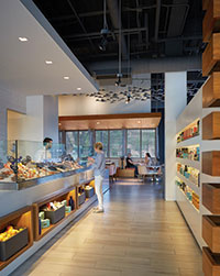 Underscoring ingredient quality and creating a visual connection to the food being served, Gensler designed Peska Seafood Culture in Houston with displays of fresh seafood on ice along the entrance to the dining room.
Photo by Dror BaldingerWhat’s your strategy for conveying authenticity in design?
**Lam: Authenticity stems from branding. Interior design can only flourish if the brand is strong, clear and authentic. We recently did a project whose brand started with such a strong attitude. We went through branding exercises in which they defined things like the attitude of the space and profiled the type of people who would work there, tattoos and all. Once you have the brand solid, the interior design is easy because everything you design will be toward that brand and it becomes authentic. If the brand isn’t solid, anything you design is wishy-washy.
**Thilenius:As long as you stay true to the story of the restaurant, the design will be authentic. The story begins in the kitchen and with the food being served. Once you begin filtering design decisions through the lens of how the food is to be presented and enjoyed, the restaurant will naturally unfold and reveal what it wants to be. Everything from the plating of the food to the pairing of beverages and music helps determine the vibe and feel of the space.
**Pope-Westerman: For me, authenticity has always started with the menu and the reason behind the chef or owner for creating their new restaurant concept. That’s how you get to authenticity because you really get to the heart and soul of the owner or chef. This industry usually consists of very emotional, passionate, creative people, so working closely with them to understand their vision and why they design food the way that they do provides the seeds for us to design authentically.
Polonsky & Morris: We always start our projects with a brand Q&A so that we can fully understand what the client’s vision is. To us, that is what an authentic design is: something that is true to the owner’s dream without trying to be trendy, perfect or expected. Engaging in constant communications and remaining rational and not megalomaniac with the design helps to stay focused on the initial vision. We go back to the brand Q&A at every step of the schematic work.
DeBoer: Authenticity also speaks to local. Consumers increasingly prioritize self-expression and exhibit a variety of lifestyle choices. To attract these customers, restaurants must venture into smaller, nontraditional settings to convey uniqueness and connection. Local relevance and uniqueness are big draws. Brand consistency is less important than getting the culture and preferences right. Restaurants are looking to engage the senses, using textured finishes and furnishings sourced from within the community to convey authenticity.
Alinovich: Absolutely. Part of it goes back to doing the research on the front end to really understand the space and the local area. Choice of materials and finishes can be used to reveal authenticity and local relevance subtly through the design.
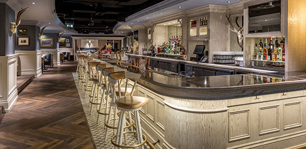 The award-winning Weslodge Saloon in the JW Marriott Marquis Dubai was Navigate Design’s first project abroad and an example of the firm’s fully integrated branding and design process.
Photo courtesy of Navigate Design
What are some common restaurant design missteps?
Pope-Westerman: One is restaurants that look too much like banquet rooms — just a sea of tables without enough articulation in the space, not enough millwork, not enough variation in the type of seating or the table heights. At the other end of the spectrum is overdesign. That often happens as people try to provide lots of different experiences within a space using lots of different materials. You always overdesign a bit and use many materials, but it is crucial in the editing process to get back to what the core of the project needs to be. There needs to be a hierarchy of experiences within a space. If everything is trying to be something, there’s no place for your eye to rest. It’s like a soup in which the chef has used too many different kinds of vegetables and spices. By the time it all blends together, it actually becomes bland.
Lam: We see a lot of instances where not enough attention is paid to flow. For example, an operation may have limited space, so they put the bar in the back. You can walk in and know right away that they should have put it in the front to ensure buzz and the energy up front. Another common mistake is not hiring the proper professionals, whether at the bar, in the kitchen or on the design side. Operators do things how they want, cut corners to save money, and when things don’t work out, they don’t know why. There’s no shortcut to successful restaurant design.
**DeBoer: Egocentric chefs wanting oversized kitchens. While some chefs bemoan the current trend toward healthy eats, it’s undeniable that all the gluten-free, vegan, dairy-free, no-white-flour advocates represent a very real change in how our society is eating. The popularity of produce-heavy menus is strong enough to have restaurant designers (and chefs) needing to rethink both their back-of-house footprints and menus accordingly. We’re swapping deep fryers in favor of sous vide machines and ditching mega-freezers for more vegetable storage or rows of juicers.
**Alinovich: Somewhat related to that, it’s often easy to get so involved with the front of house and guest experience that important back-of-house details get overlooked. Things like how the servers or cooks move through the space have a big impact on the overall success of a restaurant.
Thilenius: One big misstep goes back to trends. So many designs are based around what’s trendy as opposed to being environments created around a well-thought-out concept. Overuse of trendy elements dilutes their effectiveness because they become too familiar. I remember when the reclaimed wood look started, and now it’s in everything from Starbucks to pop-up retail, malls and hotels. It speaks to how often designers will regurgitate trends until they’re completely overexposed and no longer relevant.
How do you see restaurant design and/or guest experience changing most notably?
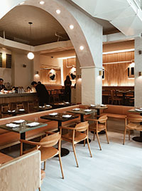 The MP Shift recently completed the design for De Maria, a light and stylish all-day cafe concept created by music producer Grace Lee and onetime “Top Chef” contestant Camille Becerra. Photo by Nikki BrandDeBoer: More technology and going green are big trends for two reasons: Customers like being “plugged in,” and becoming more energy-efficient is good for profits. In the end, however, built-in USB ports and digital sommeliers are intriguing, but great food, a welcoming and interesting atmosphere, and a sense of community are what keep people coming back. Going forward, restaurants will be increasingly challenged to straddle the line between hospitality and high-tech to be both special and successful.
Polonsky & Mann: Adoption of a holistic approach to the restaurant experience, from concept to launch, will become more prevalent. It’s something we’ve been preaching for a couple of years now. A few incredible restaurateurs have long focused on integrated brand details, but until recently, most of their peers were only focusing on one area: design but not food, marketing but not graphics, etc. The competition is too vast now and the patrons have such high expectations, it’s imperative that brands be cohesive from A to Z.
**Pope-Westerman: It is increasingly about every little detail. Think about the whole indoor-outdoor trend. People love to be outside, and a lot of concepts are bringing the outdoors in and connecting guests to nature in a variety of ways, up to and including on-site gardens. It gets back to the idea of holistic branding, design and operations. I also think that adjacencies of restaurants to other types of venues will become increasingly important. Landlords will be much more intentional, and we’ll see more crossover between restaurants, retail and other programming elements. Going to a restaurant will be a more multilayered experience. Likewise, restaurants are bringing food culture to other types of projects. For example, a corporate office tower isn’t considered up-to-date anymore without a good food and beverage offering in the lobby space.
**Lam: Notable restaurants are gearing toward more of a front social area, a hub right near the entrance. There’s a blurred line between bar and dining, and the seating around the bar is what we call chat height. The guest experience is much more social and interactive — there’s a lot of energy at the front of the restaurant. Speakeasy-type bars are also trending, where a small entry opens to a dramatic large bar space. We’re seeing a lot more use of greenery to give a little more life and energy to spaces, and, of course, we’ll continue to see centralized display kitchens. They’re still very strong in part because they also add such great energy.
Alinovich: Yes, and a lot of restaurants are moving away from stuffy, pretentious fine dining to a more relaxed atmosphere. It’s definitely very food-driven, and you can still have a fine-dining experience, but the spaces are more humble and comfortable in design and attitude. I also think food halls will continue to grow. They’re popping up everywhere and are great because they give people a lot of options in one location.
**Thilenius: Similar to the food industry’s focus on farm-to-table and locally grown products, I believe restaurant design will begin to focus on even more sustainable design using materials and products that are good for the environment. Staying authentic in design means walking the walk and talking the talk, especially when a menu focuses on this idea. I also believe restaurants will offer additional services and experiences in conjunction with F&B. We’re already seeing it with the expansion of test kitchens and the inclusion of market spaces, but I believe we’ll see even greater pairings of services. Imagine a restaurant that offers a spa experience or dance class. Who knows what awaits as restaurant labor models diversify? The possibilities are endless, and it’s an exciting time for us as designers.
- Prev
- Next
