Mercier shares a few of the concepts, products and materials that (fer) studio chose to bring Officine Brera to life.
 Christopher MercierChris Mercier founded form, environment, research (fer) studio in Inglewood, Calif., in early 2002, following nine years as associate/project architect for Gehry Partners LLP. An architect by training, with work credits including the Guggenheim Museum Bilbao in Spain, the Condé Nast Cafeteria in New York and the Bio-diversity Museum in Panama, Mercier now leads (fer) in designing a diverse portfolio of commercial and residential projects. The studio was recognized as a finalist in the AIA | LA 2014 Restaurant Design Awards for Connie & Ted’s and is a finalist again this year for the newly opened Officine Brera. Housed in a 1920s masonry and steel warehouse, Officine Brera features 35-foot, original open-truss ceilings, original factory windows and skylights, and an industrial-flavored, open culinary workshop kitchen.
+ Lighting Game: Lighting is critical to every single restaurant project. Here, you can see lighting coming from multiple sources — from the ceiling, floor, large and small pendants, and skylights; under the bar; behind the banquette; etc. It’s a kind of game: You need a ton of lights to almost overpower the space with the amount of fixtures you have, but then you have to turn them all way down so it becomes all of these ambient pieces of light working together.
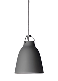 YLighting Caravaggio Black pendant
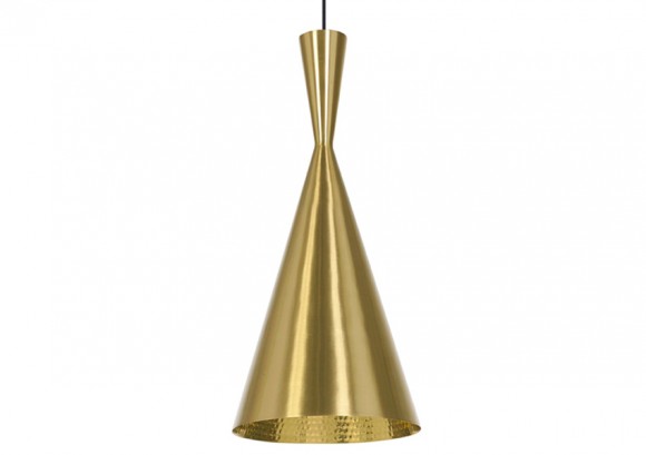
Two pendant light styles that we love are Tom Dixon Beat Tall Brass pendants, which in this project hang over the bar, and YLighting’s Caravaggio Black pendants, which are used throughout the dining room. We picked the Caravaggio right away — thought it was perfect, but the client didn’t agree. We looked for months for something we liked as well, circled back, and ultimately he decided he loved it, too! The scale is nice, and the black fits in well with the overall aesthetic — historic and industrial but also contemporary.
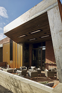
+ Metal Works: We started with an old warehouse building from the 1920s, so we wanted to play into that. Corten standing seam siding does that very nicely on the exterior. When new, the panels look like regular steel — clean and bright — but if you leave them to the elements, they naturally rust to a great-looking color. The 10-by-15-foot entrance, patio and host station area that we added to the building (right) is basically an architectural canopy created from Corten steel. Inside, we carried the metal theme through with custom hot rolled steel around the expo kitchen (below). It has a softer-to-the-touch look that we liked.
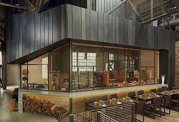 interior hot rolled steel custom siding
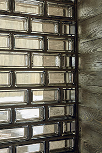 + Glass Blocks: We’ve used these in a number of locations. Most glass blocks are square, and they’re always set in a grid pattern, but these are unique because of their shape. They’re 3-by-6-inch rectangles. We have a guy who cuts them for us so that we can set them in a brick pattern. We built a divider wall at Officine Brera that runs from behind the host stand through a portion of the front patio. They look great because they play off the building’s original brickwork and they add texture, catch light and distort the view a bit because they’re not perfectly clear.
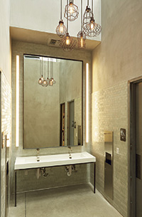
+ Textured Tile: This is a great tile — Ann Sacks Savoy Field Tile, 2 by 8 by ¼-inch ribbed. It has the durability of regular smooth tile but also gives some visual texture to the space. We used it in this project in the restroom area. It almost looks like it has been raked vertically, so it has texture, and while it’s off-white in color, it looks like it has been wiped with a black stain so the crevices have a darker tone.
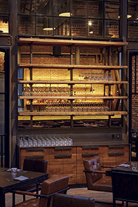
+ Reflection: I love the use of mirrors and glass to create soft, bouncing light and additional views. Here, we integrated a simple bronze mirror behind display shelving at the wait station. It sits against a glass wall that separates the main dining area from a private dining room. We just tried to get more reflectivity off that wall and bounce some light around the room. You can also see the bar across the room reflected in that mirror.
All restaurant photography by Jack Coyier; Caravaggio pendant image courtesy of YLighting; Beat Tall Brass pendant image courtesy of Tom Dixon


