It's only five years old, but the fast-growing Smashburger "better-burger" chain just unveiled its third design iteration. That's more significant design changes than many established chains have pulled off in two or three times that span.
Why the rush to nip and tuck? It's all about staying relevant in a hyper-competitive marketplace, says Tom Ryan, founder and chief concept officer. It's also part of the chain's commitment to "bring the future here ahead of schedule," Ryan says. Based on its new prototype, Smashburger's future includes highly visual in-store brand messaging and a look and feel that's more strongly designed to compete not just against QSR and fast-casual, but against casual-dining players, as well.
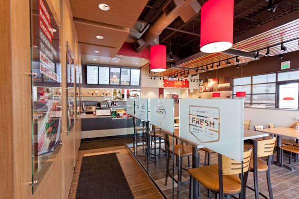
"Our research shows that we source more than 40 percent of our business from adult-casual competitors," Ryan says. "So we felt the need to make sure that we continue to evolve toward a warmer, nicer and at the same time still permissive décor package. In our new design you'll see an evolution of our red, for instance, which has always been a dominant motif. We've kept the red, but through a softer lighting scheme, wall art, use of wood tones in ceiling slats, table tops and booths, and upgraded flooring, we created a much more modern and at the same time warm look."
The chain, which is set to open its 200th unit in February, has 3 units with the new design open in its home market and one in Culver City, Calif. Ryan says all new units going forward will be built to the new prototype and that existing stores coming up for remodels will incorporate elements of it, as well. Smashburger expects to open 60 to 70 stores within the next year, roughly half corporate and half franchised, according to Ryan, "We expect that growth rate to even accelerate going forward, so it's important that we make sure the building is designed with the most contemporary perspectives of the brand."

Considerable time and energy was dedicated during the redesign process to the foyer and queuing spaces, according to Ryan. "In the new design, these areas are much more aesthetic and they do a much better job of communicating key brand attributes to consumers," he says. Highlights here include new etched glass panels and wall graphics that convey messages of food freshness, quality and variety.
With a stronger focus on merchandising, the new prototype incorporates a redesigned front counter that displays to-go beverages and other items. Wall graphics and new high-tech digital menu boards help the chain do a better job of selling the entire menu, including sides and entrees beyond its mainstay burgers and shakes, as well as better spotlight localized menu items and beers. "We view the counter as a revenue center for the brand, so we spent a lot more time, money and effort on that area to get it right," says Ryan.
"What drove the specifics of the changes was our desire to celebrate some of the things about the brand that people tell us they like," he adds. "We're doing a lot more aggressive job within the store of communicating why we're called Smashburger and why that should be important to consumers. We celebrate the fact that smashing is better and are doing more branded storytelling around that, as well as around our localized burgers, a la carte items and beers."
The partially open kitchen represents another significant change that sets the new prototype apart. "We wanted to show a bit of the back-of-the-house energy and smashing burger aspect," Ryan says. "It's not that customers can watch their burger being made, specifically, but we have great fresh food made to order and the new design lets a bit of that energy and imagery come out to into the dining room."
The new design uses wood tones extensively, from the floor tiles to seating to simple slats suspended from the ceilings, to create a sophisticated yet warm and inviting atmosphere. Various seating heights and styles provide both increasingly upscale atmosphere and flexibility for accommodating various customer occasions.
"We wanted very comfortable seating. We have people come in in groups of 10 or just 2, so part of our 3.0 design was to get that well understood and provide seating options," Ryan says. "In our more urban locations, such as in the new Culver City store, we have nice new window rails that you can either stand at or sit at. We also have banquettes, booths and high-top tables. We've learned from our customers that having eating areas at different elevations gives the space more energy and also breaks the monotony of it looking like a cafeteria. We did have some uneven seating in some existing stores, but now it's a specific design criterion. We're also using some great fabrics for our banquettes and booths that are in line with our brand concept but a little more sophisticated, a little nicer."
A key piece of Smashburger's new in-store branding effort is what Ryan calls "wall mosaics," a collection of stylized images and words that help tell the brand story and that provide local appeal. "Since we localize our menus, we're now also bringing a mosaic of icons and pictures on the wall that help underscore our local focus," he notes. "They show our customers in the occasions that we're known for — such as social family occasions, date night, etc. They also show local icons, photos and caricatures of items that celebrate the locale. In Denver, for instance, we have pictures of Coors Field, skiing and stylized iconography of the Rocky Mountains. In California we have the Santa Monica Pier, surfboard imagery and L.A. skyline outlines. We also incorporate stylized elements that bring some of our more pronounced brand benefits of the food into the mosaics. Our new tagline is "Smashed Fresh, Served Delicious." You'll see that in our mosaics and also some stylized versions in print of our local burger, with each layer of ingredients shown in words instead of a picture of the burger."
Ryan says opening costs for the new prototype come in on par with or, depending on location, slightly higher than the previous iteration. "We spent more on some elements, such as the counter merchandising, etched glass and wall art for in-store branding, but we were able to make it up in other areas," he says. "All in all, the cost comes in pretty close to what we had before but the impact is so much greater."
Owner: Consumer Capital Partners. Chairman & CEO: David Prokupek. Founder: Tom Ryan. HQ: Denver. Units: 200 in 29 U.S. markets, Canada, Kuwait, Saudi Arabia, Costa Rica. Average unit: 2,000- 2,200 sq. ft., 70-75 seats include, plus patio. Preferred location: End cap. Corporate vs. franchised: approximately 50/50. Average build-out: 60 days (corporate stores)
Internal 3.0 Project Team: Jenn Allstun, director of design; Jim Ernster, vp of construction; Jayson Burgess, construction manager; Justin Retzlaff, project manager; Jeremy Morgan, svp of marketing; Angela Sanders, vp of marketing; Alexa Abrams, graphic designer; Jesse Yuran, svp of real estate; Maria Fernandez, director of development
External Partners: Moseley Group, preliminary concept/branding design; Intertech Design Services Inc., architect on first 3.0 store; MSW Inc., millwork; Stout Imaging, interior graphics and signage; W. West – KEC, kitchen equipment; Murray & Stafford Inc., general contractor on first 3.0 store


