This Chicago breakfast concept opened a new restaurant in a challenging space.
 Images courtesy of Kamil RadziszewskiMost big cities have beloved local chains, spots with five or 10 locations that have a passionate local following. In Chicago, Kanela Breakfast Club is one of these.
This a.m. eatery was founded about 15 years ago by Christos Lardakis, a Chicago native with businesses in both the hospitality and general contracting sectors.
Lardakis’ vision was for Kanela to be “a breakfast/brunch place where you could come and enjoy local, organic, made-from-scratch food. That was my number-one focus, the quality of the food. Nothing processed. Just really good quality and a good time.”
Kanela’s menu features some diner staples, like made-to-order omelets, chicken and waffles, and biscuits and gravy. Then there are the more elevated and/or imaginative offerings.
On the savory side, Kanela offers a spicy feta omelet, a crab cake benedict, and a quiche lorraine-inspired scramble. Sweet items include red velvet French toast, churro waffles and sweet monkey bread. Since “kanela” is the Greek word for cinnamon, most of the sweet items are topped with a mix of cinnamon and powdered sugar.
Guests can pair these dishes with drinks from the full bar including breakfast classics like mimosas and Bloody Marys.
This approach has made Kanela a popular choice in a city with plenty of breakfast options. The concept grew to six locations pre-pandemic but currently stands at four.
Kanela is bouncing back from those losses, though. Lardakis has plans for growth and continues to invest in the concept.
The latest investment was a major one: The opening of a new location in Chicago’s Old Town neighborhood, replacing a location across the street where the lease had come to an end.
 The banquette allows Kanela to serve large parties in a small space, while the window to the kitchen in the back of the space adds some energy without overwhelming guests.
New Space, New Design
Moving across the street wasn’t as simple as carrying some furnishings over, obviously. In fact, it was far more complicated than most openings due to the size and shape of the new building.
The new space is smaller than the one it replaced by several hundred square feet. It’s also got a long and narrow footprint. Designing a restaurant to be both efficient and welcoming was the project’s biggest challenge, says Rocco Laudizio, principal of slick+designusa, which handled the design of the newest Kanela.
And an adjustment to Kanelas’ service model introduced at this new store made the challenge even more difficult.
At the previous Kanela in Old Town, there was no option for people who wanted a coffee shop-style experience. It was designed for full-service or takeout. The chain realized it was missing out on some potential customers.
“The other place really couldn’t capitalize on the walk-by traffic,” says Laudizio. “Before, you had to sit down and have coffee. Now, it’s almost Starbucks-like. You can go in there and just order [and leave] or you can sit down and have a full lunch or breakfast.”
In addition to having a counter ordering option, the space also includes counter seating for five, located to the right of the POS station. While these additions created a new revenue stream for Kanela, they also presented some design challenges, both within the counter-service area itself and the larger space.
Because this new location is small and narrow, the area is designed to be compact and efficient. During peak periods, only two people are needed to work the space, and everything is within arm’s length, Laudizio says. At slower times, a single staffer can take orders at the register, move a step to the right to retrieve a pastry, then turn around to work the espresso machine. The electronic menu boards not only allow for easy menu changes, they also let Kanela showcase food photography.And because of the need to use space wisely, the back wall is home to floating shelves that offer both form and function, says Laudizio.
“There are liquor bottles there and all of the storage for the cups and plates for the espressos, cappuccinos and pastries are all on that shelf. It does two things: It makes it look cool and it also helps with storage. It’s decorative storage of products.”
Laudizio also had to make sure this addition worked within the restaurant overall.
To help bring in foot traffic, the counter is located just inside the entry door. While effective, this approach could clog the entry, making it difficult for dine-in guests to get the kind of customer service Kanela seeks to deliver.
To eliminate this potential problem, the host stand was placed past the to-go counter and counter seating area. This expands the space for people who are waiting for a seat or standing in line for a coffee to go.
In addition, during the winter months, Kanela erects a canvas vestibule just outside its entry door.
This space is 10 feet by 10 feet and heated. “During the wintertime, it is a perfect place for guests to wait for a table instead of having them freezing outside or crowding other guests inside. During the summers, I don’t need it because people can enjoy the outside,” says Lardakis.
Of course, the narrow footprint impacts the design past the to-go counter. For seating, there simply isn’t room for large six-tops or even many four-tops. Seating options, then, include two-tops that run down the middle of the dining area, a few small booths along one wall, and a long banquette along the other. This final option gives Kanela the flexibility to serve parties both large and small.
Like the to-go counter, the dining area also has some decorative storage. This includes additional floating shelves that hold tableware, as well as a bus station in the form of cabinets with the same quartz countertop that’s used in the POS area.
At the end of the dining area is Kanela’s production kitchen, which is visible through a large open expo window. This space is close enough that diners can feel the energy and see their food approaching, but far enough away that they aren’t disturbed by the noise and activity, Laudizio says.
This partly hidden approach is built into the kitchen’s design. Since the restaurant is tight on space, some refrigeration is just around the corner from the expo window and technically in the front of the house. Guests don’t see these units unless they’re moving toward Kanela’s emergency exit.
The small footprint influenced the design in many other ways. With just 1,400 square feet on the first floor, this new restaurant didn’t have room for prep and production there. Prep, then, is in the basement, along with dry storage, dishwashing and a large walk-in cooler.
With relatively low ceilings and exposed pipes, however, it felt too basement-like.
Lardakis put his general contractor hat on and had the basement floor dug out and lowered roughly 8 inches. He then installed a drop ceiling to hide mechanical elements. These changes, he says, help create a more comfortable, welcoming space, which helps with employee morale and retention.
“You don’t feel claustrophobic, you don’t feel tight with anything. I wanted to make sure that even someone who is 6-foot-4 or 6-foot-5, wouldn’t have to put their head down. We lowered the floor so we had the height and didn’t have to build soffits everywhere.”
Modern, Minimalist
Once Laudizio and Lardakis solved the space’s flow concerns, their attention turned to the new look for Kanela.
The legacy design, Laudizio says, was created 15 years ago and was simply out of style. “The food is so great that people are going there no matter what, but I said let’s try and make this something that could go into the future.”
Something, in this case, is an ultra-modern diner that is both minimal and timeless.
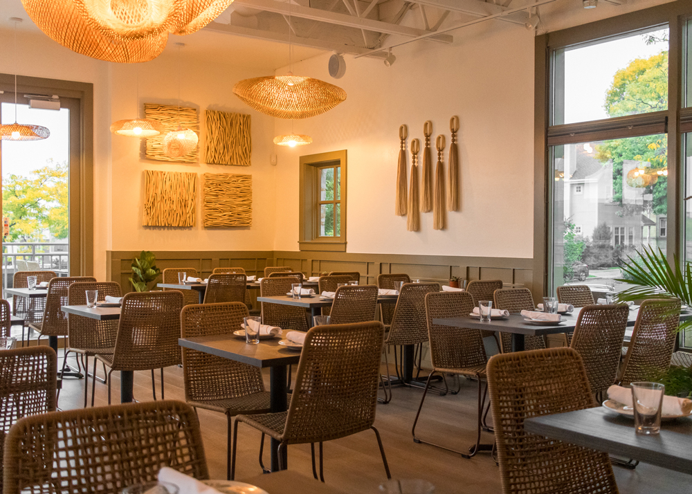
Entering the space, guests encounter two primary colors, white with brown accents. Together, they create a clean, bright, energetic space.
That minimalist approach to the colors could have been too minimal, but the design team adds visual interest with texture, Laudizio says. In addition to white plaster, the space includes white wood walls, white painted brick and white tiles.
Similarly, there are different brown textures in the new design, as seen in wood and fabric elements. Design highlights include these egg-shaped lighting fixtures, which align with a breakfast concept.The design’s original plan called for the use of walnut for the brown wood elements, including, tabletops, soffits and the spindles used on the lower section of some walls and the POS counter face.
Pandemic-related shortages made that impossible. Instead, the design utilizes walnut in some places, while in others ash stained with a walnut finish is employed. According to Laudizio, this approach “looks pretty close to what we wanted and financially it didn’t hurt. It was a little cheaper, and we could get it.”
The upholstery for the chairs and long banquette is a brown faux leather. The name of this fabric, given by the manufacturer, is Cinnamon, says Ladizio. While the color is a shade off of what Laudizio envisioned, the connection with the brand was too strong for Lardakis to pass up.
In addition to inspiring this fabric choice, the menu also directly influenced the restaurant’s lighting design. Pendant lights throughout the space are white and shaped “like an egg that’s been cut open. I found that shape and said this is it, we’ve got to use it,” says Laudizio.
The wood-spindled POS face is topped with a marble-style white quartz, creating an elevated, dramatic effect. And, in a clear nod to the concept’s diner-influence, the floor is a black and white patterned tile that was custom-made. This design, says Laudizio, is more complex than it looks and adds drama to the space.
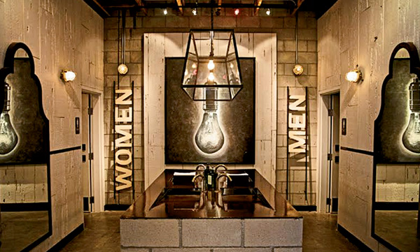
The restaurant also includes some nods to social media sharing, such as a neon sign declaring that “This is the place to be.” Also, social-media friendly, says Laudizio, are the bathrooms, which are done in all black and white, including black-and-white wallpaper and black fixtures. “We like doing cool bathrooms. These days everyone is doing selfies in bathrooms, so there are more requests for areas for Instagram and photographs.” The addition of counter ordering allows Kanela to capitalize on foot traffic in Chicago’s Old Town neighborhood.With this design now set, Laudizio and Lardakis are now updating the legacy Kanela locations with this new look.
This process is simple compared to creating the first restaurant with the updated design. These legacy restaurants don’t need any kitchen, HVAC or other mechanical changes, and the flow of the spaces is defined. All that needs updating are fixtures, furnishings and finishes. The chain is in the process of bringing all these new elements into all the old stores. Nothing will be left out.
This investment, Laudizio predicts, will be well worth the time and money. While the old look eventually became outdated, the new modern, minimalist approach should stay relevant well into the future.
“This was designed so it would be timeless for the next ten years. I think we’ve done a job where it can be. Sometimes when you design and detail with the latest trends, it goes out of style in three or four years. The goal was to make the investment in the space efficient so it could last us ten years and still look modern.”
Project Team
- Project lead: Rocco Laudizio, principal of Slick+designusa
- Architect & interior design: Slick+designusa
- Kitchen supplier: Olympic Store Fixtures
Snapshot
- Headquarters: Chicago
- Concept owner: Chris Lardakis
- Concept: Breakfast/brunch/lunch with full service and to-go options
- Location of prototype: Chicago’s Old Town neighborhood
- Opened: January 2023
- Size: 1,400 square feet on the first floor and 950 square feet in the basement
- Real estate: In-line property that’s part of a historic structure.
- Design highlights: Custom black and white patterned tile, walnut tables, egg-shaped light fixtures, and a well-designed operation in a small, narrow space.
- Build-out time: Six months


