Americans have always enjoyed convenience. And with c-stores increasingly going after restaurant market share, it makes sense that restaurants would counter by increasing grab-and-go offerings. The addition of offering grab-and-go items — even in unexpected market segments like fine dining — can drive sales and expand branding opportunities.
“You’re seeing grab-and-go everywhere, from corporate campuses to K-12 schools, to hotels, restaurants and even retirement homes,” says Jeremy Kittelson, director, Ricca Design Associates, Denver.
It’s driven by a couple of reasons, he says, mostly the convenience factor that everyone’s now used to, but it’s also a revenue driver with low labor cost.
There are two types of grab-and-go, Kittelson points out: manned and unmanned spaces. A manned space may have an employee working the register, but this may also extend to heating food, like putting a prepared sandwich into a panini press.
What’s important with grab-and-go areas is that they are intentional, says Sean Callnin, FCSI, executive principal with Ricca. “Grab-and-go can enhance or strengthen a brand. It's not an afterthought; it’s very purposeful if you do it right.”
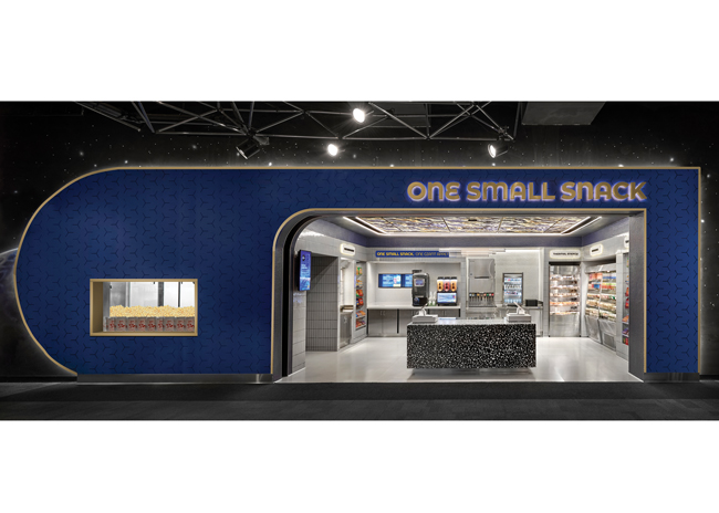
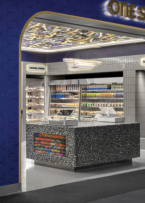
 This space-themed grab-and-go location designed for a museum allows passersby to see every element at a glance. Images courtesy of Aria Group Architects
Clear wayfinding is key
Island Provisions has a robust grab-and-go offering in its two restaurant-markets on St. John’s Island, S.C., and downtown Charleston, S.C.
As customers enter the business, three refrigerator doors offer salads and snack items like olives as well as beverages. A stainless-steel shelving unit, located opposite the coolers, is stocked with dry goods such as chips and pantry items.
Next, customers encounter the cash registers and a self-serve area comprised of a gray cabinet covered with a white quartz countertop containing organizers holding condiments, napkins and silverware. From here, guests can leave through a covered patio. “The design helps push people through the space and out the back door,” says Emily Florian, co-owner.
Sana Ahmad, senior designer, and Elizabeth Plecha, project designer, were part of the team from Aria Group Architects, Oak Park, Ill., who designed a grab-and-go area at a Chicago-area museum. The 300-square-foot grab-and-go area has a 250-square-foot back of house. It was designed around a space theme, matching the area of the museum. “Our aesthetic was materials you might see with a moon landing,” says Ahmad.
The three-sided area features a central counter holding the POS, which is made from terrazzo, inspired by moon rock, and the ceiling features backlit acrylic panels and stands out “to give an other world feel,” Ahmad says. The top of the walls, above the coolers, are clad in gray tile with blue penny rounds, which reflects onto the ceiling.
The grab-and-go equipment is stainless steel, fitting in with the theme, and there’s a window into the kitchen, providing a view of the popcorn machine. The grab-and-go area offers hot and cold snacks and shelf-stable foods and beverages. These offerings are merchandised around three sides of the space — the fourth side is open to the museum and is where guests enter. In the middle, food and beverages are merchandised below the POS stations. This unit was designed to be self-serve but is manned since employees need to be in the space for restocking.
The POS was deliberately placed in the center, Plecha says, so customers could flow around it and pay on either side.
All food for this area is made in its own kitchen. The front-of-house refrigerators are all open air, which was deliberate for speed “and we didn’t want people opening doors and hitting someone else,” says Ahmad. “It allows for easy access and also means we don’t have to worry about keeping the temperature correct.” All equipment is vented at the bottom.

Viable visibility
An important factor with grab-and-go areas is visibility. Whenever possible, they should be visible from outside the restaurant as well as inside. You need to strike a balance, Kittelson says, between having it visible to passersby on the street to drive impulse visits and to those inside who may not be as concerned with speed of purchase.
Potential customers need to see that a grab-and-go option is going to be fast before they even enter, Callnin says, and see their path from selecting food, to payment and back out again. A POS station isn’t always a must, he adds, and could even take the form of a wandering employee with a tablet who can check customers out or a simple tap-and-go technology station.
If you feel you can’t fit in a grab-and-go area, think of what you could eliminate, says Callnin. Do you need a large waiting area? A coat closet? A host stand?
Grab-and-go sections can be placed at the beginning of a line or at the end of it, by the POS station, Kittelson says. If they’re at the end, it’s a good idea to merchandise sweet items like cookies, for an after-meal treat.
At the same time, designers need to ensure grab-and go areas don’t interrupt a restaurant’s flow. “Flow is so important to sales, making sure people can get in and have a good experience and don’t have to walk past a line if they’re eating in. You have to consider everyone — eating in and taking out,” Kittelson explains.
David Shove-Brown, partner, //3877, a design firm in Washington, D.C., ideally incorporates these spaces as part of the flow from picking up food to moving toward payment. He likes customers to see snack grab-and-go areas coming up, which means they start thinking of what they might want to add on to their meal.
Fitting in and standing out
Grab-and-go areas change to: are increasingly are increasingly common in restaurants. “They’re becoming an integral part of the design,” says Kittelson, who points out that building them in with millwork or powder coatings to match the front of the house makes them part of the operation instead of an eyesore.
Grab-and-go areas have to fit in, says Callnin. “Spend the money in the appropriate places. So, if you’re going to have a refrigerated case, either save on dry retail shelving and spend money on a good-looking case with good lighting or surround a less expensive case with millwork, so it reinforces and strengthens the brand.” Ventilating the cases is important, he notes. Compressors need to breathe so leave an air gap for circulation.
Clean and clear
Employees need to monitor grab-and-go areas and condiment stations regularly to keep them clean and tidy, says Kittelson. So, if you can build in some small cupboards to house cleaning materials under the condiments, it’ll make it easier and faster. “Nothing is going to hurt your sales more than someone walking up to a dirty grab-and-go area.”
Don’t let condiment stations be an afterthought either, Callnin says. They should also be a continuation of your brand. “Everything should be complementary. Even the bags everything goes in, make them part of your brand.”
 A grab-and-go station needs to be an extension of your brand, says Callnin “and that encompasses everything, from the signage to the packaging, the colors, the labeling. “The more you can get your logo out there, facing forward on all packaging, the more exposure your logo has,” Callnin says. “It’s a merchandising opportunity.”
And don’t skimp on packaging, Callnin warns, “because it’s an extension of your brand. “Customers need to be confident that everything in that case is the same quality as the dine-in food. Use the same names as your menu items, the same descriptions, have the logos facing out, and make sure the case has color, from logos and the food itself.”
Making it clear — from branding and signage — is key. Island Provisions’ grab-and-go areas all have signage above them, such as “Hang Out or Grab-and-Go” and “Salads+Snacks+Beverages.” The signage matches the store’s branding.
Signage of grab-and-go areas varies, says Kittelson. Some operators want these spaces to blend in and feature the same colors and graphics as the restaurant; others like to draw attention to them with fun signs, chalkboards or digital screens.
Any grab-and-go signage should also reflect your restaurant’s brand and the configuration of the restaurant. A grab-and-go station just inside a restaurant can be better seen from outside with signage, or you could turn it into a window sign, points out Callnin.
On the flipside, if a grab-and-go area is designed well it doesn’t need signage, says Shove-Brown, but he does encourage operators to have some fun with it and be clear with signs that offer specific messaging like “Don’t forget the cookie!” “Advertising sells,” he points out, “so whet their palates at much as you can.”
At the same time, make sure that cases are well lit, says Callnin. “You want to highlight the case, bring out the color, make it easy to read the signage and labels. You need it bright in the appropriate places and have it stand out well.”
Equipment requirements
Grab-and-go refrigerators should either have air curtains or sliding doors, says Shove-Brown, because doors that swing open make it difficult for restaurant flow. And it’s even better if a refrigerator is double-sided, especially at busy meal periods, so employees can load them without interrupting the flow of customers. Another disadvantage of doors — swinging or sliding — is condensation can build up on them, making it difficult to see what’s inside.
In the back of the house, ensure your storage for grab-and-go is organized. It doesn’t have to be kept separately, or in a separate walk-in, says Callnin, but it does need its own specialized area “whether it’s a rack in your walk-in or reach-in. But it needs to be organized so you manage your first-in, first-out product and manage the schedule of production, packaging and service.”
With a little bit of thought, grab-and-go areas can be excellent revenue drivers with low labor and a lot of recognition.
Key Takeaways
- Grab-and-go stations can be manned or unmanned, depending on space and concept alignment.
- Visibility is important. When possible, make grab-and-go areas visible to passersby.
- Clear wayfinding is key. Ensuring customers understand how to move through the space from item selection to payment will increase visits and sales.
- Clear signage can aid in both wayfinding and visibility as well as merchandising and sales.
- Design of the grab-and-go area should reflect the restaurant’s brand or design.
- Equipment selection should include considerations for both merchandising and venting in addition to aesthetics.


