Though it’s currently shut down in response to the pandemic, the Round Robin Bar in Washington D.C.’s Willard Intercontinental hotel is one of that city’s most storied watering holes. First opened in 1847, the bar has hosted luminaries such as Walt Whitman, Mark Twain and Abraham Lincoln.
Even storied spaces need a facelift now and then, though. The space had a very old-Washington feel, with dark green felt walls and dark stained wood. Tracy Morris of Tracy Morris Design was tasked with updating the Round Robin Bar’s look but maintaining the historic feel that helps make the space such a draw.
“If you modernize it too much, it loses what makes it special. That's what I was worried about. Thinking about if from the hotel and hospitality income perspective, if it changed too much it might change the entire flow and demographic of the space,” she says.
One of the biggest changes Morris made was to the walls. While they were previously a forest green, they are now covered in a grass green beaded wallpaper.
This material not only lightens up the space, but the beading (small bits of reflective material covering the wallpaper) adds a warm glow to the restaurant.

"Every time you turn on the sconces or any of the chandeliers in the space, it glows. That was the whole point, to give it a warm glow. People are coming there for libations and socializing, so you don't want any lighting that is too harsh or colors that are too harsh.”
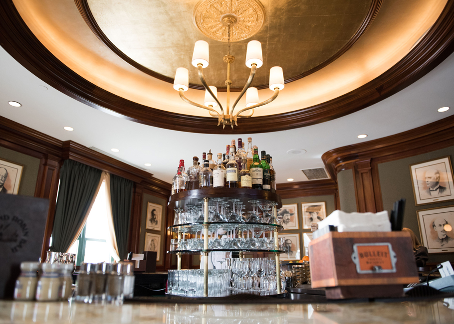
 More glow can be found overhead. The operation gets its name from its circular island bar. While there was never a thought of removing it the whole area got a facelift. The space above was outfitted with a new chandelier, which was adorned with hand-applied gilding.
The bar itself was installed with a new granite bar top with some slight green veining. The bar face also changed from its legacy deep mahogany stain to a warm walnut finish. This, says Morris, maintains the warm and historic feel of the space while brightening it a bit. And in another nod to modernity, the bar was retrofitted with outlets, allowing guests to charge up while enjoying a drink.
 The finishes on the bar seating got plenty of attention in the redesign as well. The space has a tight color palette, with medium greens and browns peppered with golds throughout. To provide some variety, the designers gave special attention to details like texture where possible.
The back of the barstools provides a prime example, Morris says. While its color pairs well with the leather on the banquettes, its embossed diamond pattern adds a needed pop.
“There is so much leather in that space between the banquette seats on the other side and the seats on the bar. If you did just two colors of leather, it would fall flat. [The embossing] allowed for those two colors to be pulled together and give it a bit of texture.”
While a main goal of the redesign was to maintain the bar’s historic feel, the designers gave its entry area a modern touch. Instead of the green beaded wallpaper, the designers chose a gold ombre wallpaper, which also lit up the space.
 Not only does this offer a bit of variety it also makes sense from a durability perspective. Beaded wallpaper is very delicate. In the bar, the beaded paper is protected by banquette seating. The entryway has no such protection.
“Out in the main space as you walk in that beaded wallpaper is way too delicate. People's luggage or arms would constantly snag it. We did much more of a heavy-duty paper that could handle a lot of wear and tear,” Morris says.
This space doesn’t feel completely separate from the Round Robin Bar’s main area, though. The carpet is the same, while the chairs in this section follow the bar’s color palette but have higher backs and are tufted.


