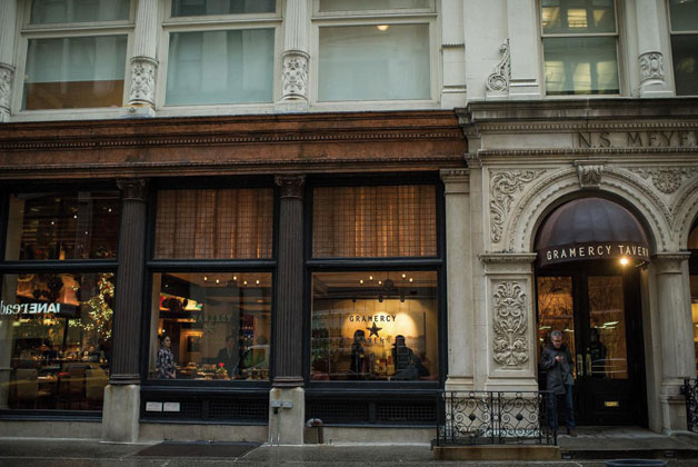
Food critics most likely will never write about a restaurant's entrance. To them, it's all about the food and the service. Yet, the entranceway represents a key element — the first, in fact — of a dining experience. The entrance reflects the hospitality the staff will deliver once diners take their seats.
"The key thing is to put yourself in a position to offer really, really strong hospitality," says Richard Coraine, senior managing partner, business development and consulting, for the Union Square Hospitality Group (USHG) in New York City. "You do that when you greet [diners] with a sense of welcome and in a way that is not imposing physical or emotional barriers."
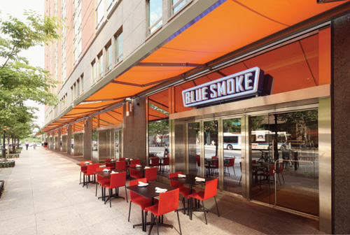 Blue Smoke restaurant entranceUnfortunately, time tends not to be on the side of the restaurateur. It only takes five seconds or so for customers to form a good or bad impression from environmental cues once they cross the threshold. Luckily, restaurant operators can employ a number of tried-and-true tactics to use in their entrance strategies that will make guests feel welcome and properly represent a specific brand's promise.
Whether transforming an existing location or building from scratch, a restaurateur should plan to carefully execute three important elements from the outside in:
- The doorway
- The foyer
- The welcoming staff
Each has its own particular challenges. How the restaurant meets each challenge will depend on what the brand personality dictates and the space available. As Coraine says, in this case "one size fits one."
The Doorway
Coraine recommends paying attention to anything on the immediate outside of the entrance that is under your control. This means everything you would experience before you step through the door.
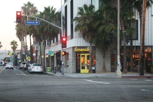 Lemonade's Venice Blvd. entranceThe choice of door and hardware matters a lot, he adds. In addition to the visual impact, functionality represents a key consideration. Emotional barriers can form if a customer cannot determine which way the door opens due to an overly artistic design or if a door is too heavy, requiring two hands to open it. "You shouldn't have to struggle to get in," Coraine says. "I've been to restaurants where the air intake has not been balanced properly, so you have to pull really hard on the door. It may be because the air conditioning is trying to do makeup air and is keeping that door shut."
Weather plays a role, too. During the winter months, Coraine thinks it is vital to consider placing a temporary enclosure outside the main entrance. It serves a valuable purpose, allowing customers to step inside from the cold and the elements and compose themselves before entering. Plus, it prevents a cold blast from going into the foyer, impacting people waiting in line or sitting at tables near the front.
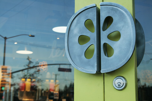 Lemonade's door handleIlan Dei, of Ilan Dei Studio in Venice, Calif., faced a different challenge for the outside of the locations he's designed for the 12-unit Lemonade restaurant chain. Lemonade is a modern cafeteria-style concept that features "seasonal California comfort food." Some of the restaurants are in malls reachable on foot and some are "drive-bys." What Dei calls a "car-driven entrance" has different requirements from a "walk-in entrance."
If the restaurant has to be visible from a car, it needs to attract visitors like a billboard, he says. Dei's strategy: Use large windows that allow potential guests to see the inviting physical space from a distance. "This communicates a clean and welcoming environment," he says. "How you read the physical space from the car and how you read the space when you are walking, from eye level, is very, very different."
Dei uses enough elements, like color, to make the units seem the same, but the design allows them to fit into the location's environment. One common element is the customized door handle, which looks like a slice of lemon, enhancing brand recognition. This signature element impacts diners as they walk through the door, he says.
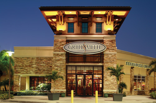
GrillSmith is a refined-casual, chef-driven restaurant chain with six locations in the Tampa Bay, Fla., area. According to Billy Grimm, president, the chain aims for an atmosphere where guests can "relax and feel special."
The strategy behind GrillSmith's entrance is to make guests feel special as they come through the door. The entrance features stacked stone, Grimm explains, along with wood and wrought iron. "The polished craftsmanship provides an inviting atmosphere that is crisp and classy — but not too stuffy — to make guests feel welcome," he says.
The doorway to a restaurant sends the first message about how customers will feel once they enter. The foyer is next.
The Foyer
Danny Meyer's Union Square Hospitality Group, which includes Shake Shack, Union Square Cafe, Gramercy Tavern and Blue Smoke among others, is known for great food and excellent hospitality. Coraine points out that, with the exception of Shake Shack units, USHG's restaurants reside in pre-existing spaces. This presents design challenges. "You are put in a position to create the most welcoming environment for people based on the architecture that you're given. Rarely do you get a square box where you can create the proper ambience you want," he says.
As an example, Coraine refers to Gramercy Tavern, which Zagat describes as "soothing" and "elegantly rustic." "We specifically created that entry foyer for a feeling of place. By that I mean, if you look at the design of the floral arrangement, the art on the wall, we wanted the front of Gramercy Tavern to be seamless with the rest of the environmental experience."
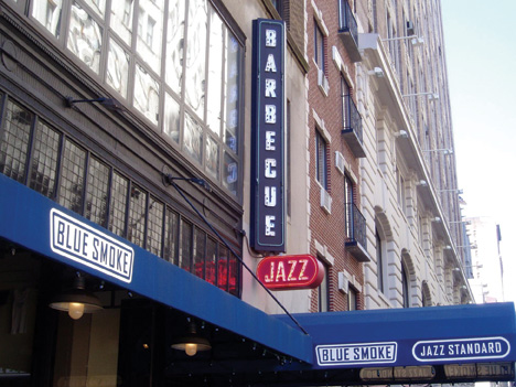 Blue Smoke awningDuring the design phase, Coraine and Danny Meyer use an old-school but workable way to determine what needs to be done to create a welcoming foyer. "Danny and I do an exercise with every single restaurant we design. We take a floor plan of the building and the space, and we pretend that our two fingers are somebody walking in. We say to ourselves, 'What do I see, and what do I feel like when I get here?'"
"You put yourself in the position to offer really, really strong hospitality when you have the ability to look somebody in the eye and greet them with a sense of welcome, or process them in a way that is not imposing physical and emotional barriers," Coraine says. "I wish it was more scientific than that, but that's how we look at it."
Coraine brings up a point that he believes a lot of operators think about as an afterthought, which is the coat check. "It's something we think about as one of our primary thoughts. It's going to sound somewhat trivial, but in the months of November through March, a coat check becomes something I believe is a function of hospitality."
Some restaurants are not blessed with ample space to devote to coat checks, he explains, plus they have a shelf life of only five months. "No one checks anything of volume in the summer months. So the question becomes how can you carve out space for a coat check while still leaving enough space to have an area that feels welcoming?" Restaurant operators can sacrifice a great deal of storage and sales opportunity or the ability to open the room up more for bar seating, Coraine says, but at the end of the day the coat check adds to the hospitality, even if only in the winter.
At Blue Smoke, a barbecue concept, Meyer decided to only accept reservations for 50 percent of tables. He wanted it to be a neighborhood place where locals could drop in without a two-day wait for a reservation. This means there is usually a line of 20 to 30 people waiting for a table, standing in what is a small foyer area. A line of customers, of course, is a good thing to have, but it meant sacrificing the space for a coat check. Instead, runners take coats to a location in the back and bring back check tags, a process that takes a minute or more.
Some restaurants separate the foyer from the dining area, and some keep it open, depending on the brand identity. Coraine explains that, at one restaurant, they didn't want customers to just walk into the coat stand and bump into a bunch of bar tables. The solution was a decorative metal divider placed behind the reception podium that defined the bar and dining area, making sure that people coming in the front door wouldn't bump into people sitting at tables. The top of the divider was just below eye level so customers could see diners but the two areas were still separate. "We did that from doing the two-finger walking exercise," he explains.
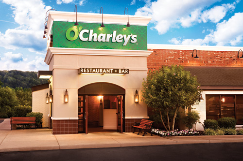 O'Charleys
O'Charley's takes the open approach. The 44-year-old casual dining chain has recently updated its prototype. "We wanted to bring the classic brand into the 21st century with a modern, open and inviting spirit that remains true to the people, Southern hospitality and ideals that have made O'Charley's an American institution," says Jen Sanning, chief marketing officer at parent company American Blue Ribbon Holdings. With this re-imaging, it was important to create an entrance that clearly conveyed all of these elements.
The new O'Charley's has an open, welcoming layout, and the entrance introduces that design. From the entrance, diners can see into the different dining rooms. Each entrance features a graphic quote from founder Charlie Watkins that says, "Everyone who walks through this door is a friend of mine." Sanning adds, "We want [guests] to feel comfortable as they arrive at our restaurants — to feel as if they've just shown up at a friend's or neighbor's house for a meal."
Sanning points out, "Just remember that how a guest is welcomed when arriving is always the first impression. This is, hopefully, the start of a great dining experience for them."
The Welcoming Staff
Hospitality Quotient (HQ) is a consulting firm under the aegis of Union Square Hospitality Group that focuses on helping companies build and sustain a culture of hospitality as a strategic competitive advantage. It was founded by Susan Salgado with Danny Meyer, and Meyer's philosophy of "Enlightened Hospitality" serves as its basis.
"At HQ and USHG we talk a lot about the difference between hospitality and service," Salgado says. "Service is very technical. It's managing the entryway, checking people in, making it technically easy for people. Hospitality is having the whole experience infused with warmth and welcome. When you put these two together, you get this amazing experience of really being taken care of. In your evaluation of an entrance, you're going to have those two components. You have to ask, Does the design allow staff to greet people really well, and does it help people coming in the door feel incredibly welcomed?"
Getting the right people to work the entrance represents a key challenge, Salgado says. "You want to hire people that have an awareness of others and an awareness of themselves: how they appear, facial expressions, body language." Training is a key element, she adds, but "people at the front door need to have an incredible capacity to notice things, many things at the same time."
It is important that leaders give the reception staff clear expectations about what the guest experience should be like. Do not assume everyone automatically understands this. The goal of the entranceway should be to draw people in and make them feel immediately comfortable, she says.
Coraine agrees. He believes the greatest design element and most memorable asset a restaurant can have is the warmth of the welcome. "I've been to restaurants in the U.S. and abroad where they don't have any entrance space, but the warmth of welcome is something that is memorable," he says.
"When people walk in the front door — it's the two fingers walking the layout again — what is our approach to making them feel welcome? Have we given the people we've hired the right tools and right training and the right setup to make the greeting memorable?" Coraine asks. He adds that, if you have too little space in the foyer, it can always be overcome by training the people doing the welcoming. In fact, he goes so far as to say, "I think that's the most important design element of any restaurant — the people in the front."

