This fast-casual chain managed internal and external relationships to update its look.
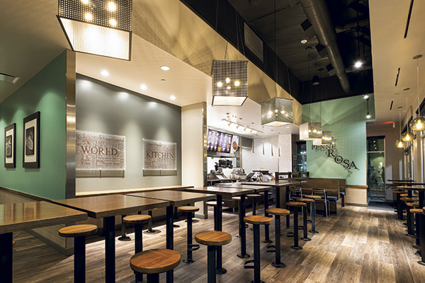 Brighter brights and darker darks help create a more dramatic dining experience.The old adage “If it ain’t broke, don’t fix it” has mixed results in the world of business.
Coca-Cola definitely should have followed that advice before dumping its original formula in favor of New Coke, only to change back a few months later after customers complained. On the flip side, however, is a company like Blockbuster Video, which didn’t seem the least bit broken until Netflix came along and showed exactly where its cracks were.
It seems that no matter what a company chooses to do, the decision to evolve or stick with what works brings some significant risks.
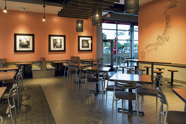 The redesign features several different types of seating, allowing diners to choose the experience they want.For its part, Noodles & Company falls squarely in the evolve camp.
Founded in 1996, this fast-casual chain specializes in made-to-order noodle-based dishes from around the world, from pad Thai to Wisconsin mac and cheese to classic spaghetti and meatballs. With more than 500 stores in 35 states, business had been going so well for the chain that its look hadn’t been updated in more than a decade. The time finally came for Noodles & Company to undergo a redesign, says Vice President of Design, Construction and Facilities Michael Ulm.
According to Ulm, the reasons for Noodles & Company to update its look ran far deeper than a simple makeover. Millennials and their families have different expectations of restaurants than Gen Xers and Boomers; capturing those diners means changing the front of the house, he says. At the same time, the way customers interact with the chain has evolved in recent years, with more than 40 percent of its orders now coming from to-go customers. “You take all those things and gather them together in one place, and all of a sudden, what we were doing was probably not the best face to put toward our customers,” Ulm explains.
Starting in early 2015, the company began working on a redesign project to address all these issues. The end result is a new prototype that uses color, lighting and furnishings to create a more dramatic space and provide diners with seating options that offer a variety of dining experiences.
Brighter and Darker
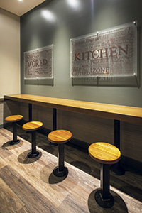 The to-go area has a counter-height bar that customers can place their drinks on and lean against while facing the POS station and waiting for their order.Walking into a newly designed Noodles & Company, one of the most striking changes customers will find is with the color palette.
“Traditionally, with the look and feel of our restaurants, we were in the middle of the color band. We were using some greens and yellows and orange colors,” says Rob Levinson, the chain’s director of design. “Now what we’re trying to do is go with brighter brights and darker darks — create a little more drama in the dining room.”
One prominent spot with brighter brights is along each store’s queuing area, dubbed the Welcome Wall. The bright color of this wall, says Levinson, should attract the eyes of customers and indicate to them where to get in line.
The designers also used this space to address one of Noodles & Company’s operational challenges, Levinson adds. Given the chain’s unique menu, new customers can sometimes find it challenging to figure out exactly how and what to order. Along the Welcome Wall are menu boards framed in dark woods. This gives customers a chance to preview the menu and decide on their order before making it to the POS station. The chain’s full menu is posted above the POS station as well.
Behind the ordering counter, customers will see another feature that has been amped up. While the operation has always had an open kitchen, the new design highlights its fresh-made food. To showcase food quality and freshness, the kitchen features produce displays, a fully visible food preparation area and even refrigeration with see-through windows. Most important, though, is what the chain achieves through lighting: The POS is downplayed with darker lighting and some focused lights only where needed, while bright lights are placed above the sauté station, where most of the action takes place.
“Ideally, we want the guests to see our blue sauté pans and our cooks and the theater and art of cooking. If nothing else, we want them to see the cooks who are cooking their meal and hear the sizzle of the fry pan — that sort of thing,” says Levinson.
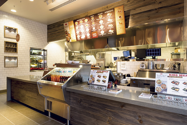 Noodles & Company’s open kitchen is brightly lit, driving home its fresh-made food and adding some energy and theater to the space.Lighting was an important tool in the designers’ work on the dining area as well. Along with furnishings and flooring, it was key in setting up distinct areas that offer customers different types of experiences. Notably, the design doesn’t rely on physical barriers to define these areas.
“It’s still a pretty open seating plan, but I think in the new design, you will gravitate toward the experience that you want to have in that restaurant, simply by the way it’s set up,” says Ulm.
While most dining spaces have carpet, for instance, walkways are tiled and generally have low lighting. Large booths are likely to attract families, so they have brighter lighting to make it easier to monitor and manage children. High two-tops have lower lighting that creates a more intimate atmosphere for couples. Each of these seating areas has a custom-made light fixture made of perforated metal in different geometric shapes, which helps to distinguish the spaces from one another.
The to-go area, which is a new addition to the Noodles & Company prototype, was given particular attention in the redesign. The space is located near the POS, which allows customers to watch and respond as soon as their order is ready. Since it’s not a showcase of the new design, lighting is ambient. Furnishings include stools against a bar-height counter attached to a wall, where customers can place a drink or purse while they wait.
Rebuilding Relationships
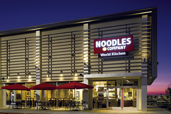 In spite of its solid growth, Noodles & Company took on a redesign to better attract Millennials and serve takeout customers.While the new look and feel of Noodles & Company helps the chain better serve its diners, many of the benefits of the redesign are unseen by customers. The design team specified or customized pieces with improved durability and lower cost of ownership to improve long-term ROI.
One simple change involved carpeting. Rolled carpeting was replaced with square carpet tiles, which can be swapped out at far less cost and effort. Other changes were more involved. The chain, for example, has a signature tabletop: wood with a laminate veneer with long, thin, light wood-toned stripes. Though the customers respond positively to this piece, “it’s a terrible table in terms of actually being a tabletop,” Ulm says. The design and procurement team therefore worked closely with its manufacturers and millworkers to develop a tabletop with the same look but greater durability.
A similar change was made to the stools, which are used for high-top tables and in the to-go area. In the past, said Director of Procurement and Services Nadine Rodriguez, the chain used chrome pieces manufactured in bulk in China. Those stools had maintenance issues, though, and needed to be replaced frequently. Now, the chain has switched to a U.S.-made custom piece with a steel base and walnut seat.
“When the tops wear down, we’ll take them off, sand them down, refinish them and put them back on,” says Rodriguez. “We won’t throw them in the dumpster and buy new ones from China. We’re spending a little bit more on up-front cost, but we expect to realize some really good savings years from now when we’re not replacing them all.”
Making these sorts of changes, she notes, required a shift in how the chain works with its vendors. For years, Noodles & Company hadn’t asked much of its vendors beyond filling orders. The redesign meant they had to change the dynamics of those relationships. That led to some honest, and sometimes difficult, conversations with the company’s suppliers.
“We had to sit down and figure out, how did you guys begin the relationship with Noodles & Company? How has it gone? Has anybody asked how we can make the pricing better, the relationship better? Some of those conversations were really tough to have, but I always gave the existing vendors the opportunity to make it work,” Rodriguez says. While these talks did result in the end of some relationships, in most cases, existing vendors rose to the challenge and were able to improve in areas like pricing, service and product quality, Rodriguez says.
Rodriguez’s efforts on this front, added Ulm, have had a big impact on the success of the project’s financials as well as on the design itself. Working directly with vendors (not brokers) to get the best possible price has given the company the financial flexibility to develop custom pieces when needed.
“The great thing about [our willingness to develop custom pieces] is that it allows Rob’s team to do and dream as deeply as they want,” says Ulm. “At the same time, we know Nadine is going to get in there and find it at a very competitive price in the market. I feel we’re getting a lot of customer work but not paying extra for it.”
Internal Expectations
Relationships and expectations weren’t purely external issues with this project. According to Ulm, the development and design team also had to get the rest of the company on board with the redesign. One of the biggest obstacles to getting this buy-in, he said, was the company’s success leading up to the redesign. “We were doing so well, and I think the internal people we had were questioning why we would want to do anything,” Ulm recalls.
Another issue: Up until a few years ago, the chain’s design, construction and facilities unit functioned as order takers for other groups in the company. While Ulm has added a lot of expertise to his group since joining the firm three years ago — including new directors of design, construction, procurement and facilities — getting the rest of the company to embrace the capabilities of this team meant shifting Noodle & Company’s culture.
To introduce changes in both design and culture, Ulm took it slow, initially changing just one or two elements at a handful of stores. “We altered paint colors in restaurants and brought some of the executive team out there to take a look,” he says. “We altered the stain colors on the millwork and the fabric on the benches, and then we would take them out and try to build some consensus around the fact that, yeah, we can change, be successful and maybe become more meaningful to our guests.”
While piecemeal may not have been their preferred method, the redesign team has taken advantage of the situation. Approximately 85 percent of Noodles & Company locations are corporate stores. Having control of that many stores has allowed the redesign team to experiment with elements like paint colors, millwork stains and lighting schemes. At interview time, in fact, the chain was testing different design elements in 16 stores in its home state of Colorado. “It’s been a really quick laboratory for these guys to take a look at what we want to do and roll those things back into the new design,” says Ulm.
With so many variables to Noodles & Company’s look under review, the company doesn’t consider its work on the redesign fully complete. While some elements, like lighting fixtures and distinct dining spaces, are set, others, like paint schemes and millwork, may still be tweaked. And while the company will at some point consider the redesign finished, it will still be willing to fix even those elements that don’t seem broken, according to Ulm.
“We are going to get to a place where we feel we’ve got our standard solution, but at the same time, there’s no decision we won’t reconsider tomorrow if something comes up,” Ulm says. “If it’s a better thing to do, we’ll do it.”
- Snapshot
- Headquarters: Denver, Colorado
- Owner: Publicly traded
- Concept: Globally inspired noodle dishes
- Segment: Fast casual
- Average check: $8
- Locations: 35 States, Washington, D.C., and one Canadian province
- Units: 507 system wide as of March 29, 2016
- Opened: October 1995
- Average size: 2,800 square feet
- Real estate: End cap preferred
- Design highlights: Stained beetle kill pine, handmade steel and walnut stools
- Build-out time: 12 weeks
Noodles & Company Team
- Shannon Adamson, Design Manager
- Rob Levinson, Director of Design
- Anna Putnam, Design Manager
- Nadine Rodriguez, Director of Procurement and Services
- Michael Ulm, Vice President of Design, Construction and Facilities
- Justin Yost, Design Manager


