Let’s get this out of the way right up front: Restaurant designers are really tired of reclaimed wood, Edison bulbs and rustic, warehouse, industrial chic. If you’re a client or brand chasing that look right now, chances are you’re getting gentle (if not exasperated, eye-rolling) pushback from your design partner. It’s time for fresh ideas and insights, and we’re serving up plenty of both, courtesy of this year’s Designers Dish! panel.
Leading design firms from coast to coast and in between, they’re six well-seasoned pros who help put the buzz in some of the buzziest restaurant and hospitality projects around the country and the world.
Read on for their personal takes on everything from big, market-shaping forces to favorite new finds for finishing projects. And mark your calendars to join us for a special follow-up Designers Dish! webcast, taking place June 21 at 1 p.m. CST.
rd+d: What’s one design or consumer trend that’s driving your work these days?
ALVAREZ: Since the recession, affordable comfort food became the trendy thing to have on your menu, and the same
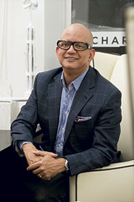
| Rafael Alvarez, ALVAREZ + BROCK Design New York, N.Y. |
 |
| Born and raised in the Dominican Republic, Alvarez spent more than a decade as design director at New York’s Tihany Design. During his tenure there, his projects included some of the country’s most iconic restaurants, including Per Se, Le Cirque, Shun Lee Palace and Spago Chicago. In 2005, he and Brannen Brock, a senior designer at Tihany, formed ALVAREZ + BROCK, a multidisciplinary design firm specializing in restaurant and hospitality projects. 5 projects: Uncle Sam’s Burgers, Uncle Ted’s, Lucier, Izakaya, Tacos & Tequila Inspiration: Art and fashion. “Art because I was a painter before I was an architect. I go to a lot of museums and galleries where you can feel the artistic freedom, see fresh ideas and get new perspective. Fashion because it’s so fast and forward-looking. You have to have a vision for what’s going to be hot a year from now.” On trends: “Everyone scrambles to follow them, but they don’t last. Nobody thinks about the simplicity of places that don’t change by trend, that are timeless. One of my dreams in life is to design a place where 95 years later, someone like me goes there just to see it again and appreciate what it is.” Restaurant pet peeves: Poor service, TVs, formulaic design and decor. “The abuse and overuse of recycled/reclaimed wood and Edison bulbs in restaurants and bars is insane!” |
thing happened with design. It became very uninteresting. It was like people thought that just because they were now doing inexpensive menus, there was no need for good design. Some clients are starting to realize that now everyone else looks the same, and we’re telling them that just because you’re a QSR or fast casual doesn’t mean your restaurants have to look inexpensive or lack design. We did Uncle Sam’s, a small burger place in New York, and it’s completely different from what everyone else is doing. It’s not industrial. It’s a little more elegant and simple but with color. At some point, consumers are going to start pushing for a little bit more.
MCCORMACK: It’s true that post-recession, fast casual became a huge trend, and it really impacted the casual-dining guys, too. That’s how the whole trend of concrete, brick, steel and reclaimed wood came about. People opted for comfort and authenticity over high-end dining. Now, we need to move on from that. If you’re a multi-unit operator whose brand has that look, an abrupt change probably isn’t the way to go. Rather, we’re moving toward maintaining some of it but evolving the look by introducing some more contemporary elements that enhance it and play off it.
DWIGHT: Our designs are getting a little lighter, losing that dark weightiness that’s been so prevalent over the past several years. We’re seeing and using more whites, grays, pastels and colors like seafoam. And while the reclaimed look seems to still be going strong, and we’re still using reclaimed materials as part of sustainable designs, we look for things that don’t have the tired, reclaimed look. Green and reclaimed projects don’t all have to have that rustic edge to them. You can find and use those materials in fresh, new ways.
SHEA: The back-of-the-house kitchen is now the front of the house. We’re lifting the veil over how food is being prepared and bringing guests into the culinary adventure. We did a QSR burger concept at the Mall of America recently, and they’re grinding hamburger up in the front, right in a room behind the front window so everyone who walks by can see the meat being freshly ground. Not every restaurant we do has, or can have, an open kitchen, but there are elements of it — there’s an authentic connection to food in the design.
SIRNA: There’s a major trend toward local, organic, high-quality ingredients and concepts, taking a nod from farm-to-table producers. The food should inform the design, so we take this idea and integrate it in subtle ways in projects where this is a focus — for example, by using only local craftsmen to produce the furniture for the space.
rd+d: Millennials have been a big discussion point for designers and developers the past few years. Are they still?
POLACEK: Any restaurant concept has to understand its target customer. If it’s Millennials, there are some considerations that rise to the top. They want food that’s healthy and authentic, and, especially in cities like San Francisco, they’re always in search of that next ‘true’ experience — the best artisan coffee, the best donut. It’s not about the nicest or coolest or most beautiful restaurant, it’s more about the idea of seeking out the authentic for a complete experience. They also have high expectations for technology and connectedness, and that’s increasingly relevant for restaurants to pay attention to.
MCCORMACK: Across the board, clients are very interested in capturing the elusive creature called the Millennial — this big, upcoming group with buying power. They see places that have been successful in doing so and want to figure out how to follow suit. I like to think of Millennials not as a demographic but more as a psychographic. It’s really a way of thinking and a shift in what this group is looking for. Namely, they’re no longer striving for uniformity in the brand experience. They prefer concepts that offer some kind of local relevance. They seem to gravitate to places that have authenticity and that capture the essence of the surrounding community, neighborhood and culture. It’s tough for a multi-unit operator to do that because they don’t have the time or the budget to tailor the design to each location. Many are trying — for example, by using local photos instead of standard art packages — but I don’t think they’re going far enough.
DWIGHT: Whenever we talk about the Millennial factor, we always come back around to feeling that if you do a good job, they’re going to come. We never design specifically to that demographic. But there have been some subtle shifts. For example, we’re starting to see fewer TVs in bars. Now, everybody — Millennials, in particular — carries a smartphone or mobile device, and there’s less of an argument for TVs to keep people connected and entertained. They can watch TV or check the score on their phones any time.
SHEA: We do projects for Macy’s all over the country, and their recent renovation of the Herald Square flagship store in New York is a case in point. They redid their lower level for the Millennial demographic, which was interesting because it’s a group that typically has little money and shops online but that loves unique experiences. Food is a big part of that, and to complement the retail mix, we created a concept called Chef Street. It’s a food truck court that embodies a lot of the characteristics that appeal to Millennials — fresh, rustic, craft, sustainable, streetwise, indoor-outdoor, gluten free, etc. In fact, while most of the restaurants we work with are trying to find the key to the Millennial market, I don’t think there’s enough substance there to support a laser-focused strategy. These are people who are burdened with school debt. They’re struggling to get started. We think it’s more important to focus on creating transgenerational experiences. Everyone wants the youth and energy of the Millennials, but they also need the money and stability of older consumers.
rd+d: What impact is technology having on your projects?
SIRNA: Mobile-based technology has become such an integrated part of our lives, and as designers, we strive to create spaces that are more social-media friendly. Along those same lines, the need for charging points has become a modern dilemma for designers as owners are now requiring that convenience outlets be provided so that customers can charge phones or plug in laptops. Creating ways to seamlessly integrate that technology is a new challenge we’re facing.
ALVAREZ: Behind the scenes, technology is making it easier for us to create and maintain the type of atmosphere the client wants — specifically, things like sophisticated lighting controls that are fully programmable and automated. But in a lot of cases, it’s also being incorporated more out front. For the Uncle Sam’s project, every single table is designed so you can plug in your mobile device.
POLACEK: It’s evolving so fast. We’re ordering food from our phones before we even get to the restaurant, interaction between staff and guests is decreasing, and social media is changing the restaurant experience, from the service to the food to the look and feel. As designers, we have to think about how we can communicate within that. Creating bold, Instagram-worthy moments via design is essential and really fun. We’re seeing emphasis on “smart design,” with USB ports at tables and bars instead of plugs and places to connect and engage in different areas of the restaurants. From a materials standpoint, we’re really excited about 3-D print technology. We’re doing a project in Tbilisi, Georgia, and we’re able to print graphics onto wood paneling, so these new technologies really get us outside the box in our thinking.
DWIGHT: We have a lot more flexibility to customize materials. We can envision a print or a pattern for an upholstery fabric or a wall covering, and there are companies now that have the technology to make just what we want or alter things quickly and easily. Not too long ago, such customization would have been too expensive or the original idea would have ended up so watered down. As for the spaces themselves, we’re not seeing a big impact from technology. Some concepts are going to iPad ordering, etc., but in general, I think restaurant margins are so tight that there’s little willingness to take a risk on new front-of-the-house technologies.
rd+d: And in your own work? Have tech tools overtaken old-school methods in terms of what and how you’re presenting to clients?
ALVAREZ: I still always do the initial drawings by hand. Sometimes people get confused by renderings, which show a perfect view. The technology can help the customer to visualize what their place will look like, but sometimes it’s too finished and can be misleading because while it looks beautiful and perfect in the rendering, at the end of the day, the place isn’t going to look quite like that.
DWIGHT: It depends on the client, but it seems we actually have better success with more of a sketchy style of presentation that still leaves a little room for the imagination. We try to keep some looseness to it to be able to capture emotions and feelings. That’s tough to do — and really tough to do in renderings.
SHEA: I’m old school, but also high tech. I carry a sketch pad with me, and as I travel, I’m always sketching things I see that are interesting. In the studio, we also sketch a lot of things out by hand. But we also use high-tech, virtual reality tools that give clients a new way to visualize their restaurants. Through virtual reality, we can basically put them into the environment, and they can walk around and see things and get the full experience. They can adjust their thinking and try new things out, so it’s an exciting way of engaging clients in the conversation and the design process.
rd+d: In which materials categories are you seeing the most innovation today?
MCCORMACK: The creative products and custom fixtures being done in lighting are amazing. It’s such an incredible medium for creativity. Given the popularity of the Edison bulb, one of my greatest joys recently was finding an exposed filament element lamp made as an LED. We’re also seeing great innovation in flooring, with luxury vinyl and wood-look tiles. Some are so realistic, you wonder why you’d ever use wood again. They stack up better price-wise, and they’re easier to install and maintain. The same is true in the solid-surface materials category. We’ve always been quick to go to marble or granite, but man-made materials are now so realistic and low maintenance.
SIRNA: Tile has been expanding with a variety of color and texture innovations, large-scale products and unique shapes that appear seamless/slab-like in quality. They’re allowing designers to make a big impact without a big hit to the budget. We’ve also recently begun using materials that aren’t traditionally used in design, such as artificial turf, as well as neon and large-scale murals, to make big impacts.
SHEA: Sound is a huge deal in our world, and a lot of new materials are now available that have both great acoustic properties and great-looking design. I’m also excited about some of the new large-format tile products. Concrete floors are great, but they have maintenance issues and they stain. Now we’re seeing big tiles — three feet or a meter square — that are just incredible. They’re simple, stylish and durable. And of course, there’s lighting. The biggest innovations are coming from the LED world. You can’t get an A19 bulb or a fluorescent lamp to do anything that these tiny little bulbs can do.
DWIGHT: The coolest things are happening in lighting, both in aesthetics and functionality. One example: We just were introduced to individually programmable LED bulbs that work in existing lights. For remodels, we could change the setup of the lighting in the restaurant without having the expense of rewiring everything and putting in new fixtures.
POLACEK: The reintroduction of the porcelain tile is fascinating. We’re seeing it used in new ways, like very large-format wall tiles that are pretty amazing and let us push the boundaries on how we surface floors and walls. We did a project recently where we did beautiful columns in porcelain tile. They look just like white Carrara marble columns but were achieved at a much lower cost.
rd+d: What advice would you offer to other designers for presenting concepts or maintaining good client relationships?
SIRNA: Be genuine. Never present a concept that doesn’t excite you, and always be open to client feedback. It allows you to marry design with function and provides the best result for all parties.
ALVAREZ: You always have to have respect for your clients, but you also need their respect. Sometimes they come to you thinking they want a certain look that you know isn’t right or is overdone. I take them to some places or give them a list of places to visit that have that look and encourage them to think differently — to let us make something special. As designers, we need to try to understand what their dream is, what they want, but ultimately, it’s like painting a portrait — it’s your interpretation of them; it’s not a photograph.
SHEA: Everyone is in this thing to create the perfect environments for the clients. You can’t just have a look. You have to have something that works for your clients on many levels. Their success is your success.
POLACEK: I tell our junior designers to go with their gut and not second-guess themselves. Things might not always work, but we’re not heart surgeons here. Nobody’s going to die. And if I could give clients one wish list item, it would be for designers to always be given a clear understanding of the project budget and objectives. Let’s have that conversation sooner rather than later so we can produce the best work that we can all be happy with.
DWIGHT: It all starts with listening — really hearing what the client is saying and internalizing that. That doesn’t mean you regurgitate it back to them in your presentation, but you have to use it to develop a narrative, a story, and work within that to create the design.
MCCORMACK: Don’t bring ego into a project. Developing a restaurant is a team effort. There are so many important players, from the client to the designer, the architect, the contractor. All of us should be focused on the client’s success and creating a restaurant that’s on budget, on time and, with any luck, financially successful. What we do is an investment in the success of that restaurant.


