What's in, what's out, what's coming up next? And how do you factor in answers to all three of those overarching questions to create relevant, fresh expressions of brands that work not only for today but for a few years down the road? Such are the issues that keep many in the restaurant design and development community up at night. To help provide some insights, rd+d tapped a panel of designers and architects around the country for their takes on the current state of restaurant design, trends they think are past their prime (hint: a certain type of wood and a certain type of bulb lead the list) and what clients can do to help ensure more successful design projects.
2015 Designers Dish Panelists
Karen Herold, designer/partner, Studio K Creative, Chicago, Ill.
Girl and the Goat, Embeya, GT Fish and Oyster, La Cave, Crush, Balena,
Sam's Smokehouse, Perennial Virant, The Betty, Salero, Hard Rock Hotels
Stephen Francis Jones, architect/principal, SF Jones Architects, Marina del Rey, Calif.
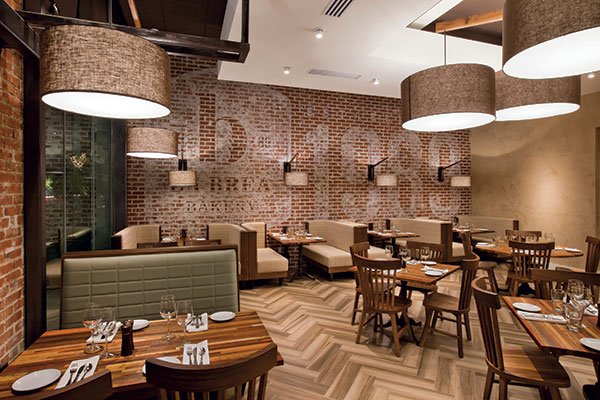
Spago, Del Frisco's Grille, Mr. Donut, 360 Degrees Artisan Pizza, Lazy Dog Café, La Brea Bakery, MB Post, The Grill, The Daily Grill
Paul Lechleiter, chief creative officer, FRCH Design Worldwide, Cincinnati, Ohio
McDonald's, Steak 'n Shake, KFC, Giraffas, Sway Restaurant, Red Mango, American Girl Bistro, Taco Bell, Chi-nnati's Pizza, Pollo Tropical
Eric Mailaender, architect/principal, Resistance Design, New York, N.Y.
Jockey Hollow Bar & Kitchen, Play café and lounge at the Museum of Sex, Lookout Hill Smokehouse, Fat Hippo Restaurant, Sorella Restaurant
Tony Pagliuca, architect/creative director, Studio 500 and ISI, Milwaukee, Wis., McDonald's, Burger King, Taco Bell, Buffalo Wild Wings, Sweet Jeorgia Mae's, Onward Beach Resort Lounge
…on macro trends reshaping the landscape
 Lechleiter: The key thing to think about is where technology plays best in the customer experience, whether waiting for a table or looking at the menu or paying at the table. It always has to link back to the brand experience and the story you want to tell. Lechleiter: We're focusing more on the humanity of things in design. There's tendency with technology to walk away from that, but we need to find those things that bring people together and touch the core of being human. Sure, you can go to dinner with your phone and be pretty comfortable with that. But how do we get people back together and get them talking and socializing? That has to be supported through design. Maybe as part of that, we're seeing much greater desire to create one-off experiences among chains. It's the idea of creating menus and experiences that are local-focused and getting credit for it. Also, fast casual has spurred a frenzy of innovation, which has forced both the QSRs and casual-dining guys to up their games. What's so cool about fast-casual players is that they're so focused around a single product, or meal type, or ethnic flavor. That allows them to stay very true, very narrow and tell a really great story that doesn't splinter. In reaction, the whole industry is scurrying to figure out how to get back on track and to create clarity around their brands.
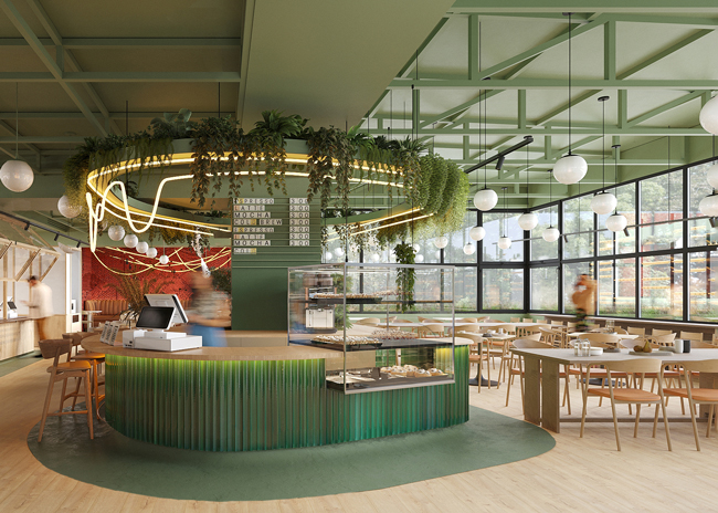
Herold: We do see chains increasingly not wanting to look like chains. It's in part a response to the sort of farm-to-table restaurant trend that has been adapted by the fast casuals. They don't want every unit looking the same anymore, and they want their individual outlets to look and feel inviting and natural.
Pagliuca: Two concepts are driving everything now: relevancy and experience. New and emerging brands are changing the landscape of what the customer expects, so older brands need to manage their brick-and-mortar differently. They have this legacy-bound set of assets, whereas the newer brands are coming in fresh and can make an impact quickly. It's tough, but if older brands delay reimage or remodel programs in the current environment that can really affect how consumers perceive them. There are so many new choices, so it's that quest for relevancy and the need to create fresh experiences that are changing the landscape.
Jones: One of the big drivers is casualization. It's been going on a while, but it's continuing to evolve — both in the work place and in dining. Everyone wants to feel comfortable and social. They want to have a variety of experiences and to be in spaces that allow them to interact. As designers, we've moved toward creating much more social spaces — and I'm talking about work, dining, play. There's not much separation anymore. The spaces need to reflect that and be multi-use.
Lechleiter: Yes, multi-occasion is big. We're working with one new restaurant client and on our first visit we observed that they had designed their place to offer multiple experiences: quiet, traditional dining; a lively outdoor patio; and a comfortable, up-tempo bar area with a variety of seating styles where people can just enjoy drinks and small plates. They speak to different groups for different occasions and let them have it their way, all under one roof. There's no big physical division between the spaces; it's just strategic layout and seating arrangements, but it hit squarely on the opportunity to foster occasion-based use of the restaurant.
Herold: That's an approach that we're using a lot lately, too — taking one big space and creating areas within it where people can gather for very different reasons and occasions. You might go with a big group of friends or for a date, and both experiences are completely different. You can create that with the way you set up furniture, the size of the barstools and chairs, whether they're bolstered or not, how high they are. You feel different if you're in a bolstered chair with an arm than you do on a wooden barstool. It's like with fashion — you feel different if you're wearing a silk blouse than if you're wearing a leather jacket. The materials that you sit at or on affect mood, and you can use them strategically to create different moods in different areas of the same restaurant.
...on Millennials' impact on design and branding
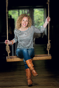 Herold: I would love not to have to touch barn wood any time soon again. Also barn lights. Let’s forget about the barns in the city altogether…I think we’re all ready for restaurant spaces that are a bit more polished, more intentional and with more drama.Herold: It's pretty big. In developing the concept for one project we're working on right now, 80 to 90 percent of the process was talking about this demographic and what's important to them. What's important is how people act and live. Design is much more of an answer to that than a story in itself. So the design takes a bit of a back seat to functionality. The bottom line is that over-the-top design, designing for design's sake, over-branding — these are very much not appreciated by this demographic. Even if it's a really smart design, they're not a group that appreciates design when it comes to, "Look what I did with this amazing wall!" It's more that they're appreciative of design when it functions and does what it needs to do and not much more. To do that, and to still create a space that feels warm and inviting without being overly designed, is where I feel the magic lays for these guys.
Pagliuca: Everywhere I go, whether it's a trade show or seminar or meeting, it's all about this Millennial conversation. Obviously, you have to address it, and Millennials are a topic that clients are very interested in talking about. But you have to start with understanding the brand identity and core customer, which is what and who you're designing for. If Millennials are your core customer, of course you need to put a lot of consideration and weight behind that, but really good design fits everyone. I don't think there is a danger in having a design that's not specifically Millennial-driven, as long as it's good design and your brand speaks to your core consumers in ways that impact their decision-making process.
Mailaender: By the time designers address a lot of the professional things that have to get addressed — building codes, budgets and having high levels of functionality — there's a risk of ending up with spaces that are overly efficient looking and lack individuality and certainly don't have the DIY, cocky sort of sensibility that Millennials are attracted to. Once things start to feel corporate and "designed," they're just not into it. They'd rather see something that people like themselves can do and that projects their values. The upshot is that we're seeing more interest in simpler, architecturally modern spaces that are comfortable but that have some soul, some warmth, places that are conducive to the meal and drinking versus a slick environment. That's true in the restaurant projects we're doing as well as in retail and residential. I describe it as not overdesigning and allowing quirks — sometimes even designing quirks in or leaving things as they are in space, even if they're a bit wrong.
Lechleiter: Millennials are looking for value, but not value in a price-driven sort of way. Rather, they want value in the experience, in transparent and honest food, in socialization, sustainability and in environments that express the craft of things. All these things add up to a different equation for them, and they're willing to pay more in one place than in another because it offers something unique that speaks to their values. Look at successful operations started by Millennials, and you'll typically see very simple expressions that are honest and true. They don't try to gimmick you to death. There are no specials, the menus are really tight and the environments foster a feeling of "my place." But what's really also clear is that Millennials are dragging the old sports along with them. Everyone, including Baby Boomers, wants to be cool and enjoys new experiences.
...on dining meets technology
 Jones: We’ve moved toward creating much more social spaces — and I’m talking about work, dining, play. There’s not much separation anymore. The spaces need to reflect that and be multi-use. Jones: We're working on a new project that involves creating a sort of amenities facility for a large office/technical campus. It will offer a variety of foodservice options, brands and service styles. Technology is hugely integral and reflective of where the trends are headed. You'll be able to come in, a greeter will seat you and eliminate the usual scenario of having to go stand in line, order, pay, take a number and go back to get your food or have it delivered to your table. Instead, guests will be greeted, seated, and use an iPad to place their orders and pay. There's a tab for each restaurant concept and the iPads have chips in them that direct runners where to deliver the food. Employees working nearby can use an app to order ahead for takeout or delivery. Both through the technology and the design of the space itself, it will serve to get people in and out quickly, if that's what they want, and completely on their own terms. It's similar to what's happening in airports today but brings the idea into an everyday work-life environment.
Lechleiter: What's happening with iPad-based ordering in airports is pretty amazing. But in your normal, everyday restaurant technology is about ordering and providing access, almost more from the outside, in an easier, simpler way. It can also be a great learning tool — for example, for taking the mystery out of wine or craft beer lists. And there's the entertainment factor; it can serve as a catalyst for people to socialize and lift the whole experience in a new way. The key thing to think about is where technology plays best in the customer experience, whether waiting for a table or looking at the menu or paying at the table. It always has to link back to the brand experience and the story you want to tell. Then you address what the right technology is to help support that story.
Pagliuca: Brands need to develop a strategy and figure out what their position is on technology. We're still seeing both extremes — those that want to enable guests to literally plug in and power up everything possible, and those that want to limit access to technology because they don't want to create a coffee shop experience where customers spend hours on their devices.
My opinion is that providing those amenities is increasingly important, particularly for younger consumers who now work very differently. Things like complimentary Wi-Fi and zone seating that allows customers to be productive and stay connected are almost expected now. We're at a bridge stage, and some brands are holding back; but in a few years we'll see full wireless access everywhere, all the time. They need to think about how they'll get there and what the impact will be on their operations.
Mailaender: I see technology's impact on how the staff works as a big part of it. When you design a restaurant space, one of the critical things is the wait stations and the relationship of where they are to the kitchen and the floor. Servers and other staff managers need to be able to see and control what's happening on the floor. Technology is freeing up how that works. Wait stations can now become smaller and more efficient because staff can work wirelessly. That gives you a lot of flexibility in the layout.
...on trends overstaying their welcome
Herold: I would love not to have to touch barn wood any time soon again. Please? Also barn lights. Let's forget about the barns in the city altogether. Also maybe concrete floors and, in general, places that look too "reclaimed" — that cobbled together look with mismatched everything. I think we're all ready for restaurant spaces that are a bit more polished, more intentional and with more drama.
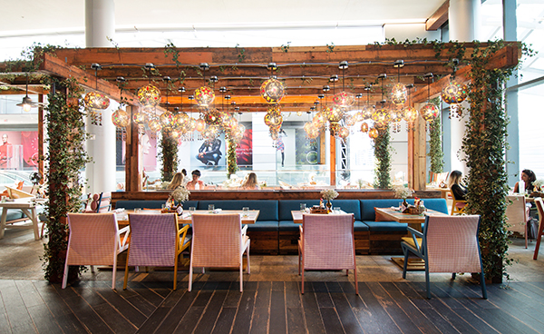
 Mailaender: We’re seeing more interest in simpler, architecturally modern spaces that are comfortable but that have some soul, some warmth, places that are conducive to the meal and drinking versus a slick environment. Mailaender: There's an unhealthy obsession in some markets, especially New York, with history. It's so often misplaced, not appropriate and blatantly fake. Everyone's chasing that sort of pared-down Victorian kind of look. In some cases, it might make sense — for example, when you're dealing with a building from the 1880s. But so often people go in and try to create these older looking spaces in new constructions or with remodels. Also, I'd have to say Edison bulbs. They can be nice, but they're over used to the point of being just silly.
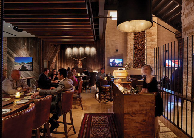
Pagliuca: I'm ready for the whole modern bistro design to go away. Same goes for industrial chic. It's nice, it was different and interesting. But everyone now has that look — the blackened steel, the Edison bulbs, the reclaimed wood. Some brands are still asking for it, and we try to steer them away and convince them that they're a little late to the party, but it's still in demand.
Lechleiter: This whole idea of reclaimed everything. I believe in sustainability, but if you're going to reclaim a barn, don't just build a barn again. Create a level of innovation around it and be sure the new life is the focus, not the old life. Subway tile and Edison bulbs are also really overdone, whether they fit the idea or not. These have all become so commonplace that they're not going to set you apart anymore.
...on materials and colors they like right now
Lechleiter: Brand story has to dictate everything — furnishings, lighting colors, materials. That said, there's a lot of innovation in materials. Look at 3-D printing. These guys are making everything from swimming suits to cars. Depending on what your brand needs to be, there's technology that can produce custom materials to tell your story in unique and proprietary ways. But what's trendy, cool and new might not be right for your brand.
Jones: We try to find solutions to problems or trends with new materials and furnishings. For example, the shared plates trend calls for new thinking on furniture. We designed a communal table with an elevated, illuminated center plate made of steel. It showcases the food and makes sharing easier. In general, I try not to keep going back to the same materials. I do use a lot of natural wood and blackened steel, but by mixing in bright, techy colors against the reclaimed-looking materials you can create something fresh and exciting.
Mailaender: I really like what the CNC machine can do with custom laser cutting. Some pretty amazing designs can be made without a lot of cost, whether it's an elaborate pattern or something simple. As for color, while there's so much industrial-chic look out there right now — rough, raw steel, galvanized steel, powder-coated metals — I'm using so-called "international safety" colors with them to create something new and to provide hot accents: vibrant oranges, reds, greens and yellows.
Herold: The tile industry is doing a nice job creating hard surfaces that mimic wood and concrete. Five years ago, I wouldn't have dreamed of using a tile that looked like wood because it was so fake. Now that they've been able to take the sheen out and add more texture, we're using more porcelain tile than ever. Lighting is also making great strides. I'm really happy with the options out there and how affordable they are, including LEDs. And my personal approach to color is evolving. If you'd asked me a year or two ago what my favorites were, I'd have said every color that ends with "ish" — greenish, bluish grey, brownish. But with what I see as a trend toward more drama in restaurants, I'm now using richer, bolder colors with higher contrast. Not primary colors, but jewel tones — very expressive colors but in the masculine tones, like mustard yellow and deep green.
...on what operators can do to help create successful client-designer relationships and, in turn, successful projects
Mailaender: Respect our training and the creative process. Try to let the creative people and other professionals you've hired for their expertise do things in the way that they're trained to do their best work.
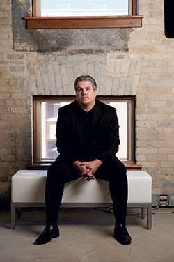 Pagliuca: I don’t think there is a danger in having a design that’s not specifically Millennial-driven, as long as it’s good design and your brand speaks to your core consumers in ways that impact their decision-making process.Pagliuca: Resist the urge to over-brand your environments with marketing materials, brand colors and clutter. Once customers are inside, they've already made the choice to come in, so don't keep hitting them with more heavy-handed branding. Also, don't use cheap materials or cheap lighting. It will be obvious, and you'll only have to replace them sooner. And spend time up front to develop a good floor plan. Think about flow, sight lines and acoustics. A good plan will get you great results on the experiential side for years to come.
Jones: My favorite clients are always those who have a very clear directive. The hardest to work with are those who come in without a single idea of what they want and expect me to be able to give them a "cool" restaurant, whatever that is. Clear directives allow the designer to develop great design concepts that are manifested from great restaurant concepts to begin with. Don't expect the designer to come up with that.
Lechleiter: When you're hiring a designer, look at their work but from the standpoint of determining if they're about innovation, understanding the brand's DNA and helping to move the needle. Design is where art and science collide, and the whole point is to help move the business forward.
Herold: If you go to the hairdresser for a new hairstyle, you tell him or her what you want, and they consider your face and hair type and get to work. You don't jump up and grab the scissors mid-cut and say, "I'll just cut a bit here and here," right? Because most likely you wouldn't get the result that you wanted because you didn't go to school to cut hair. It can be the same with restaurant design projects. Give the designer the space, the budget, the target demographic, the style of the food, a sense of your background and personality and your vision for the business. Then trust that he or she is capable and willing to take all of those elements and create the best space possible. Those are always the most successful projects. You're always collaborating, communicating and on the same team, but there has to be a leader. That leader should be the designer when it comes to design elements and the operator when it comes to programmatic and operational elements.

