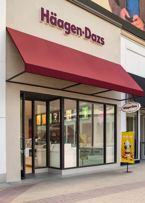
 Häagen-Dazs debuted its new branding recently in California. Images courtesy of Häagen-DazsNo question about it. Häagen-Dazs is a premium brand. For decades, the company’s sleekly designed pints of ice cream (backed up by what’s inside) have marked it as an elevated treat.
This positioning has served the company extremely well. Häagen-Dazs products are in grocery stores around the world, and there are hundreds of Häagen-Dazs ice cream shops globally, including more than 200 in the United States.
Exactly how people think about the idea of premium ice cream and how they interact with luxury has changed since the brand’s founding more than 60 years ago.
By the late 2010s, the very tight design Häagen-Dazs employed to communicate its quality was starting to yield diminishing returns. The look, says Häagen-Dazs Marketing Director Rachel Jaiven, was becoming less relatable. Häagen-Dazs, in the minds of some, was becoming a special occasion treat and not an accessible luxury.
In 2020, then, the brand was ready to make a change. “We’ve been around for 60-plus years. People respect us. We have a lot of admiration and a legacy of high quality, but we wanted to make sure we were building love, that this brand is something people feel an emotional connection with.”
Connecting with Luxury
The redesign for Häagen-Dazs started with a simple imperative: Stay relevant by connecting with younger consumers.
To determine how to build such a connection, Häagen-Dazs partnered with the Los Angeles Studio of Chase Design Group. The head of the project from the Chase side was Jon Arriaza, the studio’s creative director. Since Häagen-Dazs is a premium brand, the team looked at how people today interact with the idea of premium and luxury.
The legacy Häagen-Dazs look, Arriaza says, was like a basic tuxedo on the red carpet. It was once the standard. While it’s still acceptable, the team felt it was also a bit dated. “In contemporary times, people are showing up on the red carpet dressed in a way that represents them. There’s more uniqueness, more personality, more color.”
That revelation, says Arriaza, became one of the driving ideas behind the new look for Häagen-Dazs. The brand would introduce more color, individuality and personality to its look — to each individual flavor, even. These qualities alone, of course, don’t translate to quality and premium. Walk through any toyshop and you’ll see plenty of color, any teen clothing store and you’ll find more than enough personality. The feeling from those places don’t match the Häagen-Dazs experience.
Chase, therefore, created a colorful new look that is also artful and pure, featuring designs with flowing colors and graphics that are unique to each individual flavor and offering.
This concept was first rolled out in 2021 with Häagen-Dazs’s grocery offerings, including pints of ice cream and other frozen treats, like ice cream bars and cones. Each flavor and product was given its own “tapestry,” Häagen-Dazs’ term for these colorful designs: browns and golds for the butter pecan; pinks and reds for strawberry; oranges, yellows and greens for mango, etc.
Not only do these designs update Häagen-Dazs’ expression of luxury, they also help consumers identify individual flavors, which could be a challenge with the brand’s legacy look, says Arriaza.
After the successful launch of Häagen-Dazs’ new packaging, the brand’s attention turned to its physical stores.
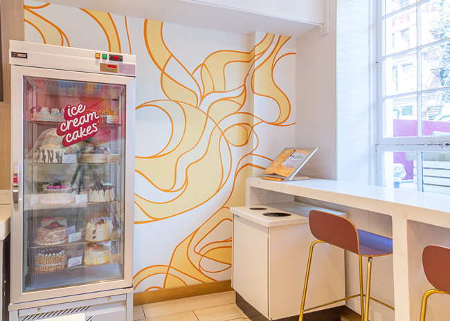 The tapestry wall, with its swirling yellow and golds, evokes flavors mixed in with ice creams. It is a signature element in the new Häagen-Dazs design.
Shop Design
Thanks to the work on the packaging redesign, Häagen-Dazs came to the remodel of its physical locations with some principles and ideas it wanted to express. “The Häagen-Dazs team worked with us and other partners in a very smart way to redefine what the brand meant,” says Arriaza. “That ultimately translated into the redesign of the Häagen-Dazs shops.”
These principles are individuality, artfulness and quality expressed through color and movement. Each is found in multiple focal points, elements that immediately grab customers’ attention and communicate the heart of the brand.
The first of these is designed to be the first thing guests see when they enter the store. Instead of an ice cream case, customers’ eyes are drawn to a tapestry wall (made of a vinyl wall covering) in golds and white, two of the brand’s core colors. This piece communicates artfulness and is a unifying element among stores and even within each location.
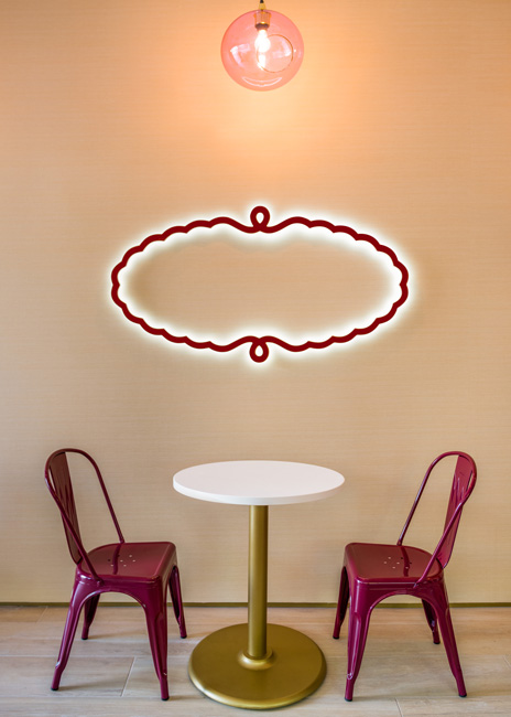 The chain applied its color palette to its chairs and table bases, while the cartouche of the Häagen-Dazs logo serves as a piece of wall decor. An arguably even more artful piece is dubbed “the cove.” This element consists of a cut out in the wall behind the counter just a few inches deep and painted in Häagen-Dazs’ signature burgundy. A shelf in the cove holds multiple pint containers along with three custom designed, 3D printed artworks, each representing a key Häagen-Dazs flavor and inspired by tapestries on actual pints: a vanilla flower, a piece of caramel and a strawberry.
The final unabashedly artful signature design element is the Häagen-Dazs mural wall. This element has changed since its initial rollout. The original mural wall featured stylized drawings of people enjoying ice cream treats, all in an expanded color palette.
The new mural focuses on the history of the brand, says Arriaza. “It really tells the brand story. It’s almost like a love story where Reuben and Rose [Mattus, Häagen-Dazs’ founders] are represented in the mural.”
Not every design element is centered primarily around artfulness, of course. Stores include practical elements that have been reworked to be both on-brand and communicate core parts of the Häagen-Dazs experience. One of these are the translights, backlit lightboxes used to display signs and imagery.
In previous stores, the translights’ images were a bit monochromatic. Now each dessert photo is given its own background color. “Customers can look at them and tell them apart now. Before they kind of blended into each other so now there’s differentiation while also being more fun and energetic and playful,” says Arriaza. The images in the transboxes can be swapped out easily, allowing Häagen-Dazs to showcase special flavors and limited-time offers.
This use of color to distinguish different items extends to the chain’s new menu design. Consisting of multiple panels on a hanging brass bar, this new menu utilizes different tones for different types of items — burgundy for milkshakes, dark blue for standard scoops, etc.
“More and more it is harder for customers to just read,” Arriaza says. “We wanted to not just bring in more color but to use color to make it easier for them to shop. They can see there are ice cream scoops but also sundaes and other elements.”
Other design elements support key brand ideas. These include the new stores’ signature light fixtures, made of pink glass spheres, which contribute to the sense of fun in the space. Flooring is a wood-style ceramic tile with a warm gold tone, while the countertops are a marble-style solid surface, which reflects ideas of flow and movement.
Then there is the seating, which is in burgundy and gold and designed with curves that recall the tapestry wall. “The new chairs that we sourced for this new design pick up on some of that movement. These chairs are in the brand colors. They have the rounded shape language that picks up on the flowiness of the design,” says Arriaza.
 The front counter of Häagen-Dazs redesigned store is filled with color and energy.
360° Look
A notable aspect of Häagen-Dazs stores is that not all are inline locations in strip malls. Many are kiosks. Chase’s work included translating this new look and feel to that format. “Kiosks present a unique challenge. They usually sit in the middle of a space and can be seen all around, as opposed to just having a facade. We really wanted those to be brand-color led. White, burgundy, accents of gold, but we wanted it to still achieve similar pops of color,” Arriaza says.
Like in the normal store, then, the translights are used to highlight specific dessert imagery, while limited kiosk seating is burgundy with gold legs.
The back side of the kiosks, meanwhile, feature the tapestry wall design. If a location includes a canopy, the interior or that element has the same design. The cove is an optional element.
In Store, on Brand
While the rebrand of Häagen-Dazs started with grocery store packaging and moved to ice cream shops, it didn’t end there. Chase also reworked other parts of the customer experience, including in-store packaging.
In creating these elements, the designers leaned heavily on the design for the tapestry wall. This element is integrated into the labels that identify individual flavors in the dipping cabinets, the sleeves for ice cream cones, and other pieces of signage throughout the store.
Similarly, the boxes for ice cream cake have been artful in their execution, according to Arriaza. When assembled and sealed, they have a seamless tapestry pattern that carries across all folds and seams.
For individual cups of ice cream, the design team turned toward individuality. Like each pint in the grocery freezer has its own design, each cup size has a unique look as well. The idea, says Arriaza, is that the different colored cups will stand out more on social media.
The designers also created new crew uniforms for Häagen-Dazs shop employees. Instead of the movement and patterns found on so many other design elements. The uniforms feature single color t-shirts and button-downs. These, says Arriaza, provide a “moment of quiet” in a store filled with energy and movement.
These shirts are matched with an elevated, linen-look apron, along with hats or visors bearing the outline of the Häagen-Dazs logo. “They want to start to make that a recognizable icon. One of the places to do that would be in the shops, within the context of the Häagen-Dazs world,” Arriaza says.
Notably, Häagen-Dazs has recently gone from offering headgear in multiple colors to the concept’s signature burgundy only. Lighter colors, while also on-brand, would showcase every smudge and smear, detracting from the premium experience the chain wants to provide, says Jaiven.
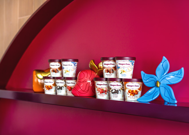 “The Grove” design element features Häagen-Dazs packaging along with 3D-printed sculptures representing popular ice cream flavors.
Brand Led
With Häagen-Dazs’ new store out in the field for about two years, the brand has made a few tweaks, such as reworking the mural and changing a neon interior wall element from “Luxury where you are,” to the more brand-focused, “That’s Dazs.”
Overall, the company is pleased with the results. Same-store sales are up and legacy locations are being retrofitted with the new look.
The success of the store project, says Arriaza, was due in part to the continuity between the grocery packaging redesign and the new store prototype. This allowed for the same level of craft to be applied to every aspect of the Häagen-Dazs brand.
It’s an approach, he says, that helps keep the focus of the design work where it belongs: on the brand and the consumer.
“Let the brand strategy lead what you create in a physical space as opposed to creating a physical space that is really, really cool but doesn’t relate back to the brand,” Arriaza says. “There are times when you get into retail and architecture and it’s about making really cool spaces, but it’s hard to tie it back to the brand in a way that’s meaningful to the customer. Keep it brand led, keep it strategy led.”
Project Team
- Jon Arriaza of Chase Design; Adam Hanson, president of Häagen-Dazs Shops; Brian Danielson, franchise business and construction manager for Häagen-Dazs Shops; Rob Schell, vice president of franchise development for Häagen-Dazs shops; Ken King, vice president of business development at Graphic Reproduction South
Snapshot
- Headquarters: Minneapolis, Minn.
- Owner: Dreyer’s Grand Ice Cream, which is owned by Froneri International
- Unit count: 208
- Average check: $13.85
- Location of new store: Broadway Plaza in Walnut Creek, Calif.
- Opened: March 2022
- Real estate: Street, mall in-line, mall open-air, mall kiosk, tourist, cart
- Design highlights: Chase Design Group collaborated with Häagen-Dazs to develop a comprehensive and vibrant redesign for Häagen-Dazs shops. This holistic project created a 360-degree brand experience and spans across packaging, retail environments and the brand’s visual identity. The retail redesign encompasses signage, materials, fixtures, shop packaging, dessert imagery, menus, floors, furniture and uniforms. The new design is rolling out across 208 franchise locations in the United States.
- Build-out time: Three to five months

