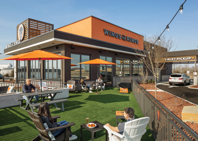
 Buffalo Wings & Rings’ new outdoor patio features games and adirondack chairs, making it a place to hang out, not just eat and go. Images courtesy of Buffalo Wings & RingsCincinnati-based Buffalo Wings & Rings has redesigned to draw a broader customer base that’s interested in more than just the big game.
Buffalo Wings & Rings has always thought of itself as a different kind of wings place.
Sure, it’s a sports bar, but this 80-plus-unit chain out of Cincinnati has long worked to offer an elevated spin on the concept. “Club level” is how the company describes its customer experience.
“If you think about going to a football game, you can sit in the end zone or you can sit in club level,” says Diane Matheson, the chain’s vice president of marketing. “The end zone is a lot of fun, but there might be a lot of rowdy people. It’s probably not the right place for family and maybe friends to watch a game. If you think about club level, you’re having just as much fun, but the service is better, the food is better and the atmosphere is different.”
However, with the rollout of its fourth-generation restaurant late last year Buffalo Wings & Rings took an even bigger step away from the man-cave-style design of many of its peers. The result is a restaurant that is meant to be welcoming to more than just the sports fans and offers more reasons to visit than a big game — and uses a good bit of technology to do so.
An Inclusive Space
To develop this design, Wings & Rings (the company’s soon-to-be-official name, pending a rebrand) and its design firm, Nelson Worldwide, conducted customer intercepts and focus groups to better understand who the chain’s customers are and how it could best serve them. The company eventually developed a series of customer profiles including sports fans, everyday socializers and families.
“We wanted to position ourselves from a consumer perspective as being highly inclusive, beyond the typical sports fan,” says Aaron Reuf, account director for Nelson Worldwide. “We really wanted to try to figure out a way to grow our consumer base by bringing in consumers that maybe would not have given us a try just as a sports bar. How do we include more people?”
Bringing in a broader customer base, the team concluded, meant creating a space that offers guests more than big television screens and menu options beyond bar food staples.
On the food front, the chain was already set. On top of wings, its menu includes salads (including Cobb, southwest chicken and blackened salmon) and sandwiches (such as Korean fried chicken and Santa Fe steak). This broad menu has long been a point of pride and a differentiator for the chain.
Drawing in a broader customer base, then, meant creating a space more people would find appealing, and one that wasn’t about sports to the exclusion of other experiences.
The new design, then, includes features that appeal to different customer types and allows for different experiences.
Form & Function, from the Outside
Wings & Rings’ new customer experience starts with a new exterior. The design, first rolled out in the Cincinnati suburb of Milford, is meant to be clean and modern. It features horizontal elements and the chain’s signature bright orange color to attract attention from the street. A key feature of the exterior isn’t just cosmetic, it’s also important to the function of the restaurant. With this new design, the chain introduced a Valet Pickup lane for to-go and third-party delivery orders.
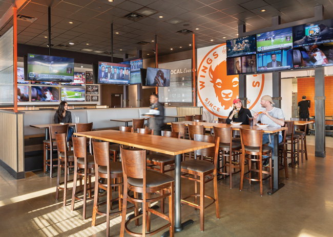 Wings & Rings’ high-top tables near the bar provide low-touch service by design. The company is piloting a system that allows guests to let waitstaff know what they need from their phone.The lane, says Reuf, takes its inspiration from high-end operations in noncompeting sectors, such as hotels. This drive-thru-style element sits on the side of the building and connects directly to the kitchen via a sliding glass door.
Orders ready for pickup are staged right by the door. When a guest or delivery driver comes to pick up an order, a Wing & Rings staffer takes a few steps outside, gets a name and then retrieves the customer’s food. If it’s not ready, customers can pull into a parking spot and wait for notification that their order is complete.
This service model provides a better customer experience for both to-go and dine-in guests, Reuf says. When customers or delivery drivers have to come into the restaurant for to-go orders, they are forced to navigate the parking lot, figure out where the pickup spot is, and maybe find a place to sit or stand if their order isn’t ready. Not only is this a hassle for people picking up food, it also diminishes the interior. “A lot of times what this does is crowd out the hospitality cues in your host area.”
From a design standpoint, the lane is hard to miss. It includes a clear Valet Pickup sign and an overhang that protects customers and staff from inclement weather. According to Matheson, this addition is one of the most successful elements of the new design because of the ROI. The chain is attracting more off-premises and delivery business at stores with the Valet Pickup lane.
Even better, the mix of off-premises business has shifted to the chain’s favor. The percentage of orders placed by customers directly with the chain has increased while third-party orders have fallen. Given the high fees delivery services charge restaurants, this shift is a real win for the company.
Indoor Activities
Not all food is consumed off-premises, of course. Guests opting for dine-in over pickup will find an interior with sealed concrete floors and a drop ceiling with black tiles.
Overall, though, the space is brighter and a bit softer than a typical wing concept. Large sections of wall are white with orange art elements, while furnishings are made with light colored wood or wood-toned finishes.
Booths and some tables are made of real wood, while other tables have wood-style laminate finishes. All seating, whether booth or table, offers at least upholstered bottoms. “Soft seating is comfortable and more durable. It’s easier to change out the upholstered surface and cheaper than replacing a chair [damaged by excessive scratches],” Reuf says.
The first area guests encounter in the restaurant is the dining area. This is the space most friendly to families and features floating tables as well as booth seating. Each booth is equipped with its own television that can be controlled by the guest. It’s common to find guests at these seats watching niche sports like horse racing or kids watching cartoons while the parents talk.
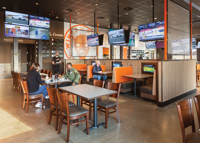 The dining area is meant to provide a calmer experience for families and others not looking for a bar atmosphere.One of the goals of the design, says Matheson, was to provide some separation between the bar area and dining area — between families or working lunches and the typically more boisterous bar patrons. To achieve this, the chain used metal mesh dividers to provide separation, which are similar to elements used above the bar itself.
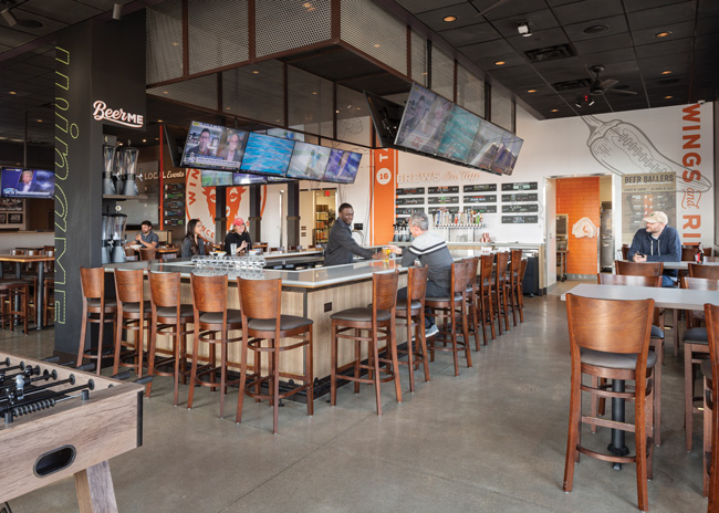
The bar is the “hero” of the whole restaurant, says Reuf. With this new design, the chain moved away from a straight line to a U-shaped bar with a concrete-style solid surface top and wood-style laminate face. Televisions hang overhead with the mesh metal panels helping hide cords, brackets and other mechanical elements.
This bar’s new shape serves several purposes, Reuf says. With customers facing each other and able to gather at the bar’s corners, it allows for a more personal environment. It also expands overall bar seating significantly.
Notably the center area where the bartenders work is completely empty. Taps are against the back wall while liquor bottles are stored under the counter. “We want to be very efficient about our square footage in the bar. With a center tap bar solution, the bar becomes extraordinarily large. This solution gives you the proper amount of access for your bartenders. It also allows for more clear sightlines through the restaurant,” Reuf says.
In addition to the bar itself, this section of the restaurant contains a few high-top tables and high-top banquette seating. While each seat has a view of at least two screens, televisions don’t dominate the area, allowing for occasions other than a game. Along those lines, the space’s service model calls for fewer check-ins by a waiter. This low-touch approach is designed to help guests feel more comfortable just hanging out.
The chain doesn’t want to be too hands-off, though. It has turned to technology solutions to strike the right balance between giving people space and being neglectful. Using their phone, guests can view an interactive menu that allows them, for instance, to organize beer offerings by ABV, bottle or tap, and beer style. They can also order and pay through their device.
Wing & Rings is also pilot testing a QR-code based system that lets guests send the waitstaff common requests such as “I need a refill” or “I need more napkins.”
If successful, this could be a win-win for Wings & Rings, says Matheson. “Labor is quite an issue these days. This could help solve some labor challenges as well as take some of the consumer friction points off the table.”
The low-touch service model isn’t the only feature in the bar that encourages guests to just hang out and enjoy themselves. This new design also offers an outdoor patio and an adjoining dining area. The two are connected by fully functioning windows that provide an indoor/outdoor experience for diners. Both patios are designed to provide guests with experiences, not just seats.
The outdoor patio features a fire pit, Adirondack chairs and a cornhole game. The area is covered with a grass-style outdoor carpet, a feature that is low-maintenance and encourages a sense of play, Reuf says.
The indoor section of the patio offers foosball tables and wicker-style furniture with soft cushions.
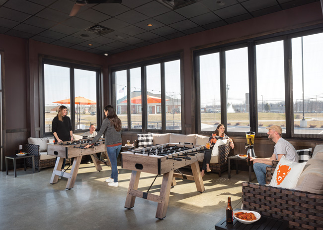 The chain’s “indoor patio” is located near the bar. The company plans to experiment with different iterations of this hangout.
Evaluations, Reevaluations
Though the outdoor area is getting good customer feedback, the jury is still out on the indoor space, says Matheson. COVID has made a fair evaluation of its execution difficult, but the chain will likely test different versions of the indoor patio than its foosball/soft seating iteration.
That’s not the only section likely to be reworked, Matheson added. The first location of the new prototype included a self-service host stand, where guests could enter the type of experience they wanted (full-service or self-service, bar or dining room) then select from tables presented by the touchscreen.
The chain’s first attempt at this model, though, didn’t succeed, Matheson says. “When someone comes into the restaurant, one of the biggest things we heard is that ‘nobody’s acknowledged me.’ We weren’t able to execute that [feeling with the electronic check-in]. I think there’s something there that we need to think about. How do we take that and make a better experience for our guests?”
Another challenge for the new prototype, she says, is simply the buildout cost. The chain developed this new design before construction materials like lumber saw major price spikes. The sales-to-investment ratio that worked then just doesn’t work as well now. Wings & Rings, Matheson says, will likely go through another round of value engineering with this new design, looking for ways to reduce costs while providing the same customer experience.
Though there are some areas where Wings & Rings will continue to fine-tune the restaurant, the chain is happy with the new design, Matheson says. The Valet Pickup lane is a clear win, the not-so-sports-centric elements are resonating and franchisees are responding positively to the new design.
“We redefined what it means to have an event,” says Nelson Worldwide’s Reuf. “A typical sports bar is looking at a game-day experience. It’s within a certain time. You go and watch the beginning. Maybe you stay through the end depending on how well your team is doing. [But] how do we understand what event means? It could mean a community event. It could mean a group that gets together to watch The Bachelor. There are these unconventional type groups that get together and hang out in a space and be in an environment together. What we did was look at how Wings & Rings can begin to service them in the long term from an overall operations perspective.”
Snapshot
- Architecture and interior design: Nelson Worldwide
- Chain headquarters: Cincinnati
- Concept: Elevated wings concept offering “club level” experience along with an environment designed to attract more than the sports fanatic.
- Unit count: 80+ (about 60 domestic, 20 international)
- Location of new prototype: Milford, Ohio
- Opened: Fall 2020
- Size: 4,180 square feet (2,800 FOH/ 1,380 BOH)
- Real estate: Freestanding building; design allows for endcap locations.
- Design highlights: Valet Pickup lane for to-go and third-party delivery orders. Outdoor patio with lawn games and fire pit. Indoor patio with analog gaming. U-shaped bar offering clear sightlines and more bar seating

