You may think your restaurant is diverse and inclusive: You welcome everyone with the same warm hospitality; you employ staff members across a mix of races, sexualities and religions; and your menu is wide-ranging to please a fair mix of people. But is the design of your restaurant welcoming to all?
“If you don’t see people representative of you, you don’t feel like you belong in that restaurant,” says Michelle Silverthorn, CEO of Inclusion Nation and the author of Authentic Diversity: How to Change the Workplace for Good. “Restaurants could be losing a huge population of people who want to come to their restaurants by not designing a restaurant that’s reflective of them.”
First, it’s important to be aware of all aspects of diversity. “Inclusion runs across the spectrum of gender and race and ethnicity, and also comfort levels with things like seating and posture,” says Andrew Ashey, principal at Aamp Studio in Toronto.
There are many people to consider, from gender and race to age and disability. “You can’t treat customers as a monolithic group,” says Ashey, who adds that a richer experience can come from a design that’s been thought out to be inclusive to all. “It can be an enhancement and a benefit to the space,” he points out.
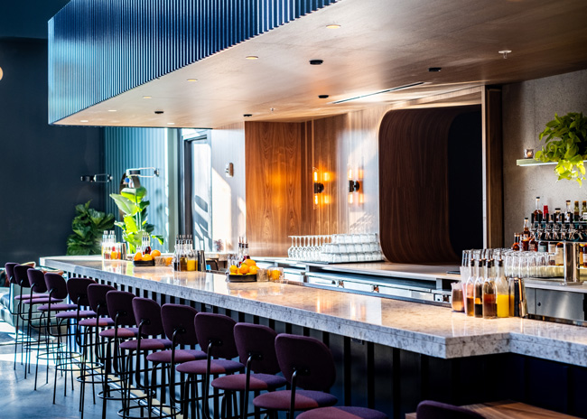
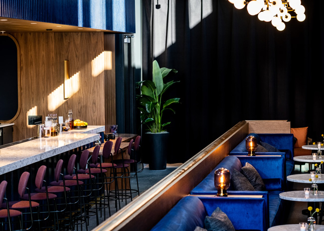
 Sound Advice in Boston, designed by Aamp Studio, offers bar stools with backs to help older customers feel comfortable. Image courtesy of JM Leach
Mobility and Age Concerns
For elderly patrons, there are two big issues: mobility and sound. Older guests can have difficulty getting into or out of certain seats, so consider ergonomics, Ashey says. Bar stools can be particularly tricky for older patrons. Having stools with backs may be a better choice for them. And poufs, which don’t have backs, can also be difficult to both sit in and get into and out of.
Moveable tables and chairs are helpful not only for the elderly but also anyone with mobility issues or overweight people, says Justin Hill, principal and market leader with MG2, an architecture and design development firm based in Seattle. Banquette tables that are fixed to the floor can make it difficult for some people; it’s not a natural move to slide into a seat, he explains. If restaurants do opt for banquettes, which are becoming more popular since they naturally offer social distancing, having one side with booth seating and one side with chairs makes them accessible to everyone, he points out.
And often, says Ashey, “restaurants may be too loud for older people, so that limits a group of people from going to that space.” For lively restaurants, it’s a fine line to walk he says, since, “some restaurants thrive on a certain level of noise.” For these, he suggests maintaining your volume but offering up quieter areas, or even separate, quieter rooms if you have them. These areas could be farther from speakers and could contain sound-absorbing materials such as upholstery, curtains and carpeting, Ashey suggests.
Lighting can also be a problem for older patrons who have difficulty reading the menu in a low-lit restaurant. Adding decorative side lamps into the design can alleviate this, especially along a bar, where they could be placed intermittently to keep some areas darker and some lighter. For wayfinding, recessed lighting can spotlight the floor in an intentional way, Ashey says, to help people with vision problems get about, and wayfinding signage can also be lit or backlit.
When adhering to ADA requirements for customers with disabilities, older buildings can present the biggest challenges. The floor is probably the most significant one, Hill says. “Slight changes in floor level require careful transitions, ramping, handrails, etc., that sometimes challenge the flow through the space and, of course, add cost to build-out.”
It’s important that ADA doesn’t just become functional, Ashey says. “We want to make sure restaurants are not just meeting the minimum requirements required by code but that the design is a really integral part of the project.”
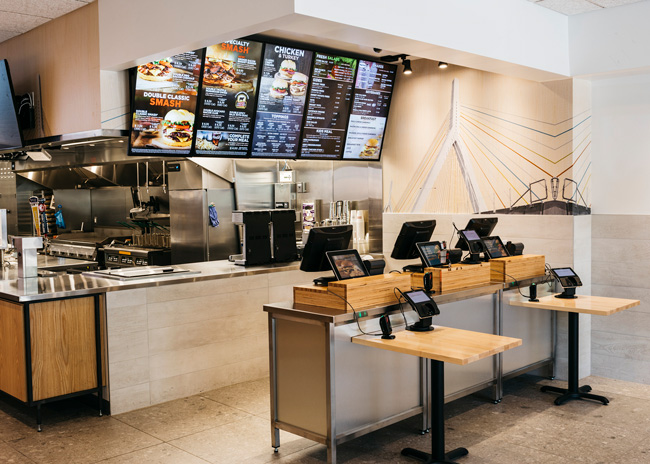
 At Smashburger in Boston, every touchpoint in the restaurant is an opportunity for inclusion.
Traditional Gender Considerations
Restaurants need to appeal equally to men and women, and if a client is considering a traditionally masculine or feminine look, Anne Marie Armstrong, principal at Aamp Studio, says she tries to pull out what’s behind that. “What’s the feeling the client wants to convey? A space with richer materials, with texture, or is it more comfortable or more hard edged, more modern, more transitional? It’s about pulling out the aesthetic or the spatial qualities of the space.” She says she might also avoid certain motifs that some people see as masculine or feminine like a pink bathroom. “We’re interested in finding ways for spaces to be interpreted by multiple users,” she points out.
It’s important to be careful not to include elements in your restaurant that are overtly aggressive or delicate as it may alienate some guests, Hill says. For example, he explains, “the classic steakhouse design has evolved to be more inclusive by being more open, lighter, and less dark and heavy.”
Color can also be alienating to some groups. A very traditionally feminine restaurant aesthetic can be off-putting to some men, for example, but Ashey points out that a restaurant seeking a softer look doesn’t have to paint it pink. Instead, he says, “it could be more about shapes, the textures and materials.”
Most American restaurants, Hill points out, have fairly neutral color palettes. “There’s not a lot of color, or boldness,” he says. “But if you look at a lot of ethnic restaurants, colors are bold, they’re bright. So, if you want something inclusive, you might want to take some chances with color because that might attract somebody, so it would be more inclusive.”
Just take care, he says, to keep colors on-brand to the concept, and not go overboard. “If the concept works with a little and you’ve applied lots, you’ve gone too far,” says Hill. “Or, if there are so many colors they compete and clash, then it’s too much.”

Cultural appropriation
Taglines, logos, words painted on walls or on the menus, or even directional signs that are meant to be humorous or different, can easily be seen as offensive or just leave some patrons feeling excluded. Using a lot of slang can be tricky, says Armstrong, because if it’s too youthful, it can make older patrons feel confused. If it’s too localized or obscure, it can deter new customers from patronizing the restaurant.
Some of this language can be tongue in cheek, Hill points out, and restaurants can provide translations, “so people in the know can smile smugly and say ‘I know that,’ and other people are happy to learn. As a restaurant you have to be able to laugh at yourself.”
Armstrong points to Bar Maruno in Los Angeles, a Spanish restaurant on the California coast. In order to be fully cognizant of being outsiders and of understanding iconography and imagery from Spain, the owners first spent a couple of months in Spain, “so they could translate that variety and diversity in the design,” she says.
However, the owners also included localized touches, like surfboards, placed adjacent to traditional Spanish iconography, offering both local flavor and a nod to the global inspirations behind the menu.
It’s important to be very aware of cultural appropriation, says Hill. If a restaurant is trying to attract people from a certain culture but get it wrong that can be very offensive. Many restaurants simply don’t realize this, or don’t know when they’ve gone too far, he says. A small amount of something, such as signage supporting Black Lives Matter or the LGBTQ community sends a very clear message to patrons, but too much can be offensive and be seen as using the community for business gains. “It’s important to rein in that enthusiasm and remember less is more,” Hill says.
Messages of inclusivity should extend to marketing and advertising. It’s important to include people of different races and ethnicities in marketing and advertising materials and to use inclusive language in social media, signage and every aspect of a marketing campaign, says Silverthorn.
At the end of the day, says Hill, involve as many people as you can in the design of your restaurant. “We all have a myopic view of the world, so the more people you can get involved, the more people listening and the more people commenting, the better.”
And don’t leave anything out of your inclusivity considerations. “All the touchpoints through a restaurant — arrival, seating, menu, ordering, dining, washroom, payment, leaving, online — are opportunities for inclusion,” Hill says. “Paying attention to each of them but also knowing how they connect and flow and, most importantly, what message you want to send, is going to define how your patrons feel.”
