When Jackson Schwartz bought a warehouse building for his blown glass fixture company in Minneapolis, he had more space than he needed. His solution: add a cafe along with a co-working space. This could serve as a gathering spot for the neighborhood as well as for other creative professionals who rent a desk from him.
“When we started [the fixture company] we were in a large warehouse with probably 30 different design companies. We really enjoyed the collaboration and connection with other designers and entrepreneurs. When we moved, we wondered how do we get some of that energy back, how do we get these different people and ideas all mixing again.”
The building's cafe, Parallel, opened in early 2018. The operation offers breakfast, lunch and beer and wine through happy hour.
 Parallel Cafe, Minneapolis
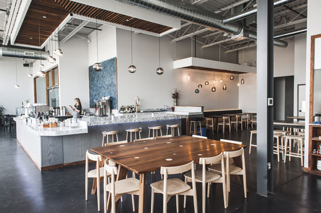
According to Schwartz, the centerpiece of Parallel’s design is the bar, where guests can get everything from coffee and tea to adult beverages.
This space is defined by its dramatic solid surface bar top, which is designed with a marbled black and white look. Behind the bar are blue scalloped tiles, one of the only splashes of color in a restaurant otherwise filled with darks and lights.
“The countertop has been an integral component in marketing the cafe because of its presence on social media,” says Schwartz. I can’t tell you how many Millennials come in and really want to capture that countertop alone,” Schwartz says.

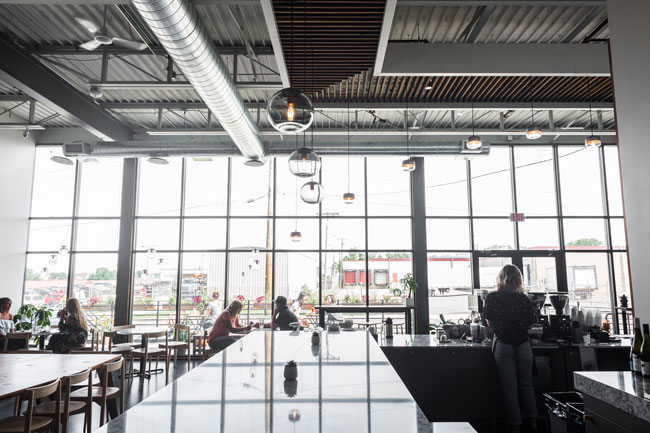
In addition to the bar, one of the key design elements of Parallel is its floor-to ceiling windows. Measuring 16 feet high, these windows face north, so they don’t allow in any direct sunlight, only indirect. More important, though, is the connection they provide to the outdoors, says Schwartz.
“In winter in Minneapolis, you want to feel like you’re outside as much as possible. This is as close as we could get to being connected to the outdoors, but without really being outdoors where it’s 20 degrees below zero.”
Notably, the tables directly against the wall are made of the same solid surface material as the bar. These were selected specifically for their ability to age well. While prolonged exposure to natural light will change the color of wood, these tabletops will hold up better over time, he says.

Parallel’s design also includes elements that allow Schwartz to showcase his blown glass light fixtures. A wired grid system on the ceiling allows him to easily swap fixtures in and out. Above the bar and banquette area tucked into the corner, this grid is masked by a walnut cloud element that helps make those spaces more intimate.
“[The grid] is an intentional element, functionally, but visually you would never know that was what we were trying to create. That walnut pattern gives a nice feeling, and behind that is a steel grid that gives us ultimate flexibility in creating new lighting installations without having to go back in and reengineer construction,” he says.
In addition to tables and chairs, Parallel has a lounge area with soft seating. This space is the most relaxed of the restaurant’s zones, and is ideal for someone who wants to sip a cup of coffee and read.
Notably, this space has just one power outlet. The designers adjusted the number of outlets throughout the cafe to match the type of experience they wanted to create: While the lounge has few spots to plug in, for instance, the bar and two-tops have plenty of outlets, since that’s where Parallel prefers that people work.
Nearby the lounge, behind the glass walls, is a flex space that has various uses. Retail popups for Schwartz’s fixture company and other small design-centric firms are held in the room. It also hosts private events, with room for 75 cocktail party guests and seating for 30. And on Saturdays and Sundays, it is simply seating for the cafe.
“We’ve developed a really strong brunch offering. On weekends the whole space fills out and we use that room for additional brunch seating,” Schwartz says.


