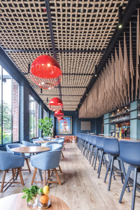
 Creative ceiling treatments crafted from simple, natural wood add earthiness as well as artistic and sculptural elements to the room. Images courtesy of f8 Photo StudiosOver a 40-year span, Lou Moshakos has developed a lot of restaurants. His hospitality management firm, LM Restaurants LLC, now operates 7 different concepts throughout the southeastern United States, including 30 Carolina Ale House sports bars in 6 states. His latest endeavor, Vidrio, adds a new kind of sparkle to the company’s crown.
Located in the trendy Glenwood South District of downtown Raleigh, N.C., Vidrio is the first LM Restaurants operation to venture into polished-casual, chef-driven dining territory, and it does so artfully. Food, of course, serves as the main draw, with menus showcasing fresh ingredients and Mediterranean-inspired dishes perfect for sharing with family and friends over a bottle or two of wine. But the backdrop against which the restaurant serves its best sellers such as grilled octopus, wood-fired lamb skewers, whole grilled fish and hearth-baked breads draws rave reviews as well.
Its pièce de résistance: a 2-story, 30-by-80-foot feature wall in the main dining room. Adorned with more than 750 colorful, hand-blown glass bowls and orbs of various sizes and organic shapes, the wall was designed and created by Ohio-based glass artist Doug Frates. Conceptually, it evokes the sun setting over the Mediterranean Sea — warm yellows, oranges and reds on the left side of the wall flowing into cooler blues and greens on the right. Large script below the installation encourages guests to relax and “enjoy a moment for the time being.”
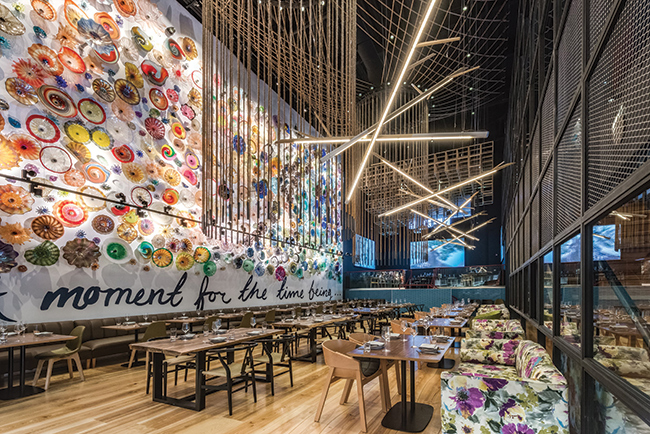 A two-story art-glass feature wall, evoking the sun setting on the Mediterranean Sea, anchors Vidrio’s design. Custom rope and imported sculptural chandeliers add interest and bring the scale of the large open dining room down.It’s just the type of high-impact design feature that Moshakos knew he wanted when he began envisioning the concept for Vidrio — which means “glass” in Spanish — eight years ago. And it was the first key design element to be decided on and installed as part of the project, which includes the work of several local artisans and craftspeople in addition to Frates.
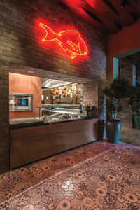 Upon entry, guests see a display showcasing the day’s fresh catch as well as a glimpse of the open kitchen and dining room beyond.“Lou wanted a major wow-factor feature wall in the restaurant and had planned the building’s layout to incorporate one, but it took some time to figure out what it would actually be,” says Giorgios Bakatsias, who led design on the Vidrio project. Bakatsias, himself an award-winning restaurateur, heads up The Giorgios Group, which develops its own restaurant portfolio, consults on concept development, and provides design and architecture services to clients through ARCHE Design.
“We tested several concepts for the wall, starting two years before construction began, but nothing really clicked until Giorgios came in with the idea of the blown glass and introduced me to Doug Frates’ work,” Moshakos says. “I fell in love with it instantly and knew that was it. It turned out to be even better than I expected. When customers turn the corner into the dining room, it literally takes their breath away.”
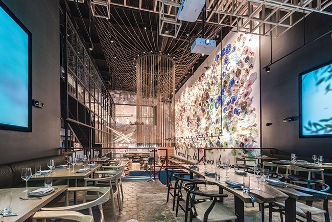 Opposite the kitchen, an elevated area at the far end of the dining room offers dramatic views of the dining room and kitchen. A three-dimensional wood ceiling grid and large video screen art installations give the area its own unique vibe.
Special, Not Special Occasion
The restaurant’s design and architecture seek to highlight the large glass element and extend its vibrancy to every corner. At the same time, however, the design team incorporated elements and approaches that create human scale, warmth and comfort in the large, open space.
Helping to bring the restaurant’s tagline of “Earth. Flavor. Wine.” to life is a materials palette marked by warm, polished woods; hand-painted tiles; mosaics; custom rope chandeliers; and creative, natural wood ceiling treatments.
“The space needed to balance ‘wow’ and vibrancy with an everyday approach,” says Katherine Goldfaden, director of marketing at LM Restaurants. “We were not out to create a special-occasion restaurant. Rather, the idea was to create a welcoming space that invites people to come and come often. It’s amazing visually. There’s a lot to see and different experiences to be had here, but we developed the concept to be approachable. Mediterranean dining is not high-end. It’s a casual, shareable approach to eating, and that’s what we’re grounded in.”
The building itself is new construction. LM Restaurants purchased the parcel several years prior to being ready to develop it. It formerly held a long-vacant office building that ultimately was demolished to make way for new construction.
“I worked with two different architects to try to use that existing structure, but we just couldn’t get it to work for what we needed,” Moshakos says. “It was nondescript and had no historical significance, so we ended up bringing it down and building from the ground up to get what we needed on the site.”
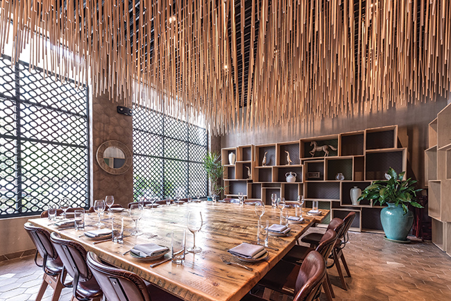 While larger private functions are held on the second floor, the first level includes a smaller private dining room called The Library.
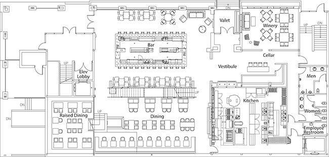
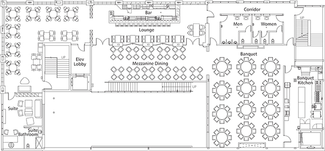
The three-story structure houses both Vidrio and, on the third floor and rooftop, a Carolina Ale House. The first floor holds Vidrio’s main dining room, wine cellar, small private dining area room called The Library, full bar and kitchen. The second level, used almost exclusively for private functions, includes a “Mediterranean villa-style” private-dining mezzanine overlooking the main dining room and a 1,500-square-foot banquet room.
A second full kitchen upstairs ensures that private functions don’t disrupt operations downstairs, and a second bar, the Fiera Lounge, offers groups their own dedicated bar/lounge space. That lounge includes a 40-foot bronze-topped bar and takes its name from the warm, fiery glow visible through its windows from the street thanks to the room’s red-painted ceiling and walls.
At the street level, Vidrio’s entry sets the stage with a bubbling water feature, flowers, herbs and olive trees brought from the village in Greece where Moshakos was raised. Once inside, guests first see a small display showcasing the day’s fresh catch. The entryway view also includes a glimpse of the restaurant’s open kitchen with wood-burning grill and hearth oven beyond.
“It’s all very cozy, and there’s nice human scale upon entry,” Bakatsias says. “But then, as you begin to walk in and pass the wine cellar, where we have more than 300 bottles on display, things begin to reveal themselves; we have introductions and sneak previews of the sightlines. As you continue in, on the right you see the main bar, which has great energy and is very inviting, and as you continue to move ahead to the left, you see this magnificent wall and soaring ceilings of the dining room and say, ‘Wow! Now I’ve arrived for the full experience.’ We really wanted to play with scale and also to incorporate the romance of not exposing everything all at once.”
A Multidimensional Experience
Indeed, there’s much to discover in each main area of the restaurant, with each adding layers of flavor to the full Vidrio experience.
In the 76-seat main dining room, massive rope chandeliers fashioned from 30-foot lengths of thick rope hang from the ceiling, adding earthiness and bringing the scale of the room down while still maintaining an open, airy feel. The fixtures’ circular, organic shape is offset with several large architectural chandeliers that run the length of the room.
Those chandeliers were sourced in Italy, Bakatsias says. “They’re very modern and add nice contrast,” he notes. “Whereas the rope fixtures are circular and vertical, these are multidirectional. They add light but also architectural drama. And, like the ropes, they help bring the scale of the room down. Lead times were an issue, and getting them here took a lot of coordination. You really have to be flexible when bringing in unique items from Europe, but it was worth the time and effort in the end.”
Seating styles in the main dining room include larger, communal-style tables down the center of the nearly 2,000-square-foot, rectangular room; a banquette that runs the full length of the feature wall; and freestanding tables backed by loveseats that line an iron-framed, glass-paned wall separating the dining room from the bar.
While most of Vidrio’s seating sports a clean, midcentury modern aesthetic, the loveseats add softness. “I always want to bring some romance into a dining room,” Bakatsias says. “What is life without love and romance, after all? The floral loveseats are an expression of that. A couple can sit together there and have a view of the art-glass wall across and the open kitchen at one end of the room. It’s a great experience.”
A 30-foot-high wall lined in imported Mediterranean tiles frames the large open kitchen. The wall’s top section includes a view into the upper-level banquet room.
Opposite the kitchen, an elevated area at the far end of the dining room seats up to 38 and measures roughly 540 square feet. It offers dramatic views of the dining room and open kitchen but has its own unique vibe. “We call it the stage. You get a very different feeling sitting there because you’re a step removed from the heart of the restaurant, but you can still take it all in,” Moshakos says. “It’s a little more of an intimate dining experience.”
Wooden slats create a unique, three-dimensional grid ceiling treatment over the area, and three large video screens line its walls. The screens project slow-motion scenes, such as olive trees rustling in the wind or laundry drying in the breeze in front of a quintessentially Mediterranean home.
“There’s no audio; just visual,” Goldfaden says. “It’s very serene and calm and helps transport you to a Mediterranean mindset when you’re sitting there. Sometimes it’s something a little more abstract, like ink slowly swirling in water. So there’s an artistic statement to it that helps bring you back to the amazing architecture and art that surrounds you.”
“We wanted dramatic scale in the dining room but also elements of past, present and future,” Bakatsias adds. “The slow-motion visual element, projected onto very large screens, was crucial. It’s modern and adds movement, and it’s another way we played with scale to create a multidimensional space.”
Multidimensionality also comes into play in Vidrio’s main bar area, the design of which allows it to serve as a cozier and more intimate space. A freestanding double-sided bar topped in polished walnut showcases one of the restaurant’s big draws — an award-winning wine program that features 48 selections on tap, as well as hundreds of bottled wines.
As in rooms throughout the restaurant, creative ceiling treatments crafted from simple, natural wood add artistic and sculptural elements to the bar area. Above the bar, for instance, thousands of dowels hang vertically, taking the place of a traditional soffit. Pin lights shine down through the dowels, illuminating the bar and creating shadow play that implies subtle movement.
“It helps to bring the ceiling down and add some intimacy to the space while still maintaining the scale. It’s also intriguing and fun,” Bakatsias says. “And because it’s made from wood, it again incorporates earthiness but does so in a way that’s very artful and modern.”
Positioned along the street side, Vidrio’s bar also offers an indoor-outdoor experience. When weather permits, large custom guillotine windows slide open to the vibrant street scene outside and to the restaurant’s front garden.
Goldfaden notes that the entire Vidrio experience strives to convey vibrancy. “Whenever we design a restaurant, we begin with what we call a filter word,” she says. “For Vidrio, that word was ‘vibrant.’ Every decision we made hinged on whether or not the material or design approach in question had the vibrancy that we wanted Vidrio to portray. Starting with the wall, all of these various elements work together toward that goal.”
Project Team
- LM Restaurants: Lou and Joy Moshakos
- Design: Lou and Joy Moshakos, Giorgios Bakatsias
- Architecture: Olive Architecture
- Kitchen consultant: Giorgios Bakatsias
- Art glass: Doug Frates Glass
- Mixed media, neon: Louis St. Lewis, Nate Schaffer
Snapshot
- Project: Vidrio
- Location: Raleigh, N.C.
- Ownership: LM Restaurants
- Project type: New construction
- Concept: Polished casual Mediterranean restaurant and private event space
- Size: 17,000 square feet; two levels
- Average check: $35
- Build-out: 18 months
- Design highlights: Two-story art-glass wall evoking sunset over the Mediterranean Sea, rope chandeliers, elevated dining area with video art feature walls, midcentury modern furnishings, artistic wood ceiling treatments, Mediterranean tiles, open kitchen


