Though it’s a chain, no one would describe &pizza as corporate. The brainchild of founder and CEO Michael Lastoria, the concept was created to be “a modern, forward-looking brand” driven by more than profit.
&pizza’s brand statement includes commitments to serve and care for its employees first, partly by pay paying higher than minimum wage and backing a federal minimum wage of $15, as well as to support and do business with smaller like-minded companies and vendors.
Based in Washington, D.C., where it has roughly 20 stores, &pizza recently made its first move outside the area, opening a location in New York City’s Flatiron District.
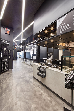
&pizza’s unorthodox approach to business can be seen in its design. Though having a set prototype is one of the advantages of chain restaurants, no two &pizza stores are alike. This encourages customers to think of nearby &pizza stores as part of the neighborhood, says Lastoria.
There is a common look to these restaurants, though. Each store (save one) has a black and white color palette. According Lastoria, this look should help &pizza restaurants stay relevant in the years go come. “It’s the colors that tend to date things...We want this brand to be around for a very long time and we want to build shops that are sustainable, not just in the materials that we use but in how we approach design as a whole. Black and white really allows us to have the right staying power.” This approach, he added, also lets pizza ingredients and pies, with all their colors, truly stand out.
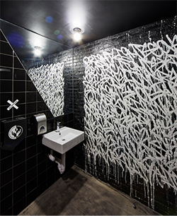 Black and white could be either boring or edgy. It’s no surprise that &pizza chose the latter. In its dining room, the chain cut black and white tiles to build a mosaic. Both the dining area and the bathroom features work by NY/LA artist Bisco Smith.
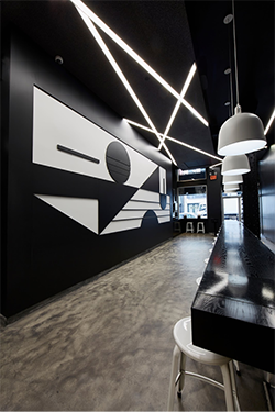
The featured art in the dining room is a mural by New York artist Tony Rubin. “We had him draw and then we had his art fabricated [in wood] to give it texture. The art itself represents the architecture of the neighborhood in a very abstract way,” says Lastoria.
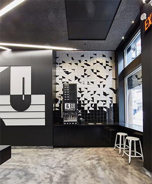
For flooring, the restaurant would have preferred stained concrete, but the building has a wood floor that could not be taken out. The restaurant placed a faux concrete floor over that wood to achieve the same look. The space also has a very high ceiling. To bring intimacy to some areas, &pizza installed a black drop ceiling with white strip lights.
&pizza also had to work around structural pillars. The chain used these to its advantage by using them as supports for a large wood community table. The restaurant’s black and white theme can be seen in the table’s black paint, with white stools and the white pendant lights hanging overhead.
&pizza was a 2017 winner in our rd+d awards. You can submit your project for the 2018 awards here.


