Once an afterthought, the interior of this regional pizza chain has gotten an upgrade.
Columbus, Ohio-based Donatos Pizza prides itself on the quality of its food. The chain, says Vice President of Business Development and Franchising Jeff Baldwin, uses high-quality, edge-to-edge toppings on its pies and sells them at “the higher end of the price point.”
Until recently, however, Donatos’ dine-in experience didn’t match the food’s quality. The dining area, Baldwin says, was treated as something of an afterthought. In response, the company has rolled out a new design meant be warm and welcoming and to appeal to a variety of customers.
“Pizza is fun and we wanted to grab that fun atmosphere and provide an environment where people could get together and have a good time,” Baldwin says.
Guests find this first bit of fun before they even enter the store. Donatos signature pizza is a pie with 100 pepperonis. In those stores where the chain can have wooden exterior doors, it stencils 100 pepperonis laid out in a circle — a pizza formation — on the door.
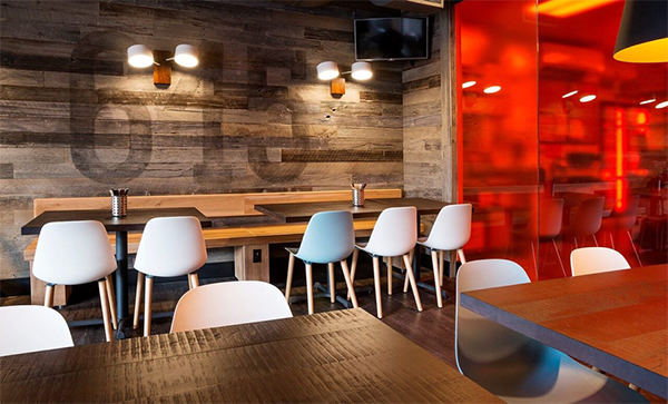
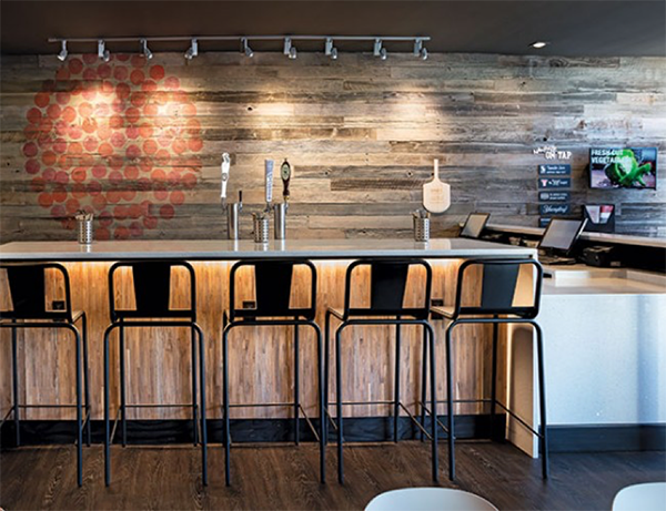
This same design can be found in the store’s interior, painted on a feature wall covered in gray reclaimed barn wood. Other art elements include a localization wall, often displaying something relevant to the community, such as an area code, as well as a chalkboard highlighting craft beers sold by the restaurant.
The most eye-popping aspect of the new design is the chain’s new semi-open kitchen. This space is presented in an unusual way, with a translucent red glass wall separating the dining room from the production kitchen, giving guests a partial view of the operation. “The intent of the red glass is to provide the experience for the customer that there’s activity and action and there are people assembling pizzas in the back, thought it stops short of showing you every gritty detail of what happens there,” Baldwin says.
Fun and energy are important, especially for a pizza place, but to bring in dine-in customers, a restaurant must be comfortable, too. With this in mind, Donatos has created a design that is relaxing – and full of options.
Donatos new color scheme is dominated by warm tones. This includes the previously mentioned reclaimed barn wood, a stained concrete floor, and tabletops made of solid dark wood.
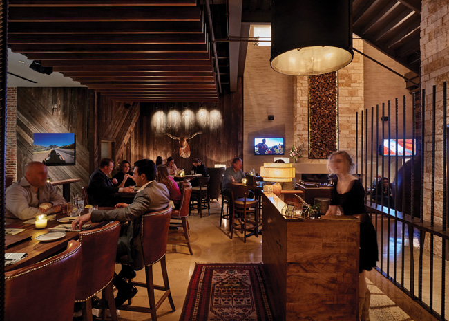
Customers can feel more welcomed by the variety of seating options the chain now offers. Though seating can vary by location, there are now a variety of choices in each store to meet whatever preference a customer may have. This includes booths, floating two and four tops, high-top tables and bench seating.
“The more zones you have, it gets customers at different levels,” says Baldwin. “There are a lot of choices in a relatively small space. It allows us to leverage and maximize the sizes of the dining rooms we have.”
Included in this new seating approach are new seating zones. Where possible, the chain is now adding an outdoor patio to its stores. It has also created a “pick-up bar.” With just a handful of seats, this area is designed to give carryout customers a place to relax and enjoy a drink while their pie is being made, though it is also used by the occasional dine-in guest.
With the new Donatos look rolled out for several months, the chain is now in the process of value engineering and introducing the design to franchised stores. While this represents a real financial commitment, it is one that will help the chain and its partners
thrive in the years to come, says Baldwin.
“Invest where it matters. We’ve made the decision to invest in the dining room and the guest experience — where the guest is sitting and eating and enjoying.”


