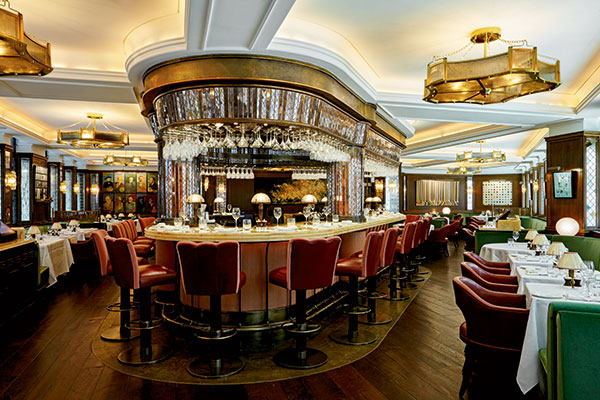
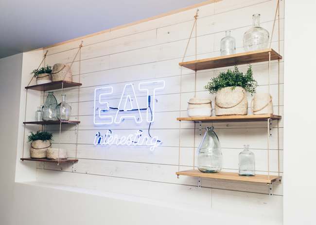
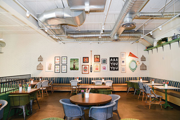
 Flower Child's designs include a mix of chain and localized elements. Photo courtesy of Fox Restaurant Concepts
Sam Fox, CEO and founder of Phoenix-based Fox Restaurant Concepts, believes every restaurant should tell a story, and that’s why each of his chain locations is unique. Fox operates four chains that have a local flair — Flower Child (5 locations), True Food Kitchen (16), Culinary Dropout (5) and North Italia (9).
“It is important to preserve the soul of the community we are in,” says Stephanie Ryder, director of development and design for Fox Restaurant Concepts.
This company isn’t alone. As chains expand across the country, operators are working to make each restaurant unique while still staying true to the brand. Each chain has its own methodology.
The starting point for the individualization of each Fox restaurant, for example, is the artwork, which comes from local artists and photographers. But artwork is only part of it.
The Irvine, Calif., North Italia store features surfboards on the walls; the Santa Monica Flower Child has a two-story-high mural that depicts a large open journal filled with art inspired by the area; and the Chicago True Food Kitchen has a moss installation that spells out “Be True.” “We’re always trying to be cognizant of the area we’re going into,” says Ryder.
The chains also work with what they’re given at each location. The Flower Child in Santa Monica, for example, has a midcentury facade. “So we brought in Sputnik light fixtures and midcentury furniture so it all felt right, and it aligns with the Southern California feel,” Ryder explains.
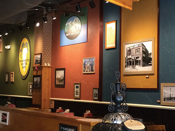 At Potbelly, local photos bring the restaurant closer to home for patrons.Each location is also decked out with items from local antique shops. “We accessorize a lot,” Ryder says. “The company gathers things like lamps, vintage toolboxes and stacks of books, although some items are standard for each location. The latter tend to be functional pieces like the silverware holders and furniture, though occasionally even they are switched out if a local item works better. “We have things we like, but we are not afraid to change if it works better for the space.”
Fox Restaurant Concepts has a small team that works on localizing each restaurant. Some research can be done from their offices, such as scouring eBay, Etsy, and Napa Home and Garden, but other work is done in the local communities.
Despite all this, there are brand standards at each of the company’s four chains that are nonnegotiable. Wall coverings, bathroom materials, the wood and the interior finishes are typically identical, “which is why accessorizing is so important,” says Ryder. “It’s important to maintain consistency, but we want to do right by the space and make it feel it belongs in that community.”
Searching for History
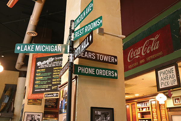 A Chicago Potbelly store offers directions to Lake Michigan and the Sears Tower.Like the Fox chains, Potbelly Sandwich Shop, which owns and operates more than 400 units and is headquartered in Chicago, has its team research local communities before it enters them.
“We check out the historical society, the web page for the city, the library, then dig deeper from there,” says Senior Director of Design Melissa Wyder.
The artwork Potbelly uses is mostly old. “We look for historic photographs, newspaper clippings, magazines, high school yearbooks,” Wyder explains. Murals are typically graphic images printed onto wall coverings.
Potbelly also has standard pieces. There are usually signs that say “You Gotta Get It Hot” and sometimes “Come In and Eat Before We Both Starve,” as well as photos and drawings of antique potbelly stoves. “They’re a nod to our heritage and history,” Wyder says, “and we supplement those with the neighborhood artwork, so it’s a fifty-fifty mix.”
The color palette of each store is also the same, as are the ordering lines. But in seating areas, it all changes: Logos or other designs, such as a city seal or flag, are carved into the tabletops, which are sealed with an epoxy coating.
Making each store fit into its neighborhood is working, Wyder says. “It gets customers in and staying in because they feel like it’s their store.” This is especially true, she says, when customers see themselves, friends or family members in old photos on the wall.
Creating Some Madness
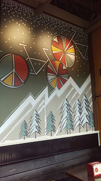 Some Potbelly locations acknowledge the local terrain in custom murals. Photos courtesy of Potbelly Sandwich ShopTeriyaki Madness is a fast-casual restaurant concept that’s committed to breaking free of the homogenization of franchising.
The Denver-based chain has 39 stores open and 117 in development — and it wants each to be unique.
“We’re looking for individuality in each shop,” says CEO Michael Haith. “We want each one to reflect the personality of the franchisee and the market they are in. We want them to celebrate their individuality and be proud of their shop.”
To stay true to the chain’s name, Haith encourages each franchisee “to put a little madness in there,” he says. “This creates the personality of a store, and frankly, owners enjoy and take more pride and ownership when the stores are designed partly by them.” The Las Vegas store, for example, is decorated with local sports pennants and posters, including an AC/DC poster; the Lewisville, Texas, location shows the movie “Godzilla” on a permanent loop.
One constant — although it varies from store to store — is a Wall of Chatter, which features an enlarged quote chosen by the franchisee. “The quote has to be something that identifies with them as a person and their business,” Haith says.
There are few rules for the restaurants. “We are not hung up on the furniture or the type of floor or the lighting or the type of ceiling. We do insist on our color scheme and brand book, which identifies our brand voice, personality, vision, values and defines who we are and who we are not,” Haith explains. However, he adds, “we want a feeling of community where we support the community and the community supports us.”
An advantage of doing things this way, Haith adds, is that retrofits can be completed for much less money since existing designs and furniture — and anything else — can be used.
Of course, Haith says, this is much harder than using a cookie-cutter format since each restaurant begins from scratch. However, the payoff is worth it. “It allows us to compete with local restaurants, and it provides more ownership of the shops by the franchisees,” he explains.
The stores are very diverse. One may feature an industrial look with concrete floors and ductwork showing; another may look like a couple bought the store space and turned it into a little owner-operated restaurant.
“Not having that scripted decor makes a more comfortable environment,” Haith says. “There’s some warmth in each one because there’s been love and attention poured into it. It’s very hard for a franchise owner to pour their heart and soul into a fluorescent-lit box versus something warm that they feel good about. If there isn’t that soul, there’s nothing for the community to latch on to. It’s about connection. We want the community to want to support this restaurant.”
America’s Diner, Recreated
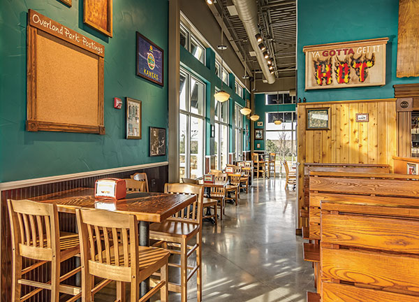 Potbelly stores maintain chain branding while including localized graphics and signage. Photo courtesy of Potbelly Sandwich ShopIn 2011, Denny’s began overhauling its restaurants nationwide as part of its new “heritage” brand reimaging campaign. By the end of October, it had completed the revamp of 49 percent of its locations — more than 800 units.
With each remodel, the company looks to pull in locally inspired design elements, including massive murals inside each unit depicting scenes from the communities in which the restaurants reside, usually created from current or historical images.
“We’re looking to give the brand a more contemporary feel and looking at what is the American diner of the 2020s,” says Joseph Giordano, senior director, franchise and company development. “We want to make our units as local as possible and connect with the local community. It gives a sense of ownership.”
To understand each community, Denny’s works with local architects and design firms but also local chambers of commerce to find out what that local market is about, what people are proud of and what the community ties to.
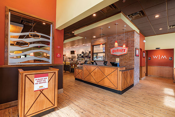 Denny's reimage combines an updated design with local flair. Photo courtesy of Denny’sFrom this, the concept commissions a mural. In Atlanta, for example, there’s a mural of the church where Martin Luther King Jr. was pastor. And some of the location’s other artwork has some images of Dr. King’s family, “so it really relates back to the community,” says Brian Harrison, senior manager of architectural design.
In Las Vegas, the Denny’s team tied the restaurant to traveling since so many people pass through the city. They created a large mural of license plates. “Each area we go into, we try to find that uniqueness,” Harrison explains.
But not everything changes. The counter remains the same since it’s the cornerstone element in the brand’s identity as America’s diner. And there is always a strong focus on booths in each location because Denny’s has found it’s what customers prefer. The ceilings are always dark brown, the floors are always tile and the Always Wall, which features the saying “Always Fresh, Always Here, Always Open,” never changes.
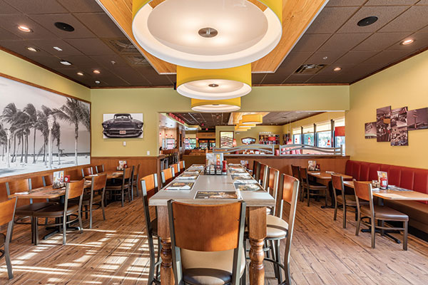 Locally-inspired murals and art are key elements in Denny's "heritage" reimaging campaign. Photos courtesy of Denny’sTaking a store-by-store approach to chain restaurants imbues each location with a story and an identity while ensuring stores retain elements vital to their brand.
However, the split varies among chains. Teriyaki Madness, for example, is unconcerned about replication in its units beyond the basics. “We keep the key elements, but it’s not necessarily clear each location is a Teriyaki Madness as soon as a customer walks in,” Haith says. “I’m puzzled as to why chains need their interiors to be the same. People know it’s a Teriyaki Madness because they read the sign and walked in the door.”

