It really hadn’t been that long since McAlister’s Deli underwent a brand refresh.
While chains often go 10-plus years between makeovers, this Atlanta-based fast-casual concept underwent one just 4 or 5 years ago, says McAlister’s President Joe Guith.
The restaurant industry, however, keeps changing, and changing so quickly that the company unveiled a “brand evolution” over the summer to address these shifts. The effort included the launch of a new prototype in September in Atlanta’s West Midtown area.
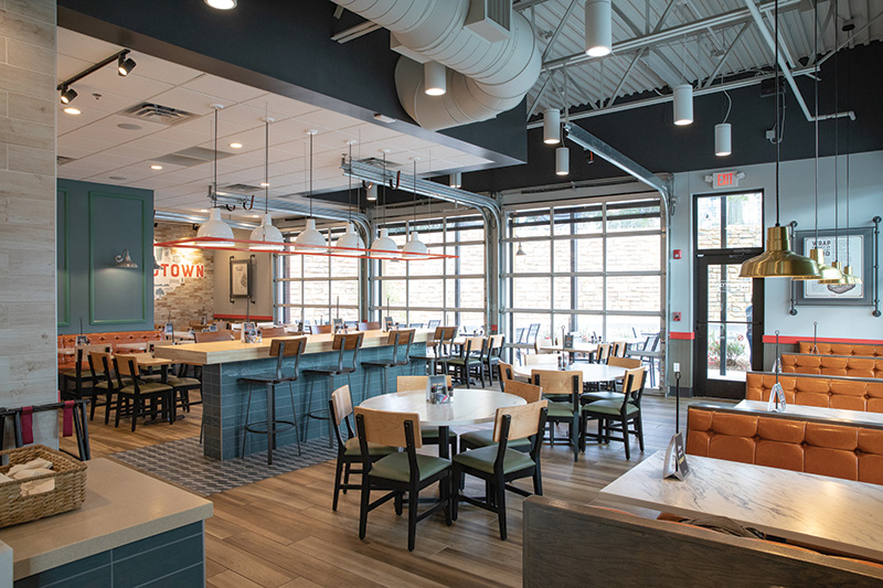 The new design offers booths, floating tables and banquette seating, providing guests choices depending on occasion and the size of their party. Photos courtesy of McAlister’s
“I think evolution in today’s industry is rapidly accelerating,” Guith says. “We looked at things like how we are connecting with our guests by leveraging technology, how guests connect [to us], whether it’s the type of table they sit at or how they receive their food. Then there’s just the general evolution of style and trends and color palettes. We want to make sure that while we have heritage, we don’t look dated. We can’t ever really stop.”
Developing a design and a brand position that addresses all those areas — from design to technology to dining trends — is difficult enough but to make the effort worthwhile, a chain must center these efforts on its customers. A sushi place, for instance, may want to address similar industry trends as McAlister’s. If both chains use the exact same solutions, though, something has clearly gone wrong.
To help with this aspect of the project, McAlister’s turned to third-party research firm Sterling Rice Group (SRG).
According to Robert Dimson, the chain’s vice president of marketing, McAlister’s worked for a year and a half with SRG. Through research methods, including focus groups and customer surveys, says Dimson, SRG helped McAlister’s “determine and pull forward key characteristics ... to help us understand the fundamental need space that our guests are in. That journey led us to the overall Craveable Connections brand positioning that you see coming to fruition today.”
 McAlister’s new design includes a patio wherever possible. This space can connect to the interior through a pair of garage doors.
What Is Cravable Connections?
McAlister’s new brand positioning includes three main pillars. Connections between the restaurant and guest represents the first pillar. The chain, says Dimson, wants to provide hospitality to its guests. Through features like table service and staff that circle the restaurant to attend to guest needs, McAlister’s strives to be a place where guests feel comfortable and truly welcome.
Culinary innovation — the “craveable” aspect of Cravable Connections — serves as the second pillar. As a deli concept, McAlister’s provides comforting and familiar food. The chain, however, elevates its offerings, Dimson says. Instead of just a standard BLT, for instance, McAlister’s offers a BLT with avocado and herb mayo. In addition to soups like tomato bisque, McAlister’s has a seasonal autumn squash.
Each restaurant’s connection to the community it serves marks the third pillar. McAlister’s doesn’t want to be just a place to grab a bite to eat. It wants to be a member of the community, from serving as a gathering place to supporting each community’s causes. To that end, the company developed a community connections toolkit that helps individual stores partner with local nonprofits or causes that are tied to the community. Through its research, the chain found these smaller partnerships do more for each restaurant’s ties to its market than system-wide efforts.
“What we heard in the research is that ‘this is my McAlister’s,’” says Guith. “Even though we’re a larger restaurant concept, we still have a very local feel. There are real benefits by having that connection to the community. There are other brands out there that are doing this, [but] we do believe it’s a unique position for us in our segment.”
Naturally, the Cravable Connections brand position applies to more than a fund-raising strategy. The company reworked many of its other customer touchpoints with this approach in mind.
For instance, McAlister’s new logo and its new tagline, “great food brings us together,” have been added to its cups, one of the restaurant chain’s most frequent customer touchpoints, says Dimson.
The restaurant chain also changed its uniforms as part of its brand evolution. Prior to this effort, McAlister’s employees could choose from several different-colored shirts with different designs on the back. The new shirts have a handful of sayings (one example: “Sweet Tea is Like a Warm Hug”). The company now asks crewmembers to wear a nametag as well.
“If we truly want to create guest connections, then we want them to be able to quickly identify who works there,” Dimson says. “We just want to make sure we’re doing everything we can to bridge that gap.”
Then, of course, there’s the restaurant design. It’s here that everything comes together, from McAlister’s desire to better leverage technology to its response to the off-premise dining trend to providing a comfortable, friendly space where people can gather for good food and good company.
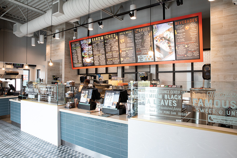 The chain’s new ordering counter includes a counter face clad in a blue-gray tile that elevates the space as well as glass panels with brand messages.
Smaller, More Local
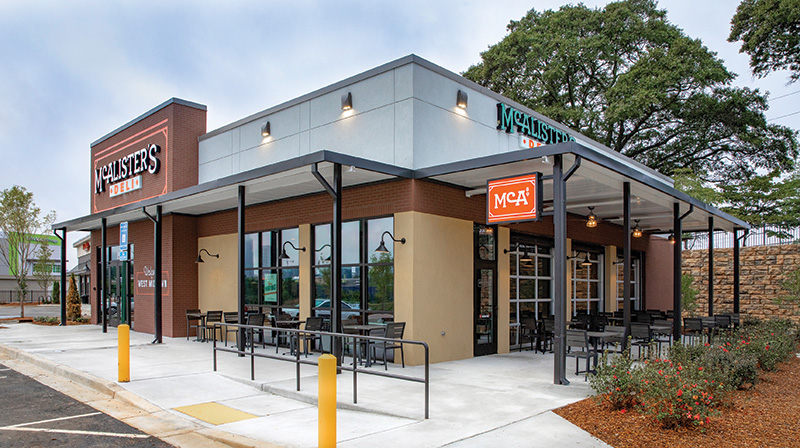
McAlister’s displays the company’s community focus on the exterior of its buildi ngs. People glancing at the building might not catch it, but the chain’s new logo and signage contains the McAlister’s Deli name (with the “Deli” framed by the M and S in McAlister’s) in a rectangular container. This container, says Dimson, represents the new design’s featured community table and, more broadly, McAlister’s community focus as a whole.
Other symbols of the chain’s commitment to the places where it operates are not so much Easter Eggs as they are part of a community-centric aesthetic. Take the building’s facade, for instance. Made of a composite material designed to look like bricks, this aesthetic is part of what the company calls its “modern Main Street,” approach, says Justin Krivanek, McAlister’s director of brand activation.
“We started thinking about some of these small towns that we’re already a part of ... where you have this Main Street. So many are being revitalized at this point in time. It’s this idea of contemporizing something that has been somewhat aged but feels genuine and authentic,” Krivanek says.
The exterior of this first restaurant also nods to McAlister’s history. The first McAlister’s, opened in Oxford, Miss., started in an old service station with two garage doors. This restaurant includes a patio that connects to the interior through a pair of garage doors. This not only acknowledges the chain’s roots but it also brings in natural light to the space.
The patio makes a nice addition and helps offset some seats lost to a smaller interior. It’s not required for every new store, however. “We want to be realistic with the design itself separate from the patio. We need to make sure that ultimately it works, since we know that we can’t get a patio at every location,” says Krivanek.
While the smaller footprint serves as a response to the off-premise trend, the building also includes features meant to leverage this shift in dining habits. The prototype includes a drive-up window for pickup orders.
Not only does this make McAlister’s
appealing to those who want to eat off-premise, says Krivanek, but it also should appeal to “busy balancers” — parents with kids, jobs, and everything that entails, who make up an important part of the chain’s customer base. It’s important to note the window is not entirely new to McAlister’s. About 10 percent of the company’s existing restaurants have such a window, says Krivanek. Going forward, though, the chain expects the window to be a standard feature for McAlister’s restaurants, real estate permitting.
This window represents more than just a window. McAlister’s has taken the opportunity to upgrade and leverage technology to improve the drive-up guest experience. A touch screen near the window allows customers to check in as they pull up. This not only speeds service but it also allows team members to dispense drinks, including the chain’s signature sweet tea, essentially on demand.
“That comes back to the fact that we want to pour our beverages just as the guest is arriving. We want to make sure the tea is as fresh as it can be, serve them as soon as they get to the window and then they can be on their way,” Krivanek says.
The drive-up window isn’t the chain’s only accommodation for those who want to take their food away. As soon as guests enter the restaurant they’ll find a set of shelves to their left. At this station, staff place to-go orders that guests pay for in advance. Notably, these shelves sit in the front of the house and do not require a staff member to help guests retrieve their orders. To encourage honesty, these shelves reside next to the POS counter, in full view of front-of-the-house team members.
The POS area, as well, was redesigned in this new prototype. The tiled space in front of the counter boasts a “Q-bert” style pattern to help it stand out, while the sweet tea containers, which used to sit on the back counter, now occupy a front position. This, says Krivanek, encourages interaction between guests and employees and plays a role in McAlister’s providing “genuine hospitality.”
The biggest change to the POS area, though, involves its connection to the kitchen immediately behind it. Instead of a standard wall, the chain has put in translucent glass panels that show the kitchen’s activity without having it fully on display. “We wanted to show you the activity. We have a lot of pride in the crew members that are delivering that simple, elevated food from our kitchen, and we wanted to open that up a bit more,” says Krivanek.
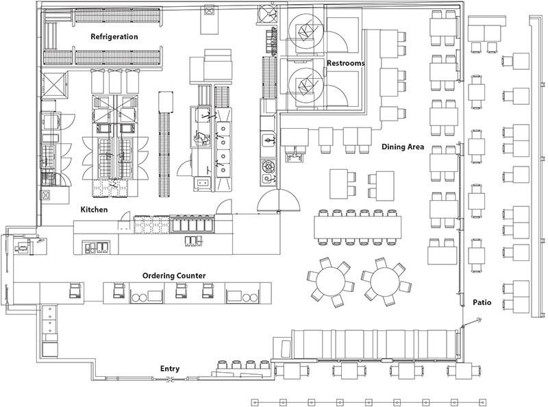
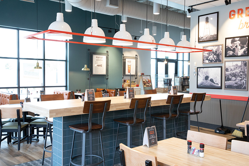
For guests who want to stay and enjoy their food after ordering, the chain offers a bright space with wood-style ceramic flooring and a color palette featuring blues and oranges. Since McAlister’s wants to be a community gathering place, the chain also offers a variety of seating options that meet all sorts of needs: patio seating, booths, floating tables, a banquette and the restaurant’s new community table.
While many operations have added community tables recently, this one is built into the structure. McAlister’s highlights this table with a base clad in the same blue-gray tile used at the POS counter, more Q-Bert style floor tiles and a special pendant light fixture. The tabletop, meanwhile, has the McAlister’s logo on it, highlighting the idea of logo-as-community table.
More than being a special place to sit, the table’s permanent nature helps it break up the dining space, says Krivanek. “There is that open restaurant feel when people can connect with others, but at the same time, you can still see those designated zones based on the placement of that community table,” he explains.
Other community-focused elements remain visible in the restaurant’s art package. New prototype stores, then, will have a wall graphic on an interior brick wall with the community’s name and images familiar to community members, such as local landmarks and gathering places.
To build even stronger community ties, the company will add a video monitor to new stores that can display images of guests. Customers simply have to take a picture of themselves enjoying McAlister’s, then tag it on social media with the hash tag for their local restaurant.
 The community table in McAlister’s new prototype not only serves as seating, but it also helps break up the space without relying on a wall to create different zones.
Back to the Beginning
With the new restaurant open only a couple of months, McAlister’s continues to evaluate the design and look for opportunities to improve it based on customer behavior.
According to Krivanek, the chain will obviously look at sales at the first store and a few more currently in the pipeline. It will also look at beverage sales — highlighted through the placement of the tea — and to-go orders. The chain will also continue gathering customer feedback through surveys and quantitative research.
This sort of feedback helps the chain understand what its guests want and how McAlister’s can meet these needs within its own unique positioning, Guith says. Leveraging customer feedback has long been a key ingredient in McAlister’s success and it plays a key role in the latest evolution of the brand.
“We recognized the need to continue to update and be relevant to our guests. To that end, we’ve undergone this new evolution of the brand,” says Guith. “It has largely been focused on refreshing our roots. The focus is still very much on community connection, providing true hospitality to our guests and providing simple but elevated food.”
Snapshot
- Headquarters: Atlanta
- Concept owner: McAlister’s Deli - Focus Brands – Roark Capital
- Concept style: Deli with counter ordering and table service
- Segment: Fast casual
- Unit count: 435
- Average check: $15.50
- Location of new prototype: West Midtown, Atlanta
- Opened: 9/17/18
- Size: 3,100 square feet (occupancy space)
- Real estate: Freestanding Pad Site
- Design highlights: Prepaid pickup window, front counter tea displays, garage doors
- Build-out time: Five months
Project Team
- Project lead: Micky Boeckl, VP Design & Construction; Justin Krivanek, Director of Brand Positioning Activation, McAlister’s
- Architect: GPD Group
- General contractor: Integra Construction
- Kitchen supplier: Trimark
- Interior design: Sterling Rice Group and Lauren Taliaferro, Director of Design, McAlister’s; Margarita Sandino, Design Manager; Ryan Wagner, Creative Director; Robert Dimson, VP of Marketing; Jessica Osborne, Director of Marketing
- Kitchen design: Shelley Harris, VP of Operations; Craig Forbes, Sr. Ops Services Manager; Margarita Sandino, Design Manager; Michael Freeman, Sr. Director of Company Operations