Industrial-Chic Design Sets the Stage for One Off Hospitality’s Hotel Restaurant Debut
Described as a “sceney stunner” by Bon Appétit magazine, which nominated it as a 2014 Best New Restaurant, Nico Osteria opened in the new Thompson Chicago hotel last November. It’s the latest in a string of solid-gold restaurant concepts developed by James Beard Award–winning executive chef Paul Kahan and his partners at One Off Hospitality Group, whose portfolio includes iconic Chicago concepts Blackbird, avec and The Publican.
At Nico Osteria, where Kahan’s team turns out rustic Italian seafood and small plates, and its adjacent bar/lounge Salone Nico, a comfortably modern, residential-inspired space sets the scene. The same look and feel permeate the Thompson Chicago property thanks to a fully integrated design by Tara Bernerd of London’s Tara Bernerd & Partners. It’s also a design that was well underway before One Off Hospitality got the nod to serve as the hotel’s signature F&B provider.
In addition to being the group’s first hotel-based restaurant project, Nico Osteria also was the first project for which One Off did not have complete interior design control. “We’re very design focused and are always very involved in our design process, typically collaborating with Thomas Fletcher of Design Bureau, who has worked on our other projects,” says Donnie Madia, a managing partner and owner at One Off. “But Tara Bernerd was already in the process of designing the hotel and the public spaces. The owners felt it would be best to have her do the restaurant as well. Thomas consulted with us on schematics, but the actual design and FF&E was all done by Tara and her group. It was a multifaceted project, but everyone worked really well together. The end result is a beautiful, efficient operation.”
Bernerd’s initial work on the property included completely gutting the lower levels of what was formerly the Sutton Place Hotel to create a new layout and flow for Thompson Chicago’s lobby and primary public spaces. The main floor, where Nico Osteria and Salone Nico sit, was expanded; a driveway entrance to what was a lower-level parking garage was removed, and central elevators were moved. Suspended ceilings over what is now Salone Nico were removed to expose a soaring glass atrium and second mezzanine-level bar.
“It’s a completely new flow,” Bernerd says. “Very much like that of a home. You walk through the entrance, through the salon and into the kitchen, or in this case into the restaurant/kitchen. That was a very poignant part of our role; the visualization of the layout and how the spaces would flow into one another. From there, it became about the textures and the finishes. We had already gone quite far with the look and feel of the restaurant by the time One Off was introduced, but we had an immediate connection and a great working relationship. They warmed to our design, and we to their food and entire style of operating. We were able to take the seed that we’d already started growing and grow it better with them.”
Informal Luxury, Industrial Chic
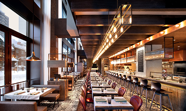
Situated in a corner space of the property fronting Chicago’s busy Gold Coast intersection of Rush and State streets, Nico Osteria’s main dining room occupies a long rectangular space. Accessed on one end from a separate street entrance and on the other through the hotel’s lobby, it features windows and booth seating along the exterior wall. A large expo kitchen and crudo station, with counter seating for up to 16, flanks the interior side of the room, and a row of freestanding tables runs in between.
Patterned ceramic tile covers the floors, and finishes featuring warm woods, leather, iron and glass combine to create an aesthetic described by Bernerd as informal luxury and industrial chic.
About the overall design vision, she says, “I’d sum it up as sort of a picture of an old movie star with a cigarette holder in ebony and ivory. I wanted to take that 1940s elegance and turn it into an industrial chic language and also to pay homage to Chicago’s Frank Lloyd Wright, with his dedication to detailing. So it’s very much about that informal luxury and industrial chic, but still something that could be a handsome home.”
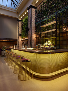
That aesthetic begins in the hotel lobby and concierge areas, marked by comfortable lounge furniture, bookcases and a fireplace, and then flows into Salone Nico. Design highlights here include a large, U-shaped bar clad in green-gold ribbed metal, custom bar stools and polished concrete floors trimmed in tile and covered in seating areas with plush patterned rugs. Lounge furniture is finished in burgundy and khaki velvet while banquettes, also velvet, pick up the green-gold shade of the bar’s base. Living “green walls” take advantage of the natural light in the atrium, adding fresh color and texture, and natural brick detailed with polished black corners carries the industrial-chic look through.
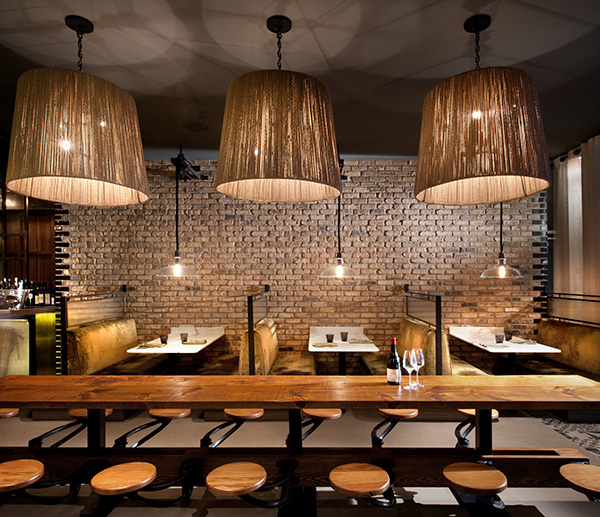
A transition space between Salone Nico and Nico Osteria’s main dining room holds booths covered in the same velvet as the lounge banquettes and a large, wooden, custom-made communal table. “It all flows together. The lounge/bar, with the khaki and burgundy velvet, and the flooring of the restaurant and the colors and the materials chosen,” Bernerd says. “They’re not ‘matchy-matchy’ rooms; but they certainly integrate, and there’s a definite language.”
Dual-Kitchen Challenge
Nico Osteria’s gleaming display kitchen is the centerpiece of the dining room. Everything here happens in full view and the small army of bicycle-hatted chefs working behind the counter, most stationed close enough to interact with guests seated there, adds to the ambiance.
The roughly 600-square-foot display kitchen turns out half of the restaurant’s menu items — crudo, antipasti and fettunta (rustic grilled bread with a selection of toppings), according to Madia. The balance, including pasta dishes and other main courses, comes from the “bottom of the house.” During the property’s renovation, the lower-level hotel parking garage was transformed into a 4,000-square-foot production/support kitchen, chef’s office, and dish washing and storage areas.
Foodservice consultancy Next Step Design was brought in to assist with layout and equipping of both kitchens, as well as Nico’s bar operations. Project manager Stuart Davis says the basement conversion was tricky. “To get an exhaust system down there was interesting,” he says. “We had it custom-engineered to work with a super-low ceiling height. There’s some substantial cooking going on in that space — prep to support the display kitchen, but the main hot cooking line and dessert production areas are also there, and that kitchen also handles room service. In addition to the exhaust system, we had to cram all of the mechanicals into that ceiling, so it’s really a maze up there.”
The finished basement kitchen ceiling height now stands at slightly more than 7 feet. “Seven feet is code,” Davis notes. “Luckily, the Nico chefs wear bicycle hats and not toques. That would be a problem.”
Not only was the dual-kitchen scenario challenging from a design standoint, it also demands tight coordination and impeccable timing on the part of Nico’s culinary staff. To facilitate that, a pickup station/pass is positioned at the end of the display kitchen, close to stairs leading to the basement. “Dishes that are made upstairs go to the expediter at the pass, and so do the dishes that come up from downstairs,” Davis says. “Everything comes together there for service. It takes a lot of communication, and the crew relies heavily on walkie-talkies. It’s amazing to see the volume of covers they do so smoothly.”
Project Team
- Owner: AJ Capital Partners
- Operators: One Off Hospitality Group (Paul Kahan, Donald Madia, Terry Alexander and Kimberly Galban)
- Interior Design: Tara Bernerd & Partners (Tara Bernerd and Tommy Gymnander)
- Architect: Hartshorne Plunkard Ltd., Andrew Shimanski
- Foodservice Consultant: Next Step Design, Stuart Davis
- Owner’s Construction Project Manager: Daccord LLC, Len Skiba
- Engineer: WMA Consulting Engineers Ltd., Michael Merel, PE
- General Contractor: Power Construction Company LLC, Michael Conlon
Snapshot
- Location: Thompson Chicago hotel
- Concept: Italian seafood, small plates
- Opened: November 2013
- No. of seats: 192 (112 inside, 80 sidewalk café)
- Design highlights: Integrated flow, industrial-chic finishes, residential-inspired furnishings, display kitchen with counter seating, ribbed metal-clad bar, living walls, patterned ceramic tile and polished concrete flooring
- Build-out: 20 to 22 months

