Restaurant design is always evolving. From materials to aesthetic trends to operational concerns, the last few years have presented major challenges, and successful operators and designers have responded nimbly, implementing innovation after innovation in trying times. We never know what the future will hold, but rd+d caught up with some restaurant designers to see what’s happening on the ground. One key takeaway? Keep up with technology!
Acoustical Attention
 Elements of design are being integrated into architecture instead of added afterwards. Image courtesy of Brandon BarreJohn Paul Valverde, principal and creative director, Coevál Studio, Dallas, is seeing a lot more attention being paid to restaurant acoustics. He’s working more with experts and sound engineers, doing studies on spaces and even making modifications to create perfect acoustics once a restaurant is open.
This might involve insulation and thicker walls in an effort to contain sound within a space. It often includes panels and fabrics used throughout a restaurant, and it often involves the layering of all these elements.
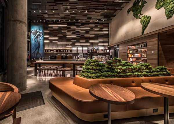
Managing the acoustics in restaurants has come a long way. In addition to acoustical panels that can blend in with the ceiling and disappear, there are now decorative panels that can be custom printed to continue the interior design’s themes or a restaurant’s branding, as well as hanging panels in different shapes that become part of the design instead of being disguised.
Or there are more hidden options such as acoustical wallpaper, which Valverde says “is a stylish, sound-absorbing wall covering made from materials designed to dampen sound, so it combines function and aesthetics and comes with a variety of textures and designs.”
Brian S. Thomas, principal, DP3 Architects, Greenville, S.C., is incorporating custom-printed felt-wrapped panels into a restaurant with a polished concrete floor. “We try to build it in so it looks intentional and not an afterthought,” he says.
AI Visuals
Restaurants are becoming more willing to invest in incredible visuals to provide a wow factor to guests, says Anna Woodman, Anna Woodman Interior Design, Jupiter, Fla. “Guests and patrons are expecting more.”
Woodman is using AI to give ideas to artists for custom wall coverings or framed artwork. “I can talk an idea into my phone and it will give me an image, then I can show it to the artist and ask him to create something similar,” she says. “AI helps me visually depict what I was looking for and helps me communicate.” So she’s using AI wisely, and retaining the human touch in the artwork. “I never want to take away from the artists who are so gifted and talented.”
Woodman is using technology in other ways, too. She’s worked on Ara in Jupiter, Fla., that had a custom digital wall covering. This was a high-resolution, custom-colored Type II vinyl product. “It incorporated metallic printing into the wall covering design, resulting in a gorgeous, glowing impact for guests,” she says.
Another restaurant Woodman is working with is retrofitting the ceiling over the bar with technology that will look like stars. They will glimmer and pick up the beat of the music.
“Technology is not going away, so how can we further enhance the creations we’re doing for our clients? How do we tap into it and merge it in the best way we can?” asks Woodman.
Another technique designers are turning to is video mapping. At Meximodo in Metuchen, N.J., Vincent Celano, principal and founder, Celano Design Studio in New York City, designed a back bar split into two halves with bottles on each side. In the middle, underneath a Mexican tile arch, is La Catrina, a traditional Day of the Dead muse, who watches over the restaurant. La Catrina brings an element of surprise to this high-energy restaurant — from time to time, she’ll wink, blow a kiss or rain flower petals, bringing moments of delight to unsuspecting guests.
 Meximodo features a video-mapped image who blinks, cries and blows kisses. Image courtesy of Pavel Bendov
Using More Local Products
Mountain pine beetles have killed more than 100 million acres of trees in the Western U.S. and Canada, much of them in Colorado. Because of this, these pine trees have been cut down and are “a great way to add a little local material into restaurants,” says Geneva Kowalski, owner and architect, Studio K2 Architecture, Denver.
Not only does this add local flair, but it’s also cost-effective and “elicits a connection to the outdoors and speaks to the local demographic, while also helping meet sustainability goals,” Kowalski says. Because the wood isn’t strong enough for structural work, it’s largely showing up in furniture design, including paneling, along bar dies or in ceilings. “Incorporating such appreciation for local influences helps create a sense of connection in each city,” she adds. The burrowing of the beetles creates a distinct blue tinge on the wood, which adds a unique aspect to furniture.
Kowalksi is also seeing restaurants add more live edge wood, especially to tables, countertops and shelving, made from hard woods like darker walnuts. This also adds a connection to the local area and the outdoors.
Design Integrated Into Architecture
Lighting, back bar elements and artisan craftsmanship are being integrated more into restaurants’ architecture instead of being added afterward as an adornment, says Courtnye Blair, senior interior designer with Parker-Torres Design, Boston.
At the Fairmont Kea Lani hotel in Maui, Hawaii, Parker-Torres’ senior designer Regan McLean worked with a local cultural advisor and incorporated a hand-carved piece as the back bar, integrating it completely. She used monkeypod wood throughout to connect the separate parts of the restaurant, with the wood from the entrance stretching across the ceiling to the bar. “All of the elements are heavily integrated,” says Blair. “It’s really important that it feels like something special; it’s that extra level of detail.”
At the Ritz-Carlton, Naples’ Club Lounge restaurant in Naples, Fla., Blair integrated elements of the lighting to add to the restaurant’s story. A light fixture above a dining table connects to two decorative fans that add interest and decor.
 Coevál Studio used acoustic solutions to keep sound down at The Rooftop at Gilly's. Image courtesy of John D'Angelo
Standout Bar Faces
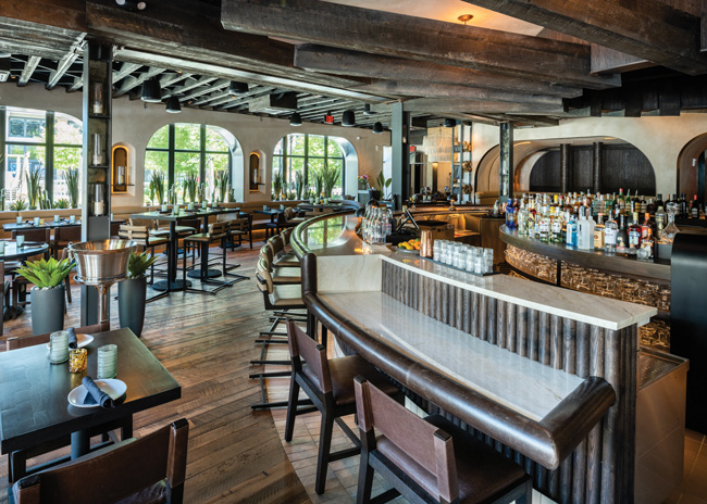
Bar fronts are becoming focal areas in restaurants, says Blair, “and not just a space under a counter.” At the Ritz-Carlton, Naples’ Nolita restaurant, she highlighted the bar front with maroon paint and gold metal reveals. And in the resort’s Sofra restaurant, she decorated the bar face with tile with a lot of texture and pattern. “It’s really sculptural, really textural and expands the feeling of the bar,” she says. “We’re integrating the bar with the whole space and not something plopped in the middle.”
Bringing more design to bar fronts give diners at tables something to see, and it also provides a wow moment when they first enter, Blair says.
Vibe Dining
Restaurant design is getting moodier, with lots of textures, very sophisticated sound systems and a distinctive vibe, says Nicole Herman, founder and principal interior designer, Social Design Studio, Scottsdale, Ariz.
This creates an entire experience of dining, Herman says. She’s been working with RDM Hospitality in Austin, Texas, and this fall opened Etta’s in Scottsdale. It features smaller lights to make the space feel moody and intimate, mixed with some show lighting and a DJ booth in each location that can augment and direct the mood as the night progresses.
Restaurants are using vibe dining to differentiate themselves beyond Instagram moments, according to Herman. “They want the whole thing to be an experience,” she says.
DJ booths can stand out or merge into the restaurant. At Etta’s, the booth mimics the bar face and has focal lighting over it; at Guest House in Austin, the DJ booth is hat-shaped and stands out more. The DJ booth makes the restaurant more of an entertainment venue, Herman says.
Valverde is also seeing more DJ booths in restaurants. “A lot of clients want this because they want the option to open later to increase revenue,” he says. At Snowbird in Frisco, Texas, he incorporated a DJ booth onto the second floor, “and a lot of people would rather enjoy that after dinner than drive somewhere else.”
Ideally, DJ booths blend in, says Valverde. Restaurants may not want to use them during the week, and they don’t want that space looking empty. Therefore, a DJ booth should function as a service bar or service table on those nights.
Extended Outdoor Dining
Restaurants are augmenting exterior spaces to extend the season and make them as attractive as dining inside.
Caryn Paradis, NCIDQ, owner, Studio Paradis, Chester, Conn., is finishing the design of a restaurant patio with firepits and lounge seating, a large chef’s table, bench seating with dining tables, and a full bar, all under a large structure with fans and heaters.
To make these spaces work in bad weather, restaurants are building structures, often made of steel, or including canvas covers that can be taken down during winter months, which is a less expensive option. Paradis is even designing blankets for exterior dining that continue restaurants’ brands.
These spaces, Paradis says, “are fully designed, with flooring, lighting, heaters and fans, water features, tiles, pavers, custom-designed furniture.” And manufacturers are bringing out many new lines for exterior hospitality, much of which can be customized. “It’s a good resource that designers don’t tap into enough,” she adds.
A problem with outdoor spaces is how they look during cold months, but Paradis is having custom, form-fitting covers made for outdoor furniture. However, for small items like table lamps, restaurants should design an interior storage space, she says.
Multiple Experiences Under One Roof
Consumers are looking to meet all of their needs under one roof. Paradis recently had requests for a restaurant with three experiences under one roof and one with five. “A restaurant we just completed has a small and intimate wine bar, a formal white-tablecloth dining room and a stone-floored tavern with a fireplace; there’s a place for everything,” she says. Other spaces include lounge seating, chef’s restaurants and event spaces. “The different areas have different moods,” she says.
Another example of multiple experiences is Spurrier’s Gridiron Grille in Gainesville, Fla., which, in addition to a dining room, offers a podcast room (that doubles as a private dining room), a room of trophies, private conference dining, rooftop dining, and a separate bar area upstairs that provides a different experience and vibe.
ADA Seating at Bars
Bars are not welcoming to wheelchairs because they’re too high. Restaurants must build in seating for them, but it’s always an afterthought, says Traci Weems, principal at GTM Architects, Bethesda, Md. ADA seating areas tend to be at the side of the bar, often by the service station, where it’s less pleasant to sit.
“I am hoping it will be more of a design solution,” Weems says. She points to a seafood restaurant she recently worked on where the ADA bar seating was planned to be right next to the oyster display and shucking area, “where it was going to be special seating that could also be ADA — that’s almost highlighting the best seats in the house.” Eventually, however, it had to be moved due to circulation issues. She did, however, design in a bar at dLeña in Washington, D.C., which curves and drops at one point to create an ADA spot that’s equally as desirable as any other place at the bar.
The key, Weems believes, is making these seats special so all customers want to sit there. She also expects to see more lower and deeper bars, which would also accommodate wheelchairs.
Dr. Carol Bentel, FAIA, FIIDA, ASID, LEED AP, partner, Bentel & Bentel Architects, Locust Valley, N.Y., came up with a creative solution to ADA bar seating at Hunter Restaurant, East Norwich, N.Y. The bar here curves and runs regular height for around two-thirds of its length, then “waterfalls” to ADA seating, so it’s completely integrated, she says. “That’s where everyone wants to sit because it’s a special spot,” she points out.
 The bar height at bar dLena waterfalls to allow for ADA seating that’s as desirable as any other spot. Image courtesy of GTM Architects
Going 3D
Building information modeling (BIM) is still fairly new to the restaurant world, but expect to see it used more, says Andrew Lengel, retail, food and beverage director with NELSON Worldwide, Minneapolis. BIM turns a 2D design process into 3D, so you can “create space, volume and give a quicker route to seeing things in three dimensions,” he says.
Restaurants haven’t really embraced BIM yet, largely due to cost, but some global restaurant brands have, especially in the fast-casual category.
The advantages, Lengel says, are that using BIM can help mitigate any lack of coordination between mechanical, engineering and construction teams. And BIM has, on many projects, been able to catch issues so there’s been fewer error and fewer changes, he says, “because with BIM, you can see if something is going to go wrong so you can avoid problems, largely.” For example, BIM can incorporate connectors, bolts and extra plates into steel beams, ensuring there’s enough space allocated for them. Or it can help get a feel for how many seats is the right amount for a dining room, he adds.
David Shove-Brown, partner at Washington D.C.-based architecture and design firm //3877, uses 3D technology to share models of projects with everyone involved in the design and building of a restaurant, including the owners. “So now, when it’s done, people are surprised to see it looks exactly like the renderings,” he says. This helps everyone make early decisions about what needs to be done, “and they can stand in the space and truly understand what it’s like and mitigate potential disasters.”
The technology can even help with pre-opening marketing. It will create a QR code, which owners can post on their door or include online while under construction “so people can imagine themselves being there when it opens,” Shove-Brown says. “It gets people jazzed and ready to come in.”


