For our complete profile on Nico Osteria click here.
Kitchen Insight: Stuart Davis, Next Step Design
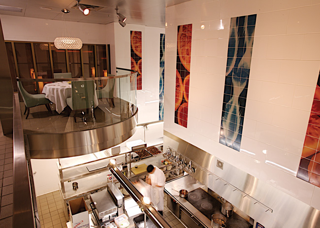
 Sightlines. For the display kitchen, we wanted to preserve sightlines to the hearth oven and the cooking suite, so we kept refrigeration at counter height of 36 to 40 inches. All of the mis en place are stored in refrigerated drawers right at the cooks’ stations, all within reach. Also, when your kitchen is on display, it’s the theater. It has to be as clean and organized as possible even during the busiest shifts. Everything was thought through to not have any visible clutter. It’s all behind a door or in a drawer so all you’re seeing is beautiful, clean stainless steel and the kitchen suite in action.
Efficiency. If chefs can take two steps instead of four to get what they need, they save a lot of time because they do it over and over and over again every shift. If they have what they need within reach, they get the food out faster, keep the kitchen cleaner and maintain a better work environment. You don’t want them having to scramble for what they need, because when they scramble they make mistakes.
Favorites. I love the island cooking suite. It’s single sided and half the size of what a lot of kitchens would have, but it’s very efficient. I also love the overall design of the kitchen and bar and the finishes selected. There’s so much theater, and everywhere you look there are nice details. If you sat in a different chair every time you came in, you’d see something different.


