Wall coverings are one of the keys to realizing the design vision. They can serve as backdrops that frame a space, provide wayfinding cues or, in the case of a feature wall or mural, make a bold statement.
Designers have a wide variety of options when dressing up a wall. Materials like vinyl, brick and brick veneer, wood (and resin-based products that emulate wood), metal, ceramic tile and wallpaper are among the many options for adorning walls. The choice of material also encompasses practical considerations such as durability, cleanability and ease of repair.
When choosing materials, wall coverings should always be contextual with the overall site design. “We consider the whole framework of space — its visual impact and function,” says Allison Cooke, partner and director of hospitality design, CORE architecture + design, inc., based in Washington, D.C.
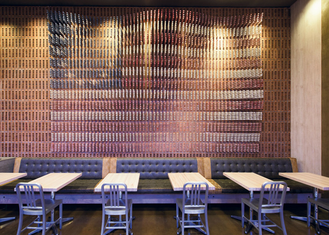
 DMAC Architecture’s team created an American flag using a series of painted dowels, making a dramatic wall-size art installation at Tacconelli’s Pizzeria inside the SugarHouse casino. Image courtesy of DMAC
Make a Statement
“Wall coverings give you opportunities to inject some personality in the overall design,” says Nikki Vincze, design director, Sargenti Architects. Before choosing a material for a wall covering, consider the size, scale and color scheme of the wall and how it fits holistically in the design, she advises.
When devising a design scheme for Sweetgreen locations in the New York City area, Sargenti took into account the surrounding neighborhood. “We were looking for some geographic variation for each site,” Vincze says. The firm assessed the vibe and clientele of each neighborhood for inspiration. The key element to express those neighborhood differences was a feature wall. The Brooklyn location features a mural with colorful graffiti emulating the street art of the surroundings. More subdued Manhattan locations are monochromatic or feature a couple of complementary colors with light texture and a small-scale geometric pattern. Feature-wall variation provides distinctive geographic differentiation, while the rest of the establishment embraces Sweetgreen’s standard look.
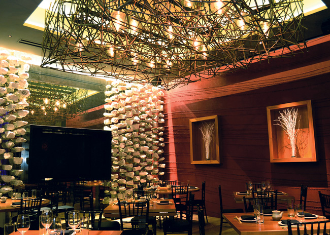
 Nontraditional wall coverings were used to great effect in DMAC Architecture’s design at Roka Akor. Image courtesy of DMAC
Bang For Your Buck
“Wall covering doesn’t usually get a big share of the budget,” Vincze says. To ensure that wall covering expenditures yield the most impact, consider the height and location of materials and features.
“Spend money where customers can see and touch elements,” says Daniel Chapman, senior interior designer, CORE architecture + design, inc. Areas above eye level do not need to have as much impact, he says. Features above 7 feet or so will be noticed less, so generally speaking, don’t spend a lot on those areas, he advises.
Thankfully, there are many economical options that can have strong aesthetic impact.
Embossed vinyl, for example, presents innumerable options for designers. This material is incredibly versatile — able to emulate wood, metal and other materials. “Vinyl has come a long way in the last few years,” Vincze says. “And it is shockingly affordable.”
“We wanted to use wood paneling on a wall in a casino, but we found a vinyl wall material that looked the part,” says Dwayne MacEwen, principal, DMAC Architecture P.C. “There are also a lot of great options for vinyl with embossed graphics.” Manufacturers provide off-the-shelf designs, but vinyl wall coverings can also be customized. Many local reprographic shops can develop a custom wall covering concept. Customizing vinyl does add cost, but it is still budget-friendly in most cases.
Resin-based and plastic products also come in many colors and textures. “We’ve used a resin-based product that looks like cast aluminum,” says Daniel Chapman, senior interior designer, CORE architecture + design, inc. The material, which is made with metallic powder, created a bas-relief effect in a starburst pattern. It’s unlikely that this feature could have been achieved a few years ago within budget before this product came to market, he adds.
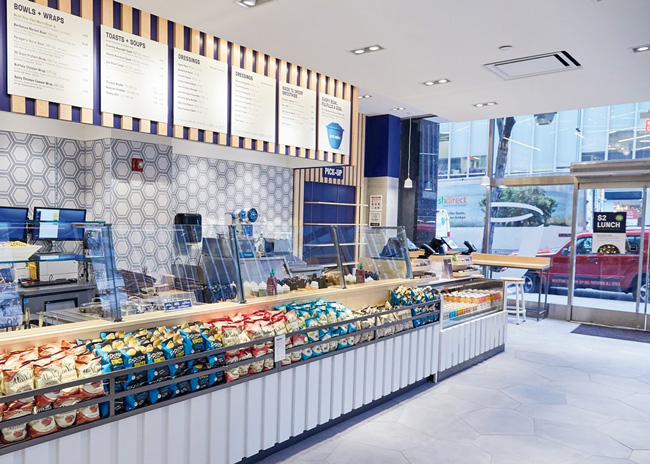
 Sargenti’s design for a Just Salad location in New York City includes a tile wall that draws the eye. Image courtesy of Sargenti Architects
Built to Last
All of these new, manufactured products have the practical qualities of durability and cleanability. More conventional surfaces such as brick veneer and manufactured stone are just as durable, though they might take more effort to clean. Real wood may be a notch below these materials in durability as it can dent and chip, but it’s still a popular choice.
For example, CORE architecture + design, inc. used plywood to cover walls at The Big Stick Restaurant & Sports Bar in Washington, D.C. Wood battens fastened to plywood sheets with a grainy fir veneer add texture and visual interest. Rather than darken the wood with stain, designers kept things simple with a clear polyurethane top coat. This kept with an Alpine ski lodge theme.
Reclaimed wood is a popular choice for designs that seek to create a rustic environment. Chapman has an important warning for sourcing this material, though. “We once sourced virgin reclaimed wood, and it turned out to contain lead,” he says. Old wood may have been painted with lead paint, and even if it has been cleaned, it may contain traces of the toxin. “That was a lesson learned,” he says. “Now, we always use prefinished stock.”
For a gas station conversion to a restaurant, MacEwen reused pine and spruce boards that were used as forms from a concrete pour at another project. The boards were cleaned, clear-coated and repurposed as wall coverings. Some concrete powder was visible, and this was a great look for the service station-to-eatery transformation, he says.
Fortify Areas Prone to Abuse
 At barmini, a José Andrés establishment in Washington, D.C., self-contained planters were attached to walls, providing a biophilic design element. These types of installations have to be watered regularly and need proper lighting to flourish. Image courtesy of Ken WynerBaseboards, corners and queuing areas are all subject to elevated wear and tear. Mops and brooms can cause marks and dents at the bottom of walls. Patrons may leave scuff marks from their shoes in corridors and waiting areas at wall bases. These locations typically require reinforcement to withstand abuse and keep walls looking good.
If wood is used for baseboards, durable epoxy paint will hold up well over the years. Gloss and semigloss finishes make for easier cleaning. Penetrating stain is another good wood finish choice as it will continue to show the color even if the surface gets scratched or chipped. Plastic laminate and vinyl products offer even more durability.
While it might be tempting to think that well-trained staff will be gentle when cleaning, don’t plan on it. “We’re better off not fighting the cleaning regimen,” Cooke says. Prudence dictates adding protective elements.
Exposed corners are another area needing protection. Wooden corner guards may use veneer, but make sure they have a solid wood core for maximum durability, Cooke advises. Metal and plastic corner guards can also be attractive protective choices.
Wainscoting for seating areas a few feet tall down to the floor is an appealing option, Vincze says: “It is a must in restrooms and corridors.” Wood used for wainscoting elements must have a durable finish such as heavy-duty paint. Plastic material that emulates wood is a good choice as it can be easily cleaned after drink spills.
It’s wise to also consider the life cycle of the material, MacEwen points out. Over time, portions of walls are likely to need replacement from damage. The easier the material is to work with, the better. “If it’s not easy to fix, workers are probably not going to do a good job fixing it,” he says. Material that requires complex joinery, for instance, presents a challenge for craftsmen — and skilled craftsmen are hard to come by these days.
Some restaurants hire local artists to paint murals or create three-dimensional artwork to hang on walls. This is an excellent way to create a distinctive vibe. However, don’t locate these one-of-a-kind statements close to soda machines or any other areas prone to splattering.
Important Lessons
After choosing wall covering material, seasoned designers take a reality check to ensure that the selection will appear in the field as envisioned. Images on a digital screen can be a bit deceiving. “I’ve learned to never select anything without seeing it in person,” Vincze says. “I always get samples. If it’s something on a large scale, you need to see the actual product, not just a sample. And you also need a rendering, especially with large, bold applications.”
Also keep in mind that the lighting in the space will likely be different than it is in an office. That can alter the appearance. Sargenti installed multiple types of lighting in its office so that the material can be seen in the same lighting as it will be when installed.
With these cautions in mind, wall coverings can go a long way in creating the desired ambience. The possibilities are only limited by the imagination. For instance, DMAC Architecture P.C. once created a plaster wall from bubble wrap forms. “If we can’t find what we are looking for, we might invent it,” MacEwen says.
