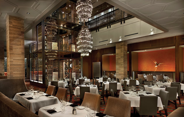
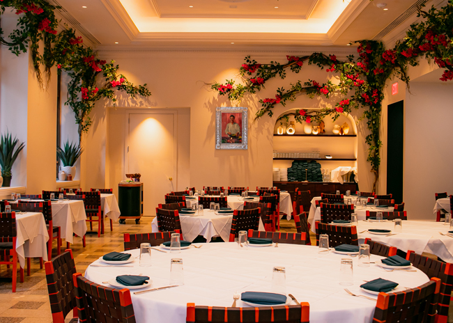
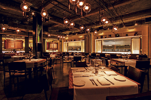
Based in Columbus, Ohio, BRAVO | BRIO Restaurant Group (BBRG) has two main concepts. BRAVO Cucina Italiana which has a Roman Ruins-inspired design; and BRIO Tuscan Grille, which has a more traditional Tuscan-inspired aesthetic.
According to president and CEO Brian O’Malley, the styles of both restaurants are starting to cycle out. In response, the company has developed a new concept with a more intimate and authentic feel, Bravo Coastal Bar & Kitchen.
The most recent of these restaurants opened in August in Sarasota, Fla.
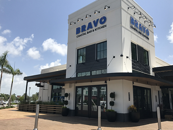
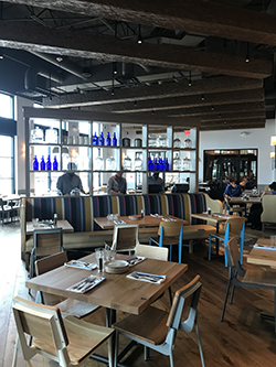
The design of the new restaurant moves far away from the golds and burgundies found in legacy BRIO restaurants. “We went with blues and whites, basically the Mediterranean coast. Much lighter, much brighter, much airier. It’s a little more friendly in terms of age and look and feel,” says O’Malley.
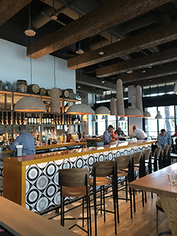
“One of the things you’ll notice is that there’s very little artwork anywhere in the restaurant,” O’Malley says. “We wanted the building itself to make the statement.”
The operation’s finishes and fixtures, then, are meant to be ornate and eye-catching. The bar front, for instance, is covered with a black, white and gray patterned tile, while the floor in front of the bar transitions from hardwood to brown and tan tiles.
The light fixtures above the bar also make a statement. Clay pots are frequently used in traditional Mediterranean cooking. The company, then, had clay light fixtures custom made. In addition to their compelling look, they subtly enforce the quality and authenticity of the restaurant’s menu.
In addition to the large bar, BRAVO Coastal features an open kitchen. The operation, says O’Malley, is proud of the work it does and wants to show it off. The space can be seen from practically any seat in the house, including the bar, where guests can see it straight through shelving.
Guests in the dining room can get a view through a large opening framed by black tile. “You have to define that space for the guest because you want them to see a beginning and an end. It keeps your focus between those two areas. If [the designer] didn’t use a darker color from the outside, he felt it could take your vision somewhere else.”
The restaurant is designed to offer guests different experiences based on where they sit. Options include bar seating, floating tables, community tables and an outdoor patio.
The restaurant also features banquette seating, backed by a set of shelving holding clear and blue jars, once again bringing in the Mediterranean colors. In addition to helping define a space, the shelving allows the operation to smoothly integrate an employee workstation opposite the banquette.
“We brought that piece in to make it feel natural. A lot of times the stations they bring in for staff are very hard. It looks like a workstation. We wanted this to actually flow with the feel of the restaurant,” O’Malley says.
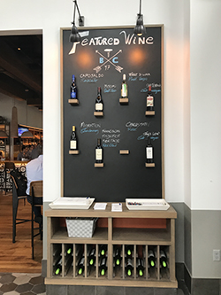
One small but effective design element is a wine display in the restaurant’s entry. Instead of using a standard wine rack, the restaurant displays featured wines on individual, bottle-sized shelves attached to a chalkboard. The long-term vision is to eventually sell these wines via retail, says O’Malley.
“As you look at that wall, we’re trying to get you to think that bout that we’re known for our wines, that we’ve made it an important part of the experience,” he says. “We didn’t want your typical wine rack. We wanted it to feel more boutique-y. This allows us to be very flexible with what we’re feeling.


