Historic Meets Hip
Ultimately, the space, which measures close to 7,000 square feet, was almost completely gutted and rebuilt. Being a historically significant building, the Denver Landmark Preservation Commission had to approve any changes to the exterior, but that process went smoothly, according to Semple Brown. "Most of what we did brought the building closer to its original look," she says. "The previous restaurant had put awnings all around and we took them off to open up more of the storefront. We also opened up some windows that had been partially covered up. We wanted to bring back the original building so you can see the details and, with the large windows fully exposed, you can really appreciate their scale."
The only major addition to the exterior was Tom's distinctive, retro-looking vertical signs posted on either side of a logoed awning that hangs over the front entrance.
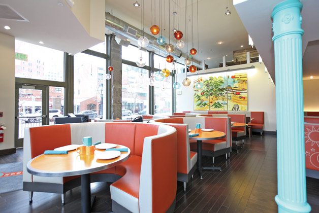
Inside, staying true to the building's original architectural details and incorporating them into the design was a priority. Among those details are huge hand-hewn granite pilasters, an original brick wall that separates the Tom's Urban 24 space from the adjoining business; and ornate cast-iron columns that date to the original construction in 1882. "When we started ripping out the infrastructure to clear the space we found these features that we really loved," Ryan says. "We cleaned them up and let them shine. We also found and refurbished the original revolving door, which is really quite striking. We're right at the corner of Larimer and 15th Street and that's kind of the front door to Larimer Square. It's also a bit of commentary on what we did with our design; we wanted a kind of modern, differentiated look that's also classic."
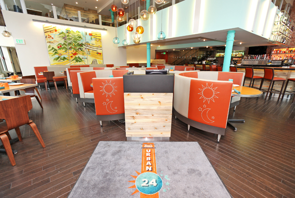
While such original historic features were left in place, the project team did make significant interior changes. A mezzanine was reduced in size to open up the main dining space and let in more natural light. A staircase up to the mezzanine was moved from the front of the space to back near the bar. The bar itself, while not relocated, was re-shaped from a straight line to a U to facilitate easier guest interaction. The kitchen, which Ryan says now comprises roughly a third of the total space, was pulled forward and expanded to be able to produce the concept's broad menu and facilitate 24/7 operations.
"Our kitchen is large and is actually divided into three areas," Ryan says. "There's a main prep kitchen, an area where prepped foods are stored, and our production kitchen and expo area. Having it divided like that allows us to have two separate teams working on both sides at once."
Colors, Lights Add Energy, Retro Feel
Beginning with the building's original historical features as key design elements, Semple Brown and her team set out to reimagine the balance of the interior into the sort of space that would bring Tom's Urban 24 to life. After considering several different color palettes, ultimately turquoise and orange were selected as the primary color elements. "We felt that they were fresh and energetic, but also retro and pretty timeless," she says.
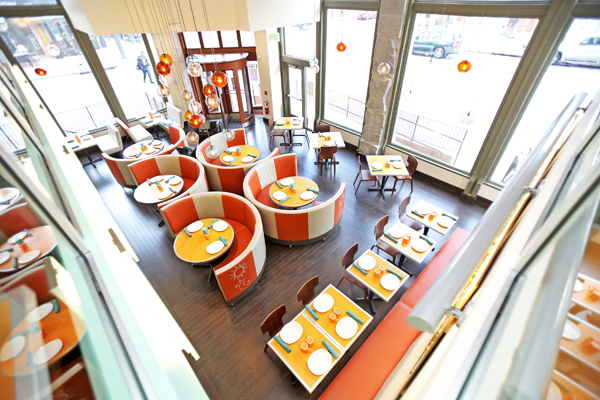
To take full advantage of the soaring windows and opened-up interior space on the main level, custom-colored glass orb lights in shades of the concept's signature blue, orange and white were installed. "One of the objectives was to use the large windows to have the space be a beacon," Semple Brown says. "With the lighting, we wanted to give it interest from the street so we used these great colorful glass balls suspended from the ceiling."
Getting the lighting right, she adds, was critical and a task made more challenging by the 24/7 nature of the concept. "We needed to create an environment that would have a fresh, energetic vibe round the clock. In the morning we have great natural light, which is inviting for breakfast and lunch. In late afternoon it softens and in the evening we're able to dim it down so it becomes a great place for dinner and late night dining. It's tough to come up with a design that works successfully for every daypart. We used lighting, as well as the general configuration of the space, to try to accomplish it."
Lighting is also a key design element at the bar, which features illuminated wall-mounted liquor bottle display/storage boxes. The boxes' colored back lighting — vivid blues, oranges, purples, reds and greens — changes to create what Ryan describes as a kaleidoscope effect that adds interest to the room.
As for the space configuration, a cluster of semi-circular padded booths serves as the centerpiece of the main level dining area. Covered in vinyl with a bold stripe pattern and custom-stitched sun and moon motif — picked up from the restaurant's logo — they serve both as a visual focal point and anchor for the room.
The same vinyl used in the circular booths lines a banquette against one wall, where freestanding two-top tables provide additional seating flexibility. On the opposite side, near the bar, a few traditional booths line the window wall.
All told, the restaurant seats 200. This includes 25 at the bar, 75 in the first-floor dining area and 100 on the mezzanine. "We call it Tom's Urban Perch," Ryan says. "It's a great overlook into the restaurant and into what's going on in Larimer Square outside and in Writer Square across the street."
Ryan says that as the team makes a few menu and operational tweaks while adjusting to serving its extensive menus around the clock, overall they're happy with the concept's performance and its prospects. "We've had overtures from developers in several other cities around the country, so there are strong opportunities to grow with it," he say. "We're actively pursuing those opportunities."
Project Team
- Tom Ryan, Managing Partner and Chief Concept Officer, Consumer Capital Partners
- Rick Schaden, Founder and Chairman, Consumer Capital Partners
- Sarah Semple Brown, Principal Designer, Semple Brown Design
- Andrea Nicholl, Project Manager, Semple Brown Design
- Leila Schwyhart, Project Designer, Semple Brown Design
- Tracy Weil, Mural Artist
- David Dunn, Metal Artist (logo motifs)
Snapshot
- Location: Denver
- Ownership: Consumer Capital Partners
- Menu: Comfort food with an urban culinary twist
- Segment: Casual dining
- Check average: Breakfast $10–$12; lunch $13–$14; dinner $20–$25
- Build-out time: 9 months
- Size: 7,000 square feet
- No. of seats: 200
- Hours: 24/7
- Expansion plans: Has "feelers" out in other major cities
- Website: www.tomsurban24.com

