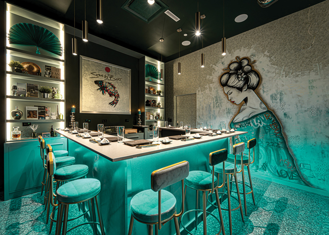
 Sushi by Bou, Puerto Rico, features a dramatic mural near the bar. Each location has a unique design. Images courtesy of Sushi by BouSushi restaurants are deviating from the script. Designers are adding flair, modernity, color, and the unexpected.
Sushi by Bou has 20 locations and though each one serves the same menu, each is completely distinct.
This is deliberate, says Humberto De Andrade, the company’s designer, because each building and neighborhood has different aesthetics. “We want them to fit in and we want to provide something unique, so you can go to two locations and have two different experiences.”
Typically, the restaurants feature a 10- to 12-seat omakase sushi bar and a lounge for drinks. “It’s an intimate experience,” De Andrade says. All customers are served together, in a meal that takes 75 minutes.
In January, the fourth Chicago area Sushi by Bou opened, with a 1920s casino atmosphere. Guests enter the basement restaurant from an elevator that opens directly into the lounge. “This location has a sense of mystery and intrigue,” says De Andrade.
The lounge features rich colors, plush fabrics including velvet and leather, and a long banquette with pouf seating.
To one side is a red wall made of shiny tufted velvet. This soundproofs the space and absorbs the reverberations from the DJ. “It’s a modern twist and contrasts with the hard surfaces,” says De Andrade. Another wall features graffiti to bring a modern edge and some playfulness. “It’s like someone came in overnight and did it,” he points out.
The lounge is separated from the omakase counter by a one-way mirrored screen that makes the dining space feel more private “and gives the feeling of a gambling den,” says De Andrade.
The omakase counter has a leather rim and leather seating, representative of poker tables. Around the bar is a hand-painted textured wallpaper that represents the sunrise in bamboo forests. “We are a Japanese restaurant, and we try to have some elements that pay homage to it, though traditional Japanese is far from what we do,” De Andrade says.
Above the bar are retro lights with some modern gold, “keeping the essence of underground old school but with this elevated touch,” De Andrade says. “It’s where we need the most lighting to display our sushi and let people see what they’re eating.”
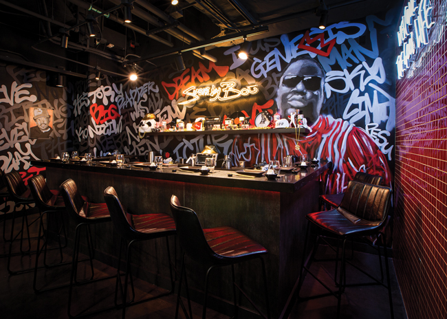
Other locations are very different. The West Loop location in Chicago is dominated by hip hop graffiti and a red tile floor; the new Puerto Rican restaurant has a modern yet traditional Japanese feel with a dining room in subterranean colors of turquoise and silver, which contrasts with red and gold in the adjacent lounge; in New York, the Bayside and Flatiron locations both have a disco theme, as does the Fort Lauderdale restaurant but they all contain traditional elements. “We keep old school elements and use modern finishes and colors,” De Andrade says.
Miami Beach Refinement
The fifth location of Kissaki opened in December, in Miami Beach, Fla., combining the feel of a Japanese drinking den and a restaurant. It bears the minimalist hallmarks of sushi restaurants, but with more color and texture, making it more welcoming and less traditional.
Its 3,500 square feet are divided into zones. Beyond the hostess stand is a bar with a tall back bar made of black cerused oak wood, with cut-outs for glasses, and a brass shelving frame, holding bottles. Guests can peek through to the dining area on the other side, sharing the energy.
The oak back bar reaches to the ceiling, creating “a feeling of height and grandeur,” says Genevieve Lake, principal, Love Lake Studio, Miami. “That’s the first thing you see, and it sets the tone with a wow moment.” Large custom light fixtures take visitors’ eyes up to the ceiling, too,” she adds.
The restaurant’s design “elevates a traditional sushi experience by blending rich-colored velvets, textured wood and subtle amber glows through brass accents,” says Lauren Williams, president, Lauren Jayne Design, Miami. “We were inspired by curves, drawing from the shape of a sushi roll. The main dining room showcases a floor-to-ceiling omakase bar with a scalloped sawtooth wood texture. Both bars are framed with a playful curved floor tile pattern, anchoring them within the space.”
Curves aren’t traditionally Japanese, points out Lake, but reference both the sushi and mid-century modern design.
The designers specifically aimed to bring in lots of different materials, from the solid ash sushi bar top to the marble beverage bar top, velvet, leather and different lighting to provide layers and depth.
“Our goal was to take traditional Japanese references and elevate them in a relatable way for Miami’s market,” says Lake. “We incorporated jewel tones and velvets throughout the space, mixed with cerused oak and burl wood to create a sense of opulence. The design aesthetic reflects the elegant and complex food at Kissaki, as well as the glamour of its surrounding neighborhood.”
An outdoor area runs the length of the restaurant, which has a different feel to the interior. Since the restaurant is in a strip mall, Love and Williams worked hard to make it feel special. They used a lot of lush landscaping to screen the seating area from cars and make the area feel like an escape.
 Sushi By Bou in Chicago's West Loop neighborhood has a hip hop theme.
Modern and Clean
At first glance, 167 Sushi Bar in Charleston, S.C., could be a seafood restaurant, a modern American eatery, a sushi joint or something else entirely.
While the entire space is filled with nods to sushi, those nods are so subtle, and the space so fresh, that there’s a sense that anything could happen here.
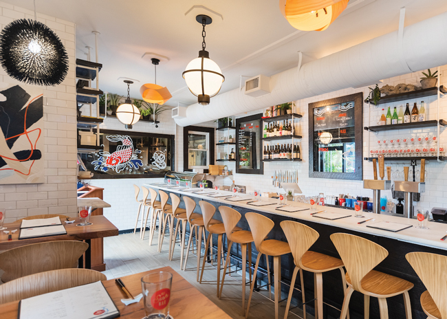
Owner Jesse Sandole converted 167 Sushi Bar from his former oyster bar and reopened it in 2021. He retained the clean white tile walls and the seating capacity, which is 12 seats at the main sushi bar, four at a chef’s counter, and two four-top tables.
 167 Sushi Bar in Charleston, S.C., has a clean and modern aesthetic. Image courtesy of 167 Sushi BarAt the chef’s counter, where hot food is produced, Sandole stained the wood to make it darker, for a more Japanese feel. This wood is also used as frames for the mirrors, and contrasts with the Colorado Gold marble bar top.
Sandole found it challenging to find chairs narrow enough to seat 12 at the sushi bar but eventually found Cherner stools made of oak, which added another modern element, he says. He also made changes to the floor. “We wanted the look of a wooden floor but we wanted it to be super clean and cleanable, so we found a really cool tile that looks like bamboo meets oak,” he says.
A local artist painted fish onto mirrors, guided through inspiration pieces Sandole shared with her. She also painted an anime-style sushi piece, which is flanked by two abstract paintings. The artwork brings shots of blue and red into the space, warming it up.
The lighting at 167 Sushi Bar is diverse. Some resemble old-fashioned divers’ helmets; some black spiky lights look like sea urchins, and for others thin bamboo is bent into a knot.
Since 167 contains a lot of clean, sleek lines there’s not a lot to absorb sound so Sandole spray foamed the whole ceiling then covered it with drywall.
The feeling of cleanliness and freshness is important for a sushi bar, though at night he turns the lights down and features candles everywhere. The Sushi Bar neon sign over the chef’s counter is a focal point in the room after dark and the brightest light.
 Sushi By Bou in Ft. Lauderdale, Fla., has a colorful interior with pop culture flourishes.
Remembering the Ocean
Crave Sushi Bar opened in February in New York City, featuring an ocean color palette of blues, coppers and greens to give the cool, sleek feel of a nightclub.
Crave sits next to its sister restaurant, Crave Fishbar, and the two are connected, sharing a story and branding, says Ryan Petyak, partner at //3877, the Washington, D.C. company behind the design.
“They feel like the same brand but also distinctively different,” says Mayyasa Roach, interior designer and senior collaborator at //3877. “Both are reminiscent of the ocean and Japanese fishing and the materiality with nautical elements.”
Petyak and Roach wanted the restaurant to be comfortable and welcoming. “Sometimes modern can be cold and too streamlined,” Roach says, so they layered materials to achieve that, with different textures and patterns and dimensions, including some that are distressed (shou sugi ban wood) and others that are more refined (such as white oak). They even used a wallcovering made from healing herbs and sunflower petals to create texture and dimension.
The lighting was tricky because the restaurant has a low ceiling. “We needed multiple layers of lighting to make it feel taller,” says Petyak, who incorporated lighting that was lower to the ground, mid-level and higher, as well as accent lighting. “We tried to bring those elements to life, so they became a focal point and eliminated the low ceiling.” He also used the lighting to create zones and break up the space, which is long and narrow. Different styles of seating serve the same purpose, with booths, bar seating and banquettes.
The low ceiling also brought some sound challenges so //3877 incorporated paneling on the lower part of the walls, upholstered seating, and used sound-absorbing wall coverings. It couldn’t put sound absorbent panels on the ceiling because it was too low, but it used another tactic: breaking up the zones and having smaller groups of seating, that typically encourage quieter interactions, says Petyak.
The bar area is a sushi bar, and most drinks come from the adjacent Crave Fishbar, except sake, which is highlighted in the back bar, with each bottle sitting in its own niche. “We wanted to showcase the Japanese drinks,” Petyak says.
Crave’s walls feature three murals showcasing “ama” — Japanese women who dive into the ocean to search for pearls. “We liked the relationship between that and sushi and Fishbar. So, we worked with an artist to create this three-paneled story,” Petyak says. “It’s a fun way to pull people into this deep space.”


