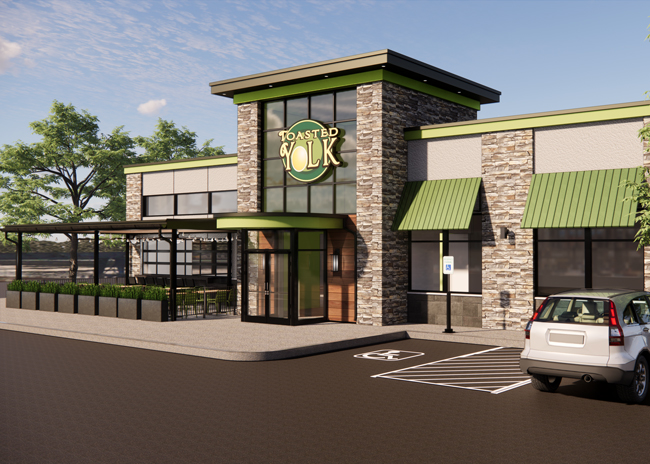
In the spring, Toasted Yolk will open its flagship restaurant, a 5,000-square foot location in Mount Bellevue, Texas, that will also be the first restaurant built under the chain’s new prototype.
 Brian Chandler, principal, ID Studio 4 in Irving, TexasHaving a flagship restaurant as part of a company that’s largely franchised is very important for brand awareness, says Chris Milton, owner of the Houston, Texas-based company.
Milton and his partner in designing the flagship/prototype, Brian Chandler, principal, ID Studio 4 in Irving, Texas, share their best practices for creating a flagship restaurant.
1. Make sure the exterior stands out
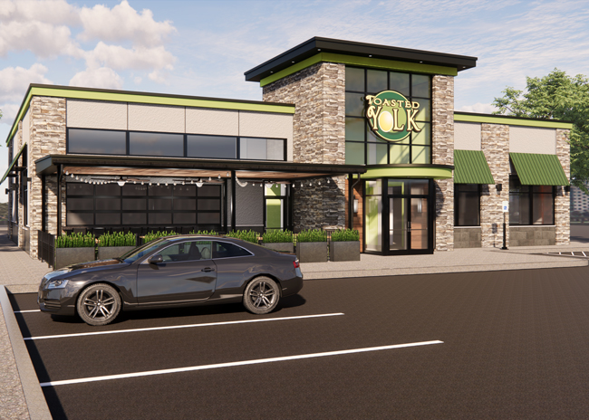
Using color on the outside of your flagship will help draw eyeballs, and ideally use your brand colors, says Milton, who’s incorporated Toasted Yolk’s Outrageous Green on the trims and awnings.
Because The Toasted Yolk brand is warm and inviting, the flagship was designed to provide an environment that feels fresh and clean with lots of windows for natural lighting, says Chandler. “The windows help transfer energy from the outside in, and showcase the restaurant to guests approaching the building,” he says. “Consumers today want more than just a meal — they desire places where they can have experiences.”
And the tower that’s built into the design of the flagship/prototype is a defining feature. Because Toasted Yolk isn’t an evening operation, it doesn’t have to worry about attracting guests in the dark, points out Chandler, but still wants brand recognition. So the tower is painted green inside, which glows through the front windows.
2. Play with elevations outside
The Toasted Yolk flagship will feature different heights and angles with rooflines and awnings to make it interesting and to make it stand out, says Milton.
“We went through a conceptualizing exercise where we pulled together inspirational images and ideas, and presented the design charrette to the stakeholders,” explains Chandler. “The immediate response was interest in incorporating a lot of exterior windows for natural lighting, and the covered patio to be anchored at the front of the restaurant for highest visibility from street view.”
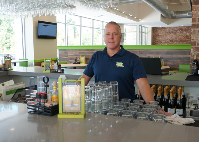 Chris Milton behind the bar at Toasted Yolk
3. Make the bar the focal point
“The bar is the essence of our concept,” says Milton, so he wanted it front and center in the flagship location. The design of the restaurant began with the bar placement so when guests walk through the front door, they’ll see it to their left, immediately. “That brings a lot of energy up front,” Milton says.
“The bar has great sight lines with the entire front of house as well as the patio [from] a wide format operable window system,” says Chandler. And, he adds, it’s open and accessible, “inviting for patrons wanting to enjoy a great breakfast or lunch, as well as serving those picking up online orders.”
The bar is a big differentiator for Toasted Yolk, but until now, it’s always been configured as an island. “But that’s almost more restrictive in the flow of your dining because you’re trying to shoehorn a bar in the middle,” Chandler points out. “So if you can anchor the bar to a wall, you maximize and get more seating on the open side of the bar.” It also makes construction easier, he adds, because you’re not trying to get plumbing and electricals under the floor.
4. Offer a variety of seating
The Toasted Yolk prototype offers bar seating, booths, high- and low-top loose tables, banquettes and barstools featuring Outrageous Green; and it’s broken up with nooks and pony walls “so it doesn’t feel like a big barn,” says Milton.
Because the building was designed around the kitchen and dining areas, “we were able to achieve more intentional zones of seating, rather than shoe horning dining sections around existing building structure,” explains Chandler. “This flagship/prototype is the first to allow for a true dining section anchored to the bar.”
He also wanted a variety of seating, some fixed and some loose, to accommodate all parties and to provide a different feel, depending on where customers sit.
 Images courtesy of Toasted Yolk
5. Feature signature color throughout
There’s a strong emphasis on color in the flagship Toasted Yolk, and the importance of natural light “can’t be overstated, especially for a restaurant that only serves breakfast and lunch,” points out Chandler.
“The brand standards for Toasted Yolk include a color palette that is warm and inviting. These brand colors are used as accents for both the exterior and interior, with the primary fields being more natural colors to create a more neutral canvas,” he points out.
Each restaurant features hand painted murals, which have become Toasted Yolk’s “biggest differentiator,” Chandler says, because they add pops of color and are always done by local artists.
There’s no question that this is anything other than a Toasted Yolk location, adds Milton.
6. Be realistic
With construction costs and schedules being what they are, there had to be consideration with the design of Toasted Yolk’s flagship. “The building design had to find a balance to be both visually appealing as well as cost-friendly,” explains Chandler. This was especially true for a flagship that’s also a prototype, with expectation for use in a rollout program – finding economy of scale and able to be repeatable in different markets across the country.
“The entire building design was thought through holistically from structural framing, finish materials, furnishing and fixturing, [so] everything is reasonably available and labor ready for construction in all markets,” Chandler explains.
7. Optimize the floorplan
Because the flagship was first designed around the kitchen and dining areas, Chandler was able to optimize the flow-through efficiency of the restaurant operation and maximize the number of seats. He aimed to also create the shortest pathway from the kitchen with loaded plates, and back again with the used plates. “That’s uber important for a concept like Toasted Yolk because they don’t have as many table turns,” he says.
“The food delivery pathing from the kitchen is in straighter lines, the dining has a more efficient seating layout for higher seat count without compromising guest comfort, and there aren’t odd leftover dead spaces,” he says.


