 Stephani Robson, Senior Lecturer, Cornell University School of Hotel AdministrationAfter graduating from Cornell University’s School of Hotel Administration, Stephani Robson launched her foodservice design career at Cini-Little International and later moved to Marrack Watts in Toronto.
Becoming an educator was never part of her plan, but in 1993, she was asked to come back to Cornell for a nine-month stint teaching foodservice design. She’s never looked back and has since earned an MS in human-environment relations and a PhD in environmental psychology with a focus on how restaurant design affects consumer behavior.
What led to your interest in the psychology of restaurant design?
SR: When I was at Cini-Little, I worked on a lot of different kinds of projects, mostly in hotel and noncommercial foodservice segments. We were looking at servery design and realized, “Gee, we can really impact sales by doing this or that.” It sparked my interest in how design impacts behavior.
Is there one particular aspect of design that came to the fore in your research?
SR: Seating. It sounds very academic, but we found that seating types have a significant impact on spend per minute. People like to defend the space around them, and because our peripheral vision is very limited, we like it when we’re approached from within our plane of vision. We’re also more comfortable when we can sit up against something. That’s why people love booths. In full-service restaurants, spend per minute is higher in booths than it is in other kinds of seating because people are psychologically more comfortable. When they’re more comfortable, they stay longer, spend more and feel like they’ve had a better experience.
What are some seating mistakes that you see restaurants make?
SR: One is how they set up two-tops, which typically is to orient them so guests are face to face. Research shows that people are most comfortable when positioned about 120 degrees to each other. Space is always an issue, but instead of having just a straight banquette with a bunch of parallel tables, one good idea is to wrap the seating around at either end of the banquette. That way, you create seating for deuces that’s at 90 degrees versus face to face. It takes less space than having seats directly across, and people like it better because they’re positioned more naturally for conversation.
About those parallel tables: Does your research support guidelines for their spacing?
SR: It depends in part on what you’re used to. Urban consumers, for instance, will tolerate less space between tables. We did experiments in which different groups of people were given the choice to position tables where they wanted them. What we found was that if you have parallel deuces along a banquette, the optimum table spacing is 16 to 18 inches. Conversely, at 12 inches or less, people not used to that started getting very uncomfortable.
Any advice relative to freestanding tables?
SR: I see a lot of restaurants putting in rounds, thinking that they’ll soften the look of the space and make things more convivial. But they’re problematic because they’re inflexible and can’t be combined. Also, research shows that guests don’t have any preference.
Bonus Web Content
What do your students teach you about their preferences for restaurant design today?
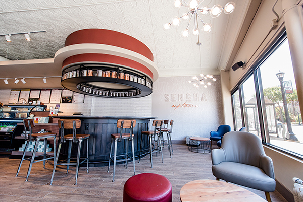
SR: When I ask students to pull together vision boards of concepts that excite them, there are some common themes. Specifically, they love high contrast and drama in a space, but they’re very sensitive to inauthentic or contrived drama. This is where a designer has a tightrope to walk. They also want design that tells a story and that has energy, and they like intimacy. They prefer small places or larger spaces that are broken up into smaller, more intimate areas but that still maintain visual connections throughout. That’s something that concepts like Starbucks have done so well. They let them feel connected but still comfortably separate. This all may not be true for all Millennials, but it’s very true for our students.


