Mid-century modernism is back in fashion in a big way, both for commercial and residential spaces, and it’s a throwback trend that restaurateurs and designers are embracing in fresh new ways (see below for recent examples). The announcement in early March by the James Beard Foundation, naming The Four Seasons Restaurant in New York City as its inaugural Design Icon Restaurant Award winner, may fan the flames. This truly iconic restaurant is the real deal, an authentic, timeless representation of mid-century design at its oh-so-elegant best.
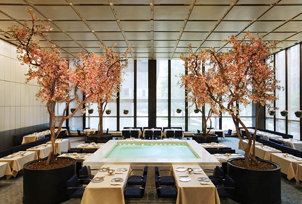 (The Four Seasons Pool Room. Photo by Jennifer Calais Smith.)
The Modernist Icon: Four Seasons Restaurant, New York
James Biber, chair of the Restaurant Design Awards committee and head of New York-based Biber Architects, said in the foundation’s announcement, “It is an honor to award The Four Seasons Restaurant the first ever James Beard Foundation Design Icon Award. “In introducing generations of diners to modern elegance and luxury, The Four Seasons forever changed restaurant design, even as it remained virtually unchanged itself.”
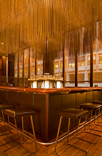 (The Four Seasons bar. Photo by Jennifer Calais Smith.)
Conceived by legendary restaurateur Joe Baum and designed by Philip Johnson and architect Mies van der Rohe, the restaurant opened in 1959. Today, more than 50 years later, the restaurant is a New York treasure. Its design has remained intact and, indeed, is fiercely protected by the city’s architectural community and preservationists. Last May, the Landmarks Preservation Commission, in fact, rejected all of the (mostly) modest design changes proposed by the building’s new owner with the exception of carpet replacement.
At the celebration of its landmark designation, on Sept. 24, 1997, leading architecture critic and educator Paul Goldberger gave a lecture entitled “On the Four Seasons Restaurant.” It provides some context and backstory on the restaurant’s design and underscores why it’s such an appropriate choice for the Design Icon award. In it, Goldberger noted, “Modern design, a new world, but one that managed here not to connote austerity, but a cool, reserved, self-assured grandeur...After all, modern design in general meant stripped down, plain and cold, to most people. All that idiocy about form following function. The Four Seasons emerged out of an entirely opposite view of modernism, the notion that modernism could, in fact, deal in emotion: it could seek to impress, even to awe, and that there were ways to do that that were different from retreating into, say , fake French chateau. This restaurant, like the building, is lush, but it is not vulgar; there is a cool sensuousness to everything.”
Sadly, the original Four Seasons Restaurant’s days are numbered, making recognition of its iconic position in the world of restaurant design even more appropriate and important. Its new owner plans to close the original in July – in part due to aforementioned restrictions on renovation -- and to re-open at a new, yet-to-be announced location downtown. It’s a likely that the new version will also be a stunner. But it’s also a sure bet that the luxurious, mid-century magic that’s unique to the original Four Seasons Restaurant will remain so. Experience it while you can.
Fast Forward: 3 Casual, Modern Takes on Mid-Century Modern
In celebration of what seems to be a serious rekindling of interest in the mid-century design ethos, here’s a look at three new-century restaurants that have tapped into the mid-century vibe. They seem to satisfy current consumer cravings for authentic, simple and unfussy environments while still providing a shot of luxe comfort.
The Mercury, Atlanta
(Photos by Justen Clay.)
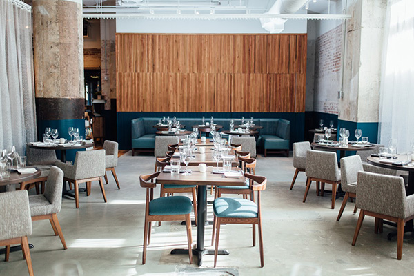
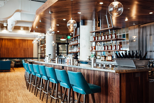
The Mercury opened in January 2016 on the second floor of the Ponce City Market’s Central Food Hall. Atlanta-based Square Feet Studio gave the 4,400-square-foot, 200-seat space an elegant, mid-century modern interior befitting the concept’s namesake – the U.S. space flight program in the late 1950s and early 60s.
aestus, Santa Monica, California
(Photos by Andrea D’Agosto.)
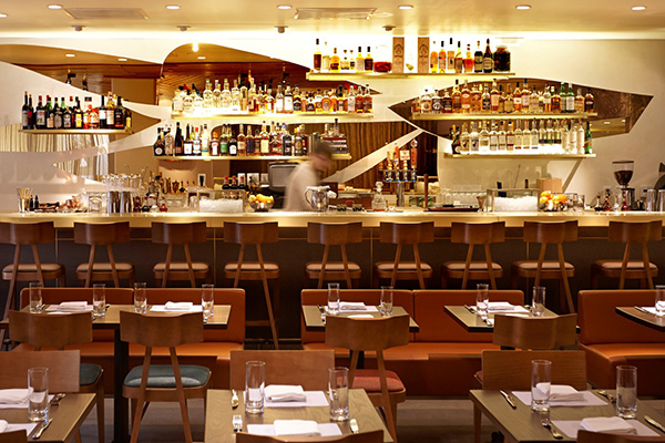
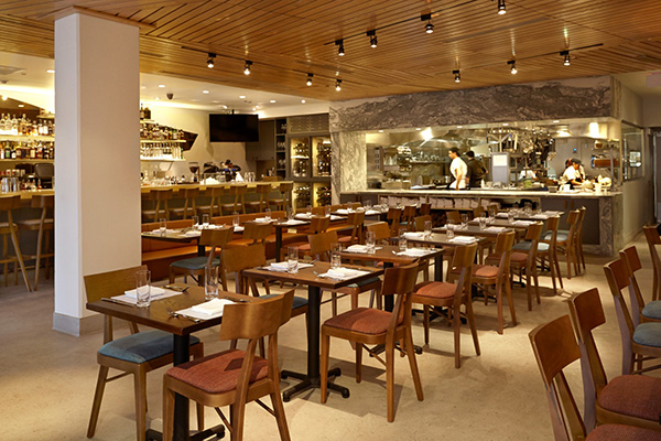
Designed by owner/managing partner Kevin O’Connor and Los Angeles-based MASS Architecture & Design, the seasonal, New American-meets-vintage aestus opened in January 2016. aestus sits on the ground floor of Santa Monica’s distinctive, art deco-style Arezzo residential building. A mid-century, retro-chic charmer, design highlights include a long brass bar that seats 15, a spacious 60-seat dining room and open, marble-framed kitchen.
Viviane, Avalon Hotel Beverly Hills, Beverly Hills, California
(Photo courtesy of Viviane Restaurant.)
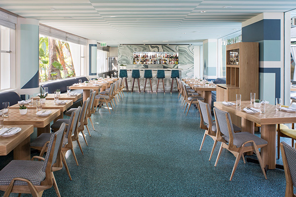
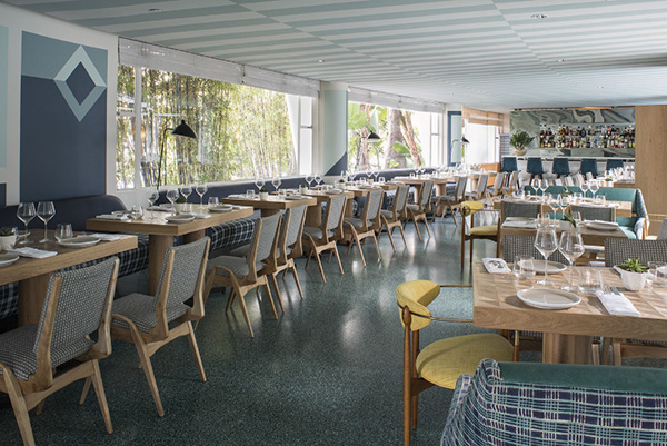
The just-opened Viviane Restaurant, part of a multi-stage renovation of the Avalon Hotel Beverly Hills, was redesigned by Kelly Wearstler to complement Chef Michael Hung’s modern California interpretation of classic European and American cuisine. The interior features eclectic groups of seating and a mix of custom and vintage furnishings. These include a 1950s Carlo de Carli settee alongside wood and brass dining chairs by American mid-century designer Dan Johnson. On the far end of the main dining room, a marble bar is a focal point surrounded by vintage iron-forged stools refashioned with deep blue and ivory geometric-patterned leather sling seat cushions.

