The sandwich chain moves seamlessly from daytime to nighttime with its new fast-casual concept.
 Quiznos Grill features a wood floor and tables to add some warmth.A unique challenge faced the designers of the new Quiznos Grill, which opened in December 2015 in downtown Denver. Known as a lunchtime locale serving sandwiches, the chain wanted to branch out with this second brand and appeal to both a lunchtime and a nighttime crowd.
“When we created Quiznos Grill, we intentionally wanted to design a place that would appeal at multiple dayparts while still being primarily sandwich based,” says Tré Musco, owner of Tesser Big Picture Branding in San Francisco, which designed the new venue.
The first thing Quiznos did was revamp and expand its menu for the new brand. Hot sandwiches remain front and center, but now the chain also offers some shareables like house-made potato chips topped with nacho cheesesteak or pulled pork; more elevated offerings like house-made sodas; and alcoholic options such as beer and wine, which makes it more of an evening spot. “We are trying to do a more elevated food brand,” says Jonathan Tress, Quiznos’ senior vice president of insights and innovation.
 Key design elements, such as the color red and the use of wood, are carried over into the design of the restrooms.But everything about Quiznos Grill is different from the original Quiznos, and the service is more in line with a fast-casual restaurant than a quick serve. Guests order at the front of the space — more on this later — then servers bring their food to them.
“We started from the food experience and designed it for that to be the heart of the whole thing,” Musco explains. “Evening concepts are usually higher-quality food, and we wanted that foodie level, and the best way to do that is to show it.”
Red Hot
The new design puts the kitchen on full display behind a large sheet of ruby red glass that measures about 13 feet wide by 9 feet tall. “This is not translucent,” explains Brent White, Tesser’s design director. “It’s clear but it’s all red, so it takes all the information and makes it monochromatic. You can see what the chefs are doing, but because the color’s not there, you’re not focusing on the specificity of what the chefs are doing, but you can see it and that the food is fresh.”
 A foosball table, designed to encourage people to linger during the evenings, is now part of the Quiznos Grill decor package.The whole impetus of the red glass, White says, was to reinforce the heat and the fact that Quiznos Grill is really about cooking. “We wanted to show there is a lot of tried-and-true kitchen equipment here that’s for cooking,” Tress says, “but these chefs are grilling, griddling, frying and baking, as opposed to the conveyor ovens used to toast sandwiches in the chain’s quick-serve Quiznos locations. This is real restaurant cooking.”
Also up front is the beer and wine. Two taps — “chrome and modern and clean and confident,” says White — sit to the right on the front counter, adjacent to where the food comes from the kitchen “so it draws more attention to them,” Tress says. “It also makes you more credible. Especially in Colorado, people have a lot of expertise in beer, and people expect it when they go out.”
The thing with the beer and wine, Musco adds, is that when lunch guests see it, they have it in their heads that it’s an offering and they could come back for a p.m. visit.
Being located in an area surrounded by lots of businesses, Quiznos Grill lunchtime business is strong, “and the alcohol helps with attracting people at night, especially people who are the veto vote — people who really want a beer in the evening,” Tress says.
Upscale Welcome
 The addition of booth seating is new for Quiznos.The POS that customers encounter when they arrive is less like a quick-serve or casual restaurant and more like a concierge desk in a high-end hotel. There are two freestanding wooden POS stands, and they’re simple six-inch-thick solid maple butcher blocks on cast-iron legs. “All you see is the simple POS and the smiling face of the person taking your order. You can feel the person could come around and help you,” White says. “Right behind that, we wanted the backdrop to be this big, red-hot kitchen and the sightline to the beer taps.”
Seeing into the kitchen and making the equipment visible was really important, Musco notes. “You essentially feel you are in the kitchen when you’re ordering,” he says. “You’re as close to the kitchen as you can be without being in it. The whole concept is built around heat. Quiznos started with hot sandwiches, so when we took it up a notch to fast casual, we built the entire concept around hot — the next evolution of hot with many more layers to the heating.”
Overall, the quality of materials is of a higher standard in this new concept compared with the chain’s quick-serve locations. “This is key in making it a place you want to be at night,” says White. “No one wants to sit on a plastic stool and drink a beer and hang out at night. If you want to draw people in at night, you have to give them a reason to come out.”
 To make the concept warmer and more inviting, the POS stations at Quiznos Grill consist of two freestanding stands with six-inch-thick solid maple butcher blocks on cast-iron legs.This meant investing in real leather for the chairs and banquettes and live edge walnut tables. Leather is more durable than vinyl, White explains, and the banquette backs have linear stripes through the leather, “which gives an extra level of detail. It elevates it and gives the sense that this is not a typical QSR or fast-casual restaurant.”
The chairs are still plastic, though it’s good grade plastic with attractive chrome and streamlined bases. “They’re supple, high-quality Italian chairs that have a bit of flex to them; they’re very comfortable,” White says. There are also stools around a foosball table.
“We find people like to find their own spot, and if you want a concept to go from day to night, you need more seating variety,” Musco says. “People tend to come in different group sizes from day to night. People in general have a variety of need states, so one day they might want some peace and quiet while another day they may be in a large social group.”
The design of the seating layout appeals to both the daytime and nighttime crowd. “We have some seating arrangements that are very flexible, so you can sit by yourself at lunchtime — most people have lunch in parties of one or two. And in the evening, people tend to go in larger groups,” Musco says.
The seating options also include booths, a new feature for Quiznos. These are clad in tile inspired by shou sugi ban, which is a Japanese technique for charring wood to make it fire-retardant. “We’d have loved to use charred wood, but the tile from Spain is perfect because it looks entirely convincing,” White says. “Plus, it’s a bit nicer to your clothes, and less expensive.” Adds Musco, “This has a very unique, upscale look, and it also reinforces the ‘heat’ element of the brand.”
Light Show
 Grills serve as a decorative element on the walls in this new restaurant design. They also remind guests about the actual cooking that takes place in the kitchen.The lighting was also essential to allow Quiznos Grill to transition smoothly from a daytime to a nighttime concept. Over the foosball table hangs a huge rectangular lighting pendant with a red interior — for warmth and energy, Musco says. Most of the lighting over the dining room is on stainless tracks, while large, round pendants hang over the front counter. “We wanted the lighting to really stand out,” White says. “Great lighting really enhances the night effect, making the space feel warm and inviting and adding energy.”
What was also essential, White says, was a good dimmer switch for the lighting so it could be bright in the day, keeping the space light together with the natural sunlight that comes in, and lower, warmer and more dramatic at night.
A dynamic light installation on one wall includes programmable red, green and blue LED lights. This installation can create different lighting displays and simulates heat or fire, White says. It transitions from red to orange to yellow in a sequence that moves from the front to the back of the restaurant and changes on the hour. While this installation remains operational during the day, Quiznos patrons can barely see it, while at night, it’s a theatrical piece that takes center stage.
To make the Quiznos Grill ceiling more upscale, the Tesser team hung a wooden raceway with LED lights that is similar in look to the floor “for visual consistency,” Musco says. This raceway guides the guests along the path to ordering their food, and it changes from day to night. During the day, you see more of the wood, and at night, the LED lighting stands out more and adds drama.
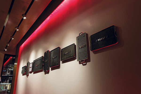
 Quiznos developed a new logo for its grill design and includes it on the restaurant’s exterior signage.The real wood floor provides softness and warmth, which patrons seek more from a nighttime concept. In fact, “a lot of the elements give texture, warmth, feeling — something above what you’d normally see in a QSR,” says Tress. To reinforce the brand connection to cooking with heat, grills serve as wall decorations, Musco says. “They are also authentic grills, not just pictures of grills.”
A final touch toward making Quiznos Grill feel like a nighttime venue is a TV near the foosball table, both of which “give people more of a reason to hang out,” Tress says.
The new Quiznos Grill logo ties everything together (see photo below). The logo also appears on the signage, handheld paper menus, crew uniforms, compostable takeout packaging, and beer and wine coasters.
Quiznos Grill is not your usual Quiznos. With a second location set to open this year, also in Denver, the chain looks to expand not only its customer base but also the appeal it has throughout the day. The design of Quiznos Grill plays no small part in consumer acceptance of it as a nighttime hangout spot while still appealing to lunch-goers. +
Key design elements, such as the color red and the use of wood, are carried over into the design of the restrooms.
Snapshot
- Headquarters: Denver, Colo.
- Concept owner: Quiznos
- Concept: Premium hot sandwiches and freshly prepared salads
- Segment: Fast casual
- Location: Denver, Colo.
- Units: 1
- Opened: December 2015
- Size: 1,500 square feet
- Real estate: Inline urban brick storefront in downtown Denver
- Design highlights: The design leverages high-quality, genuine materials to reinforce hot crafted sandwiches coming from the kitchen. The design includes a rich red glass view into the kitchen; a red, bar-height foosball dining table; butcher block and cast-iron ordering stations; wood floors and a matching wood raceway for wayfinding; charred-wood ceramic tile; live-edge walnut tables with stainless steel details; cast-iron grill/griddle artwork with stainless steel lettering; and custom programmed flame-inspired color LED lighting.
- Build-out time: 6 weeks
- A foosball table, designed to encourage people to linger during the evenings, is now part of the Quiznos Grill decor package.
- To make the concept warmer and more inviting, the POS stations at Quiznos Grill consist of two freestanding stands with six-inch-thick solid maple butcher blocks on cast-iron legs.
- The addition of booth seating is new for Quiznos.
- Above: Grills serve as a decorative element on the walls in this new restaurant design. They also remind guests about the actual cooking that takes place in the kitchen.
- Right: Quiznos developed a new logo for its grill design and includes it on the restaurant’s exterior signage.
Project Team
- Tesser: Tré Musco, CEO; Brent White, design director; Scott Gagner, design director; Christopher Null, senior designer; and Boudicca Todi, senior account manager
- Quiznos: Susan Lintonsmith, CMO; Jonathan Tress, SVP marketing; and Chris Ruszkowski, VP advertising and communications
- Architect: ELSY Studios’, Carmen Schechinger and Lynn Coit
- Interior design: Tesser
- Kitchen design: Tesser and The Culinary Edge


