Originally a pattern designer, Stacy Garcia founded LebaTex in 1999. The company produces commercial-grade textiles.
 Stacy Garcia, Designer/Principal Stacy Garcia Inc./LebaTex www.stacygarcia.com www.lebatexinc.com She has since established her own design house, Stacy Garcia Inc., where she and her team design products that range from carpets and textiles to lighting, furniture, wallcoverings and accessories spec’d by major hotels and restaurant companies. She’s also a trends guru, positioning her studio as a leader in forecasting color and product design trends. For our inaugural Products Issue, we tapped her for insights on both.
rd+d: Where does your company fit in the supply chain? Do you work with interior designers or with manufacturers?
SG: Both, but we collaborate primarily with manufacturers who develop products using our designs. Sometimes, clients will spec them just as we’ve designed them, and sometimes they’ll work with the manufacturers’ in-house teams to modify our designs to meet the needs of their specific projects. I see a big part of our role being creating a catalog of work that inspires the design community and serves as a springboard for the spaces they’re creating.
rd+d: Forecasting trends is a key part of that role?
SG: Yes. We specialize in identifying trends and what’s driving them and in being able to apply that knowledge to product development. We research the market and keep an ear to the ground on what we think consumers are going to want.
rd+d: What does your research tell you about color? What’s going to be big in the restaurant space in the year ahead?
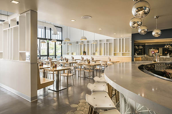
SG: Neutrals are trending very big right now, with a lot of wood tones, coffee colors, caramels and warm browns becoming very important. And for more color, we’re seeing a lot of iterations of Pantone’s color of the year last year, Marsala. That means a lot of burgundy, wine and even eggplant tones. They’re very rich, luxurious colors that play well against the neutrals.
rd+d: Coffee, caramel, wine, eggplant — sounds tailor-made for restaurants.
SG: Yes, it seems we love colors that we want to eat! We name a lot of colors after food; it’s definitely an inspiration for color direction. There are always hot new influences in the food world that ultimately overlap into consumer consciousness, and you start to see them bubble up in other areas. A few years ago, chefs seemed to be introducing figs in everything, and that color started popping up. Ten years ago, nobody knew what a blood orange was, but now you see it in beautiful specialty drinks and desserts, and it’s become a color influencer. When I look at color forecasting, one of the things I study is what’s happening in the world of food because that absolutely impacts consumers’ tastes visually as well.
rd+d: How about finishes and furnishings? What’s trending there?
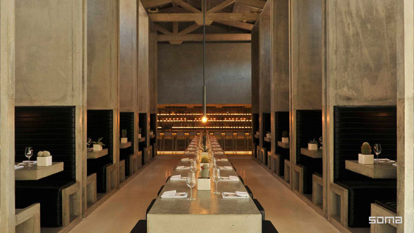
SG: We’re seeing new and exciting applications of metallic finishes such as rose gold, brass and bronze. Leather is huge, too. It’s showing up on everything from the obvious upholstered chairs to case goods, wall panels and ceilings. As for furnishings, communal tables are still trending, but almost in contrast to that, we’re starting to see a lot of over-scaled banquette-style seating that isn’t built against a wall. Rather, through the furniture design, we’re able to create intimate spaces, little enclaves, within the context of an open floor plan. Lighting is important, too. Scale is everything in restaurant design. But we’re also seeing a lot of back lighting being used.


