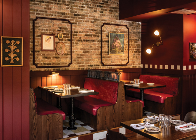
Nostalgia is a big driver in restaurant design, appealing to consumers' emotions and good feelings about the past to draw them in and make them comfortable. But it's important not to get too mired in days gone by.
Here are six best practices for balancing the old with the new.
1. Mix the modern with the old
Dala Al-Fuwaires, MFA, principal, owner and designer, House of Form, Scottsdale, Ariz., was part of the team that designed The Rose Garden in Phoenix, Ariz. The team renovated a "tired, dark, unpleasant" space into something much more appealing for today's guest.
Wall paneling evokes former days of Parisian restaurants, but features a very modern wall covering that's "whimsical and playful," Al-Fuwaires says. "It's about very intentionally mixing colors and palettes." Each panel also features a door knocker tassel in the center, "which is old but it's applied in a way that is new," she says. The panel wallpaper is continued onto the ceiling in an unusual touch to highlight a peacock hanging on a swing from the ceiling. "The peacock is a very big feature so we knew people's eyes would go up," she says.
Kristin Cullen, interior design director of dash design, New York City, worked on The Olde Bar at Bookbinders which originally opened in the late 1800s and is now operated by Garces Group. "We looked to maintain the old style while refreshing the feel," she says.
Cullen modernized the walls, adding wooden panels with a chevron design to lighten up the space which contained a lot of old mahogany wood. She also freshened up the seating, replacing heavy wood chairs with more current bar-height stools and lounge-style seating. "They start to feel a little more informal. People today want variety in seating; it allows them to use the space in different ways," she says.
Conversely, she didn't touch the booths that line one wall "because they're iconic and hand-carved; we just upholstered them."
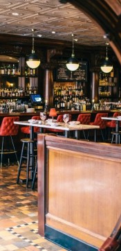
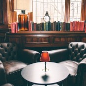
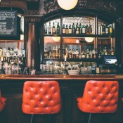


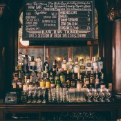
The Olde Bar at Bookbinders. Images courtesy of Grace Dickinson
2. Have an anchor piece
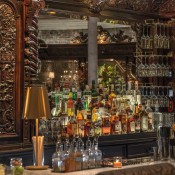
Chris Jamison, CEO of COJE Management Group, Boston, recreated the old world of a supper club in Yvonne's, also in Boston, that's in a space that's been a landmark restaurant, Locke-Ober, since 1862.
Jamison anchored the space around the original back bar, which was hand-carved on-site in the 1880s from Dominican mahogany. "That was something we were not going to touch; that is the history of Locke-Ober," he says. "Unfortunately every other square inch was falling apart. So we had to build around that existing bar but not make it look out of place." The bar, he adds, "is the most showcase piece in the restaurant. It gave us a north star. Everything we did came from it."
Cullen let the back bar anchor the design of The Olde Bar at Bookbinders. "The Garces Group wanted this to be a throwback to the days of bookbinders but make it more modern," she says. "We didn't want to strip away this character that had been there for such a long time and were noticing the beautiful mahogany bar. Other elements that stood out were the lead glass at the entry as you walk into the bar; a tin ceiling, and a floor that resembles tumbled stone. "We felt we kept seeing those elements in all the iterations of the bar in old photos," she says.
3. Make up your own backstory
To direct their design of The Rose Garden, the House of Form designers wrote a fable about villagers who flock to see a beautiful rose garden each year, only to be surprised by the beauty of a peacock. This, says Al-Fuwaires, "set a timeline we wanted to honor but we didn't want the space to feel old because people are looking for new and exciting. We wanted a nod to the past."
4. Create surprises
The Rose Garden features a gallery wall above the bar, though there's a small photo of a little boy — an internet meme — hidden among the pictures, "bringing in a modern element," Al-Fuwaires points out. And on each side of the bar are modern pictures "to create a moment of pause so people question their environment and to add a modern touch," she explains.
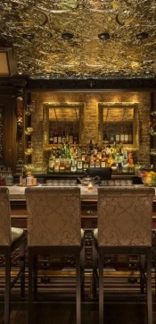
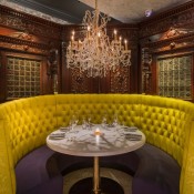
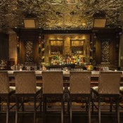


Yvonne's images courtesy of Eric Levin
5. Pay attention to the details
Jamison spent a lot of time tracking down manufacturers that could make things look old. For the ceiling in Yvonne's lounge, for example, the team had tin ceiling coffers made by a small shop that were exact replicas of the original ceiling. COJE applied and distressed the panel.
The entire design, he says, "was about capturing the feeling and the sense of place within the city of Boston that Locke inhabited. There's a sense of nostalgia because there was enough attention paid to the design details that people recognized what it was. We wanted to capture that sense of time."
6. Use color and lighting
The Rose Garden's hanging peacock is surrounded by old-school fringed lights that create the feeling of a cage around the bird. "We thought something with a fringe would give a nod back to that luxe reading room feel," Al-Fuwaires says. The lights contain LED bulbs whose color can be changed to create different moods depending on the feel of a certain night or the season.
Cullen really leaned into the color red for The Olde Bar at Bookbinders — in an entry vestibule, on bar stools, on two corner booths and old school tabletop candles with red shades to make a fun statement.


