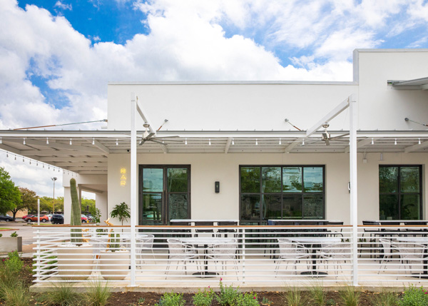
Located in Austin, Texas, Hank’s is a modern, all-day casual restaurant that opened earlier this year in a space that once held a grocery store.
Owned by the husband and wife team of Jessie Katz and Andy Means with design by Claire Zinnecker Design and Ben May Design, the concept takes full advantage of the large building and its surrounding space.

A grocery store, of course, is far bigger than a typical restaurant. With so much room to play with, the owners and designers were able to create three distinct spaces within Hank’s: A cafe offering pastries and coffee, a restaurant where guests can sit down for lunch and dinner, and a full bar. The restaurant also offers a large patio for guests to enjoy everything from coffee to a meal to a drink outdoors.

According to Zinnecker, the current design trend in Austin involves simple backgrounds with pops of bright colors. With Hank’s she set out to move toward a more natural look. “I really wanted to focus less on putting bold colors everywhere and more on the details of the space: the design of the custom booths, the pendants. [I wanted to] make it different from what I feel the trend in Austin is. The trend has gone from the barn wood look to a pop of pink. This is smooth. Let the materials speak for themselves and mix them together, metals woods, concrete.”

These colors and materials do vary slightly from section to section, giving each its own distinct personality. The cafe, for instance, features brighter colors, such as peaches and orange tones. “The cafe needed a little more whimsy, more playfulness. You’re there in the morning, so you want to wake up,” says Zinnecker.

The bar area, meanwhile, is the restaurant’s darker space, with black wooden chairs, brass fixtures and a quartz countertop.
 Hank's bar during construction
The bar also features an overhead shelving unit made with glass and a black metal frame.
“We passed that through so many times to make sure it was the proper height,” Zinnecker says. “When you’re sitting at a bar, you want that cozier feel. We wanted to bring something down to make it feel more intimate. Initially it was going to be storage but there’s so much storage in the bar already and reaching up there all the time would be difficult, so it’s a showcase for pots and plants and decorative items.”
In fact bringing down the scale of the ceilings a bit was part of Zinnecker’s plan for all three spaces: The dining area, for instance, features large rattan globe pendant fixtures, while the cafe also has different rattan fixtures that hang from the walls and the ceiling.

The use of rattan, in fact, is a theme that runs throughout the operation, helping unify the concept, Zinnecker says. Not only is it found in the dining room and cafe, it also can be seen on the outdoor patio, where nooks are filled with rattan furniture.
Other design elements connect one space to another all around Hank’s. Standard seating and high-top seating on the patio matches the bar stools, while the metal-framed windows recall the metal shelving unit in the bar. The bar, patio and cafe all also feature upholstered banquette seating, though colors differ based on the feel the team set out to create.


In addition to allowing for a large, open interior, Hank’s location influenced the patio design: The ample parking around the restaurant allowed the designers to build a super-sized patio that surrounds the building on three sides. With so much room, in fact, the designers were able to create a large walkway between the building and patio seating that lets guests (whether adult or child) move about freely, socialize and even be a little loud.
“Having that huge patio space where you can be loud and walk around is such a welcome, such an Austin feel. The walkway between the building and the back of the chairs for the banquette is huge. We were going to fill it in, but it’s just nice for people to be able to move around,” says Zinnecker.
