While many chain restaurants are making moves to bring in Millennial diners, not many recognize the need to start drawing in these younger customers as much as Burton’s Grill.
Since opening its first store in Massachusetts 11 years ago, this polished-casual American cuisine concept has been designed for Baby Boomers, both in decor and menu. While that was a sound strategy in the mid-2000s, demographics are pushing Burton’s to change, says President and CEO Kevin Harron.
“When we started working on the operation, we really targeted the brand for the Baby Boomers, who are now 11 years older. [With the redesign] we’re trying to appeal to the next generation that’s coming along,” he said.
This redesign started in Alexandria, Va., with a restaurant featuring the new name Burton’s Grill & Bar. The new prototype is designed to draw in younger diners while still appealing to its traditional, loyal customers.
This is achieved through the creation of three spaces in the front of the house, each of which offers customers a distinct dining experience.
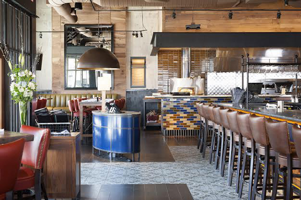
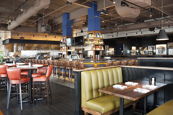
Walking into the restaurant, customers see three sections: an open kitchen with nearby communal tables on the left, an island bar with stool and table seating in the middle, and a traditional table/booth dining area to the right and along the back wall.
According to Kim Nathanson, senior designer with Niemitz Design Group, the open kitchen brings energy to the space while also emphasizing the quality of food being produced, which now includes small plates and seasonal offerings.
“One of the things that’s a clear support of this healthier, more vital Burton’s environment is to have a very strong display kitchen,” she said. “It couldn’t be just an open pass-through window, but a full, open display of cooking, a very large oven and great displays of seasonal products. Certain times of the year we’ll have bushels of apples or pumpkins, things that are very relevant to what they’re cooking, displayed on the line.”
To add color to the space, a pony wall in front of the open kitchen is clad in long, narrow tiles of taupe, cream and blue. Next to the open kitchen are several high-top walnut tables. Among these is a communal table with seating for ten — a feature that is intended to appeal to younger customers. Above this table is a large dome light with a gold interior and a blackened bronze exterior. At more than five feet in diameter, this fixture helps define the space.

The restaurant’s second area is its island bar. While the design of this space also appeals to younger diners, the bar/lounge offering provides them with a different kind of experience than the open kitchen, said Nathanson.
One of the more innovative aspects of the restaurant’s design is housed in this section. Located on the inside of the bar, where the bartenders work, are two large structural columns. Instead of treating these columns like eyesores to be hidden, the designers made good use of them. Clad in walnut, they serve as bookends to an impressive display of liquor bottles and serving glasses.

The bar itself is made of walnut panels with blue vinyl inserts, while the chain chose a granite countertop. The area’s floor includes a patterned cement tile a few feet out from the bar, where customers can sit at the bar on nutmeg-colored stools, and real wood flooring beginning a few feet out.
“We really like to stay to the authentic material if we can,” Nathanson says. “It feels better. People know it, people recognize it and the sound is much more forgiving.”
Additional furnishings in the bar/lounge include a black banquette with a series of two-tops and bar-height four-tops with red vinyl upholstery.
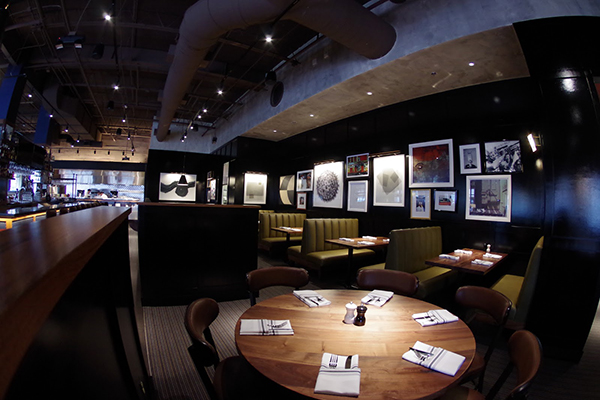
The third main area of the new Burton’s is the dining section. This area is distinguished from the bar/lounge primarily through lighting and furnishings, with walnut tables, upholstered chairs, booth seating and a large banquette.
While this space is designed to appeal to the chain’s traditional customer base, as well as families with children, it does have some modern touches. These include a large wire chandelier with an industrial look, along with a gallery wall featuring photographs and prints in various sizes and with an eclectic selection of frames.

“You’ll see a picture of Diana Ross along with a beautiful photograph of a young girl with a red balloon in front of her head,” Nathanson says. “It’s very contemporary but there are enough abstract black and white prints that keep it from being too wild. It’s a lot of fun and it gives the customer a different experience.”
While this new restaurant has only been open a few weeks, early reviews are positive, says Harron. All future stores, including four more opening this year as well as two in 2017, will adopt this new look, he adds. “We started out targeting 48- to 60-year-olds. Now that age group is 60 to 73, 74. It doesn't make sense to us to keep the brand that’s very healthy and viable and not evolve it.”
