- Ownership: Latin Café 2000
- Opened: October 2018
- Concept: Polished-casual Cuban/Latin American
- Size: 3,600 square feet, 232 seats
- Design: The Architects Group (TAG), Pedro Ramos, AIA
Creative use of wall coverings helped to transform a former French restaurant into Latin Café 2000’s newest location. Opened last fall in downtown Miami’s Brickell neighborhood, the restaurant is the third for the casual-dining concept.
Pedro Ramos, president of TAG, helped develop Latin Café 2000’s initial prototype and was tapped to design the Brickell unit as well. Stripping the walls bare at the outset, his goal was to proivde brand consistency and authenticity while taking advantage of the location’s indoor-outdoor character. To those ends, the design features plenty of greenery, wood, handcrafted materials, and vibrant colors and patterns. The mix includes several wall covering products and styles that support the narrative. Ramos explains:
Mosaic tile wall: For the long dining room feature wall, we created a mosaic of cement tiles that are handmade in a small town nearby. We selected several styles, put them all on the floor, and played with them to create an interesting mix of colors and patterns for the wall. It’s finished with a border of solid gray tiles. All tiles are 8 by 8 inches, but some are combined to create bigger patterns and appear to be larger or L-shaped. We went with cement tiles because they’re handcrafted and authentic, which fits with the brand. And because they were going on a wall, we weren’t as concerned about the maintenance that would be required had they gone on the floor.
Tropical flavor: On one smaller dining room wall, the client requested a bold, tropical wallpaper be used. It’s laminated for extra protection and adds great dimension to a wall that otherwise might have been just painted. It also helps to connect the landscaping outdoors with the indoor space.
Balancing act: In other accent areas, and to create a zone around a takeout window, we selected neutral, muted wall coverings that provide visual balance — wood paneling and the same concrete-look porcelain tile that’s used on the floor.
Bar face: We wanted something geometically simple that wouldn’t take away from the back bar or compete with the mosaic tile wall. It has a 3-D cube image that you can also see some of in the big mosaic wall.
Back bar: It’s framed in traditional Bahama shutters, like those you’d see on tropical island homes. They fit the concept, but they’re also functional because there’s storage behind them. Lining the back bar itself is thin porcelain tile that looks like marble and is lit to show off the bottles.
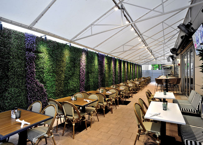
Faux foliage: The outdoor seating space is narrow and long between two tall buildings, so we tried to create an oasis in this busy urban area. Green was very important inside and out. Rather than just a solid tone, the landscape architect included different colors of faux greenery on a long wall enclosing the patio and lighting that highlights it.


