2020 was a year like no other. Here are six of rddmag.com's most-read articles, curated by our editors.
 1. Designing Restaurants in a Post-Pandemic World
After the COVID-19 pandemic forced the closure of indoor dining at restaurants and other foodservice operations nationwide, many businesses had to quickly shift gears and figure out if revenues from takeout and delivery would be enough to sustain the company through stay-at-home orders or if it made better financial sense to close completely.
Back in May, rd+d took a look at how operators were responding to the changing landscape. We took a look at how the new normal impacted restaurant design.
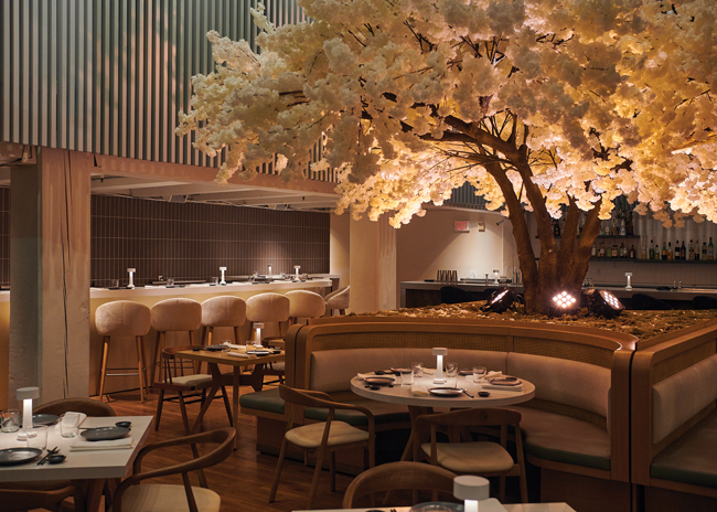
 Sinema Restaurant and Bar, image courtesy of MA2LA.2. Art Deco Resurgence
With its exaggerated curves, sleek geometric influences and bright colors, art-deco oozes modern luxury.
Art deco is enjoying a resurgence, but designers are opting to incorporate elements of the iconic lines in all sorts of ways, from faithful interpretations to thoroughly modern takes.
This article looks at how three restaurants took the classic style for a modern spin.
 Image courtesy of il Bracco.3. Best Practices for Safe Take-out and Delivery
Naturally, cleanliness is the No. 1 concern of consumers today, with great taste coming in second, according to a report, COVID-19: Into the Home by Datassential.
Consumers’ fears are strong and they are real. So, how are restaurants alleviating guests’ fears and keeping their pickup and delivery options safe?
We found that perfecting to-go packaging, overcommunicating with customers and understanding that when it comes to hygiene, there's no such thing as too much hand sanitizer.
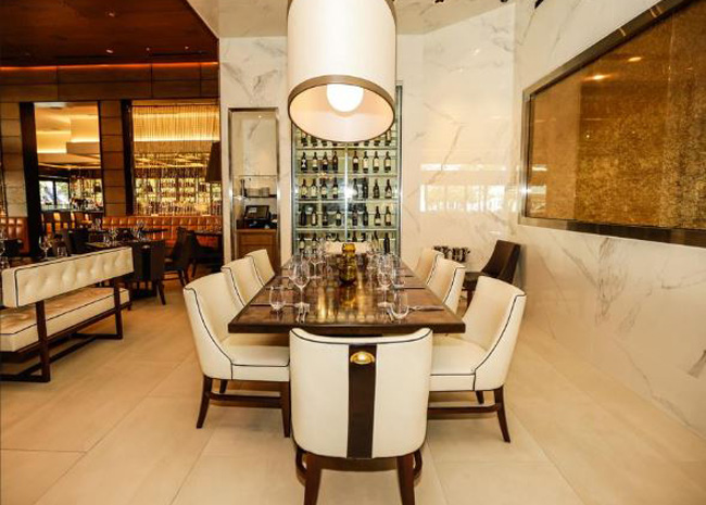
 Image courtesy of Meat Market.4. Redefining Steakhouse Design
Steakhouse concepts are typically “masculine” spaces with dark woods, low lighting and heavy, dark leather upholstery. Meat Market is a different beast.
This Florida-based concept has four locations, all hip and high-end, with a look that eschews traditional steakhouse design, according to Anthea Bosch-Moschini, founder and principal designer with Studio ABM Design, the firm that created Meat Market’s look.
“Being a female design firm in the hospitality industry, [when first approached about the concept] we suggested doing a steak restaurant that feels softer and more feminine. It can’t only be a guys-night-out kind of place, which is what steakhouses have been known for,” says Bosch-Moschini.
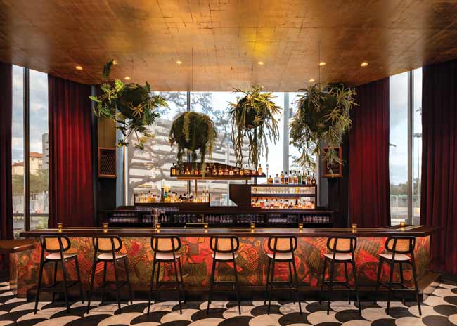
 citizenM, Times Square, image courtesy of Catie Ryan.5. Bring Nature In With Biophilic Design
If ever there was a time when the soothing, healing touch of nature on the human spirit was needed, it could be now.
Designers are perfectly positioned to help deliver that magic touch. Bringing the outdoors in for desk- and tech-tethered consumers, designers are embracing biophilic design for its enduring aesthetic appeal and, increasingly, for its well-documented benefits to the human psyche.
 Images courtesy of John D'Angelo6. Detroit Bar Nails Midcentury Aesthetic
Located in a rehabbed apartment building that once housed Detroit’s carpenters’ union headquarters, Hammer & Nail is cocktail bar with a decidedly mid-century modern aesthetic that reflects the building’s original design.
The centerpiece of the design is the neon light display behind the bar, which features a hammer striking a nail. Previously, two such pieces were on the top of the building’s exterior, highlighting the connection to the carpenters’ union and serving as an icon on the Detroit skyline.
Take a look inside to see how designers honored the history of the building while creating a space that our editor in chief hasn't stopped talking about since May.


