What’s old is new again. Art deco is enjoying a resurgence, but designers are opting to incorporate elements of the iconic lines in all sorts of ways, from faithful interpretations to thoroughly modern takes. Here, three restaurants take the classic style for a modern spin.
Prime + Proper
Detroit
 Images of Prime + Proper courtesy of Aly Sasson
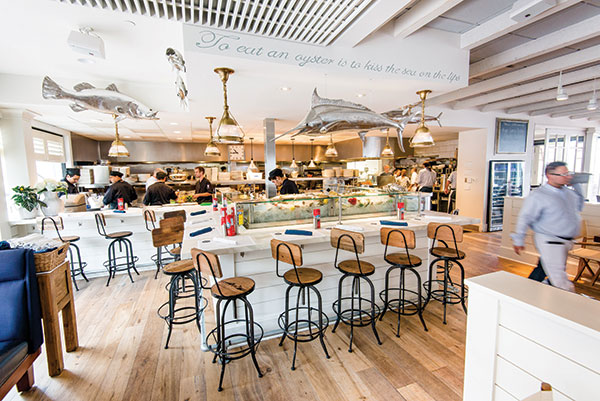
Modern luxury is the aesthetic at Prime + Proper, a steakhouse in Detroit that is almost completely designed with black and white elements.
But these colors, along with some of the materials used — a marble floor, glass tabletops, porcelain ceramic, a quartz bar top that simulates onyx — can be cold.
So, alongside these colder elements are very tactile fabrics like velvet, chenille and leathers “that give it a warm feel,” says Elizabeth Swallow, lead interior designer, McIntosh Poris Associates, Detroit. And the lighting softens it, too, she adds. “The brass accents warm up the space, as well as the color temperature of the lighting. We were paying attention to make sure it was warm throughout.”
All of these elements were designed to give Prime + Proper a luxurious feel, Swallow says. “Art deco was a transition between the historic style and modern but still keeping the richness and decorative elements. This is an updated variation on that.”
Art deco really comes alive at Prime + Proper via the black, white and antique brass color scheme; the bold geometric decorative ornamentation; the graphic black-and-white hexagon-shaped marble floors; the chevron-patterned upholstery fabric; and an overall emphasis on decorative surfaces, such as white lacquered columns, the original marble staircase and antique brass accent metal.
McIntosh Poris Associates had to keep the original 1912 stairway stairway, as well as the columns and ceiling beams, because the restaurant is in a historical building, as well as the columns and ceiling beams. Rather than hide these elements, Michael Poris, principal, went in the opposite direction. “We made them oversize, along with the columns, to hide all the ductwork,” he says. “So they are oversize and overstuffed, which adds to the richness. A lot of restaurants get designed in minimal modern and this restaurant was not that.”
Designing a restaurant with multiple bold choices, such as the hexagonal patterned floor tiles and a cowhide-faced bar, created a very high-energy space, Swallow says. Energy also comes, she says, from the open kitchen, which has a lot of movement and activity. Chevron patterns on the walls at the bar (made of wood and brass) and at the booths in the dining room (made of leather and hair-on hide) also add a high-energy repeating graphic element.
To keep the energy from being too high in a fine-dining setting, the designers added several elements. These include high booth backs “to absorb some of the visual and audible energy in the space,” says Swallow; soft and textural upholstery, which offers a comfortable place to settle into the experience; white columns, kitchen and ceiling, which help counter the bolder, more expressive elements in the space; and wood flooring in the dining area, which is “a grounded and warm flooring finish to counter the graphic marble tile in the adjacent entry and bar area,” she adds.
Sinema Restaurant & Bar
Nashville, Tenn.
 Image of Sinema courtesy of MA2LA
Sinema Restaurant & Bar in Nashville recreates the spirit of the art deco era. Housed in the historical Melrose Theater that opened in 1942, its new design was inspired by the building, a mix of original elements and brand-new custom design.
At first, the building “was the cell of an old theater,” says Kathy Anderson, principal of Anderson Design Studio, Nashville. However, there were intact parts that she could keep — amber gold mirrors in the lobby and some art deco handrails going up the curved stair from that lobby.
“The building really guided us and it was about keeping it luxurious,” Anderson says. She restored the staircase and brought it up to code, keeping the exposed brick wall in the main-level dining room. “We left the brick because you can feel the remains or the history of the old structure,” she adds.
Many elements were custom designed. Anderson sourced the aged brass 1940s sconces with a special finish; she also sourced three large brass Marset Discoco pendant contemporary gold light fixtures that hang over three round green velvet booths. “They have more of a 1960s look, but it’s timeless and creates beautiful, sexy light at the circular booths,” she says.
The stairway railing was also custom made. “We were influenced by the design of the original handrail that was still existing, but the height was way too low and the opening too large to meet current codes. We stayed with the curved lines and also gave it an old brass finish,” Anderson says. “We weren’t trying to restore in the deco period; we were trying to give a nod to the glamour and the beautiful lines of deco but not afraid to put in some modern fixtures that are obviously deco inspired.”
Anderson also included movie images from the period. Over the lobby hangs an enormous movie screen, more than 12 feet wide, where black-and-white movies from 1930 to 1960 play. Black-and-white movie photographs bedeck the downstairs walls, bringing in a Hollywood vibe. Upstairs, in the lounge, color movie photos bring a more modern feel.
Fabric and color are very important. A deep purple carpet stair runner reaches from the lobby to the second floor. A wall covering that resembles peacock feathers, and is very deco inspired, papers the wall from the lobby to upstairs.
Burnt red velvet drapes separate the lobby bar and dining room and are reminiscent of the rose gold so popular in the deco period. “We chose them for the glamour and also to keep the sound down,” says Anderson. “It also creates a mystique in the dining area.”
Anderson used a lot of mohair and velvet and leather “for plushness,” she says. “Along with lots of marble and marble tables, which are durable. These go well together.”
And perhaps the pièce de résistance of Sinema is the women’s bathroom, which is round and has a sparkly silver wall covering, white marble countertops and curved back splashes. On the other side of the room are two vanity areas with Hollywood mirror makeup lights. The floor has a deco pattern made with Terrazzo flooring, a classic deco material — and there’s a big peach ottoman in the center. The bathroom’s so popular that it has its own hashtag, #SinemaSelfie.
Delilah
Los Angeles
 Images of Delilah courtesy of Elizabeth Daniels Photography
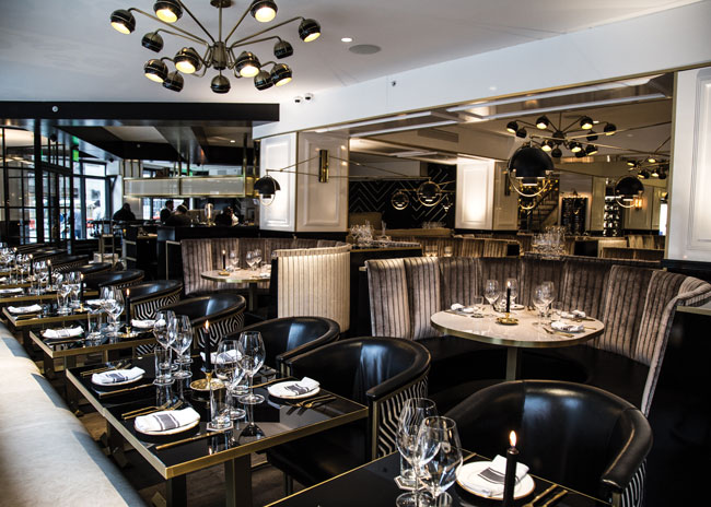
At Delilah in Los Angeles, diners take a step into the past while remaining in the present. This was a deliberate move by designer John M. Sofio, president and founder of Built, Inc., in Los Angeles, who wanted this to be an art deco restaurant.
Sofio was inspired to turn this location into an homage to art deco by the original venue that occupied the building. In the late 1940s, the Pink Pussy Cat was a burlesque dance club with pink decor. “I channeled the soul of the original space into my interpretation of a current-day supper club with high energy,” he says.
Through Sofio’s design, he aimed to make the space much more refined and finished. So he closed in the open ceiling and added soffits “to take the eye around the room.”
Where the art deco feel really comes alive is in the bar and back bar, Sofio says, as well as the carpentry. The ideas for this largely came from the Queen Mary in nearby Long Beach, which was built in the 1930s. “I studied all the interior detailing of the millwork, woodwork, and what was amazing was they had a large board of every veneer they used in the ship. It was inspiring to see they had 54 veneers. I had only about four, but I stained them differently to create about nine different wood looks based on that history on the Queen Mary.”
Sofio didn’t want the art deco feel of Delilah to be obvious, so he stayed away from certain elements, “and we knew that meant our design was going to be tighter and that we’d swoop people back-and-forth in the space between now and then,” he says.
The modern pieces Sofio has featured include a 1920s hanging lamp with semi-transparent glass over the inglenook in the fireplace. “We matched it with a round mirror from the 1940s over the fireplace,” he says. “I dropped it off center and put some sticks under it, and it works really well with the lamp, the fire and the leather seating.”
On the green Pullman booths, Sofio used crushed velvet, which contrasts with the beige-and-gold center furniture, and the golden curtains. The banquettes are covered with leather, and the black leather of the inglenook “keeps the palette minimal,” he says. To avoid chaos, Sofio kept the wooden floors dark brown and the ceiling an off-white, “which calms the whole space down and lowers the energy.”