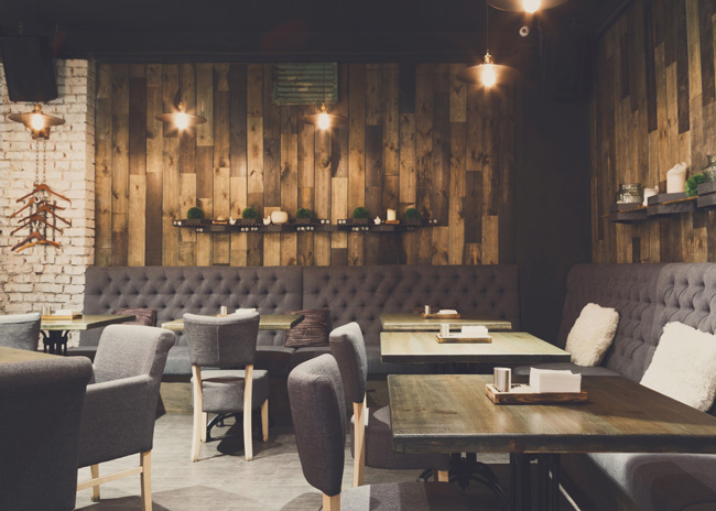
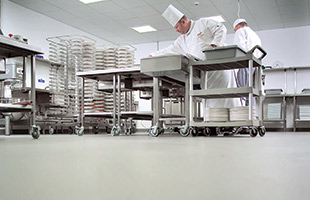
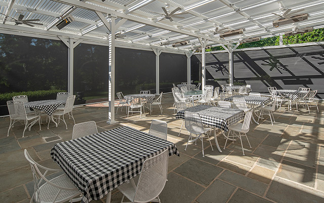
 Ask five different designers to tell you their favorite restaurant design, and you’ll most likely get five widely varying answers. To one designer, it may be an ultra-modern concept that’s all about the stylishness of the front-of-house area. To another, it could mean a well-designed kitchen that moves high volumes of food out of the kitchen efficiently. To yet a third designer, it could mean taking an established concept and giving it a more up-to-date look.
For most people in the restaurant industry, whether designers, owners or management, a favorite design is made up of a combination of elements because every part of a successful restaurant interacts with every other part. Stylish design in the front of house isn’t enough to compensate for inefficiencies in the kitchen. Conversely, a kitchen that works efficiently won’t bring in the customers if the seating and ordering areas aren’t attractive and functional.
Unlike many other businesses, even a seemingly minor change made in a restaurant can have an effect on everything else in the operation. For example, new floor coverings can have an effect on the noise level. Adding a piece of equipment can drastically affect the flow of workers in the kitchen area. So, a really effective restaurant design can be thought of as a combination of elements that all work in harmony to enhance the customer experience.
The stories on the following pages will show you some ways to make any restaurant design more eye-catching and efficient.


