Food halls are springing up in cities from coast to coast. Gathering multiple quick-service artisan eateries under one roof has taken off in many urban and even suburban areas. The number of food halls operating in the United States is expected to exceed 200 in 2019, about twice the number that were open in late 2016, according to research by commercial real estate giant Cushman & Wakefield.
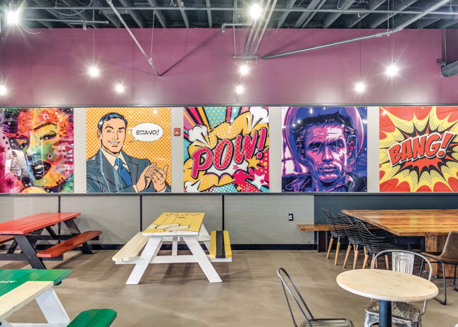 Windmill Food Hall in Carlsbad, Calif., features a variety of seating areas and defined spaces to create interest across multiple visits. Image courtesy of Haley Hill Photography
A successful food hall depends on finding the right location and mix of vendors to maintain activity throughout all hours of operation. Developers engaged in this trendy movement look for locations in heavily trafficked areas that attract multiple demographic groups. The lineup of vendors typically provides some options for patrons to eat and drink throughout the day. Ideally, choices include items for breakfast, lunch, snacks, dinner and after-dinner drinks.
Design is another crucial element to success. With the food hall trend still new, there are few design norms and there is lots of room for creativity. But there are some key principles, particularly regarding spacing and layout, that should be followed.
Food halls can be new construction, but many projects repurpose existing space. Typically, an existing structure should have about 10,000 square feet or more available to be suitable for a food hall project. Developers have converted old mill buildings, former large restaurants and retail outlets, and even empty mall spaces into food halls. Older structures with extensive brickwork and exposed beams seem to be particularly attractive for this format.
Consider Traffic Flow
Traffic flow through the space is a key consideration during the early design phase. Food halls foster more pedestrian flow throughout the space and in different patterns than a typical large restaurant. With numerous vendors sharing the space, patrons will move back and forth in scattershot patterns to peruse the numerous menus and offerings at multiple booths.
Leave enough space to prevent people from bumping into each other. “It’s critical to provide enough space between queues, especially when you are at peak capacity,” says Pat Garza, CEO of National Food Hall Solutions. Eight to nine feet between stalls is usually enough, he says. Make sure there is also generous spacing between the queue areas and any tables and seats to maintain a clear pathway during peak periods.
Effective Layouts
The shape of the space will influence layout. “You are typically working with a rectangular building with vented stalls on the exterior walls,” Garza says.
This arrangement is more cost-effective than locating booths centrally, which requires longer vents and more powerful exhaust fans. “In the center, you can put a bar or non-vented stalls for things like ice cream or juice,” Garza says. Reversing this formula with vented vendor booths in the middle and seating along outside walls may be desirable in a setting with scenic 360 degree views, but be prepared to pay more.
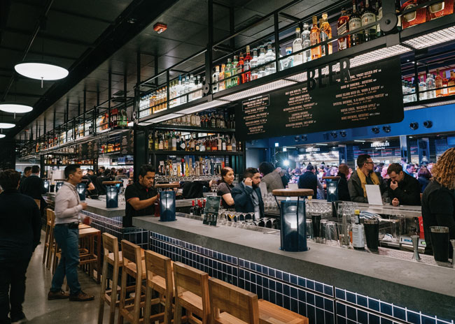 Time Out Market in Chicago is a 50,000-square-foot food hall that offers a contemporary design with local flair. Image courtesy of Jack Li
Varied Seating Areas
The basic concept of vendor booths on the exterior surrounding a large dining area may be a fine starting point, but designers can tweak this template to devise a richer guest experience. That was the case with the recently opened Windmill Food Hall in Carlsbad, Calif. “The owner originally wanted to have one big space like a food court in a shopping mall,” says Allison Whitt, principal, Design X Architecture + Interiors. “I advised against that. Instead, there was a great opportunity to create separate areas within the space.”
Whitt devised a plan with four distinct seating areas — each with its own vibe. One provides seating at a bar bordered by a fenced-off play area. Here, parents can watch their children play while enjoying a drink. The play area, lined with artificial turf, contains games such as Skee-Ball, Jenga and basketball.
Another setting, the library, has a sophisticated lounge vibe with plush seating appropriate for adults who want to chat over cocktails. Other dining space is informal, with varied seating including picnic tables, traditional restaurant booths and long communal tables. One of these areas has easily movable furniture so that the space can be rearranged for events like live music, yoga and bingo. The idea was to provide areas for different constituencies — guests at the attached hotel, workers from nearby offices and families visiting Legoland next door.
“It’s important to make sure you create an inviting environment,” Garza says. Patrons are looking for an experience, not just a place to grab a quick bite. Communal seating, he says, is particularly appealing to members of Generations Y and Z, who seek opportunities to socialize. Tall tables and counters, even without seats, can be communal spots for people to perch for food and drinks.
“Look around for local inspiration,” advises João Cepeda, president and creative director at Time Out Market in Chicago. This 50,000-square-foot Chicago food hall adds local flavor with a massive digital screen (32.8 feet by 6.5 feet) that showcases artwork from local illustrators, historical photos of the city, and information on events, concerts and things to do. Cepeda says it’s important to establish a distinctive look. “In a couple of years, 80% of the new places will look the same,” he says. If you can avoid sameness, you can forestall the need to refresh the space.
Durability of Materials
Given the large volume of patrons streaming through each day, durable materials throughout the space are a must. Polished concrete is a popular choice for floors, offering high durability and an appealing look that most people are now accustomed to, Whitt says. The Windmill Food Hall had an existing polished concrete floor from its previous incarnation as a TGI Fridays, so after a refinish, it was good to go.
Hard surfaces — wood for communal tabletops and metal for benches — are safe choices for durability. If plusher seats are part of the plan, choose materials carefully. Whitt’s design called for distinctive seating areas with custom-made furniture. Booths were lined with rich, brown leather that was resistant to tearing. If vinyl is used on seating, make sure it is a heavy-duty material.
Signs and wayfinding elements should be “big, bold and clever,” Garza says. At peak times, crowds may block some visual cues that direct individuals to restrooms, the bar or specific vendors. The solution is to place signs up high or even put some graphics on the floor for wayfinding, he says. The latter can be helpful to direct people up or down stairways.
There are two philosophies regarding wayfinding to individual vendor locations. Some project plans provide lists of vendors and maps to direct customers to each eatery. Others omit these elements to encourage an atmosphere of discovery.
 At Windmill Food Hall, vendors have various types of wood counter tops to offer customization but also fit into the overall space. Image courtesy of Haley Hill Photography
Vendor Branding
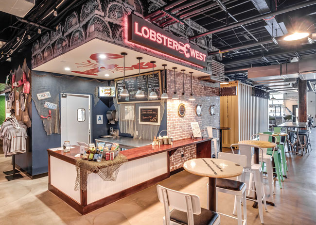
Durable materials should also be used within vendor booths, and these can provide brand distinction. “The Windmill vendor booths have a lot of variations on wood countertops,” Whitt says. For example, the counter at Bread and Cheese, a grilled cheese purveyor, for a branded effect.
Vendor booths are typically small — 150 to 250 square feet for non-vented space, 300 to 400 square feet for vented units. Each booth is a self-contained business encompassing food preparation and other back-of-the-house functions such as refrigeration, wash-up space and trash disposal. These elements are typically walled or screened off from public view. The only function not located in the booth may be a storage area in an inconspicuous space within the food hall.
The front counter area is the public face for each vendor. With each booth having limited visibility in the context of a much larger space, it’s important to add visual pizzazz to bolster each vendor’s brand identity. This can be achieved with eye-catching signage, pops of color and graphics. Almost anything goes — neon signs, fluorescent paint, chalkboards, artwork and digital menu boards are all fair game. More conventional building materials such as brick, subway tile and metal can also add distinctive flair through coloring and texture, Whitt says.
Most vendors have their own design ideas and are typically given wide latitude to realize their vision. Unique design flourishes in which even adjoining spaces look substantially different are OK and often encouraged. “Our vendors create the scenario, choose the customs and run the act,” Cepeda says. “We try to be a stage for the talent of those fabulous actors.” The design goal of Time Out Market’s common areas was to present a “beautiful but neutral” platform, he says.
“Vendors present ideas, but we may have to bring them back to center,” Garza says. “Then, the landlord typically signs off on the design.” Whitt says one vendor at the Windmill Food Hall envisioned a graphic of a giant french fry. That concept, she says, would have looked odd on such a large (12-foot-high) scale. Instead, she proposed graphics with smaller depictions of containers of fries (which the vendor accepted).
It’s common for food hall design to be well underway before most of the vendors are chosen. That presents a challenge as booth design happens late in the design process and can potentially delay construction. “For our next food hall project, I’m going to insist that vendors get involved early,” Whitt says.
As food halls continue to pop up in many places — metro Denver, for instance, already has a dozen such establishments — innovative elements will be more important to distinguish one booth from another. Adding the element of surprise, such as a hidden speakeasy bar in Time Out Market, puts a unique marker on a project.
Outdoor spaces can add flair as well as more capacity. Garage doors at Windmill Food Hall, located in temperate Southern California, provide ready indoor/outdoor access. With the facility inviting in the outdoors, kitchens in vendor spaces had to be fully enclosed to comply with health regulations, Whitt notes.
Another important element is to provide dedicated parking in a convenient location for third-party delivery services. Most food entrepreneurs today count on delivery for a significant percentage of income.
Food halls are an exciting new concept, presenting business opportunities for both developers and restaurateurs. They can be a particularly attractive option for new eateries or provide a transition from a food truck to a permanent location.
These projects are also a prime canvas for designers to exercise their creativity. Keeping but a few key standards in mind — durability, ample space for pedestrian flow and distinctive elements for each vendor — food halls are a great test-bed for new concepts in dining and entertainment — and add a shot of vitality in well-selected locations.

